Thursday 27 February 2020

Knock your next social media presentation out of the park

As a social media professional, presentations are an inevitable part of your job and a vital part of your career growth. If that gives you nervous butterflies, not to worry! Honing your presentation skills takes time, patience and practice.

Presentations can be a challenge, but they’re also an opportunity. Whether you’re presenting a new social strategy, proving the ROI of a campaign or pitching business to a new client, the basics of successful presentation are the same. Follow these tips (and use this template) to create a compelling social media presentation that keeps your audience engaged from start to finish. 

Do your research

The first and most important part of any presentation is research. It’s the backbone of the story you’ll be telling. Rather than heading to Google and scouring the web blindly, use these questions to guide your research:

What’s your focus and objective?

You don’t usually just give a social media presentation for kicks and giggles. Perhaps you’re trying to get executive buy-in for a new social tool, or you want to pitch a new strategy to your social team. Whatever your focus may be, your presentation should be mission-driven, intentional and working toward a solution. 

Some of that research may come from digging into your previous social efforts. Find concrete examples of social posts that worked in the past to support future goals and projects. Uncover content gaps and growth opportunities by listening to your audience. Hone in on your KPIs and look for markers of social proof and ways to assign value to your insights. 

Pulling in proof-points and data to support your thesis is important but don’t lose your focus. Use your research to narrow in on two to three key takeaways that will ground your presentation. 

Who is your audience? 

Research for your presentation shouldn’t be limited to your topic. You’ll need to do a bit of research on your audience as well. Who you’re speaking to should inform why and how you’re speaking to them. 

If you work in-house and represent a single brand, chances are you’ll be presenting internally to peers and leaders that know you, your work and background on your topic. But social media marketers that work in an agency have different challenges that likely require a bit more research. 

If you’re pitching a social media plan to a new client, a deep understanding of their brand, industry and business needs is crucial. Beyond their brand background, you’ll need to narrow in on the client’s pain-points, who their competitors are, their current social strategy and more.

Create your deck

Just as social media connects us to a wider world, so do stories. Great storytelling in your presentation will help keep your audience captivated from start to finish.

The “deck” you’ll be presenting acts as the outline for your story arc and your slides are your illustrations. Use this free, customizable social media presentation template to create a polished slide deck.

As you begin building and customizing your presentation, keep these best practices in mind to avoid presenting like Michael Scott.

michael-scott-power-point

Introduce yourself and your agenda

There’s a common piece of advice for speakers that goes, “Tell them what you’re going to tell them. Tell them. Then, tell them what you told them.” Following this framework will help set expectations with your audience and make sure you start and finish with impact. 

At the beginning of your presentation, add a slide introducing yourself and any presenting partners. After that, include an agenda slide that gives a high-level overview of your presentation. 

Consider also sharing your agenda ahead of time. This gives stakeholders an opportunity to respond with preliminary notes that could help you tweak your presentation so that it’s aligned with their expectations. This also gives your audience time to prepare questions ahead of time. 

Start with a hook

Engaging your audience early on in your presentation will help hold their attention throughout. With a good hook, you’ll lure people in and intrigue them from the get-go. A few of the most popular examples include shocking statistics, rhetorical questions, an interesting anecdote and inspirational quotes. 

Make slides succinct

Each slide you present should be simple, focused and void of unnecessary distractions. According to Paul Jurczynski, a TED Talk coach and cofounder of Improve Presentation, “The golden rule is to have one claim or idea per slide. If you have more to say, put it on the next slide.” 

Use colors with a purpose in mind

In many cases, your presentation should incorporate the color schemes found within your agency or brand style guide. For example, let’s say you’re giving a social media presentation to a new customer or client on behalf of an agency. The audience may not know you as an individual, but they have an existing relationship with your brand. Colors and fonts are a simple way to set off those brand recognition triggers and remind your audience that you’re a subject matter expert. 

If you’re going to branch out, your colors need purpose. Consider the emotions associated with colors. For instance, people associate yellow with warmth and energy, whereas red is often associated with excitement and passion. No matter what color scheme you choose, it should be consistent throughout your presentation. 

Incorporate data visualization

Social media marketing presentations often come down to proving ROI for stakeholders. Data visualization like graphs and charts are a compelling way to make your case.  

In data journalist David McCandless’s TED talk, he explains that the beauty of data visualization is that “that we can see the patterns and connections that matter and design that information so it makes more sense, it tells a story, or allows us to focus only on the information that’s important.”

Don’t get bogged down in mapping out every single data point you uncover during your research. The best graphs are simple graphs with takeaways that are easy to spot. Try highlighting key numbers or data points by using color, bolding or another visual treatment that makes them pop, like the example above from the Sprout Social Index

Show your work

It’s a social media marketing presentation, so naturally, you should share examples of your work on social media. Pull in screenshots of successful social posts to show how your tactics have worked for the brand(s) you represent. 

Wrap it up with a call-to-action

A powerful CTA always ties back to your original goal and encourages an action your audience can take once your presentation is over. Essentially, it’s your way to serve up a final take away and leave the ball in your audience’s court.

Plan your delivery

You’ve done your research, you’ve created your deck, now it’s time to plan your delivery. With the right approach, tone, prompts and pacing, your presentation could be about “nothing” and still be compelling. Just watch as Will Stephens does this masterfully.

Generate emotional responses 

As the great Maya Angelou once said, “People will forget what you said, people will forget what you did, but people will never forget how you made them feel.” Data points and numbers are great but hitting points that generate an emotional response is even better. 

For example, if you’re pitching to new clients about growing their social communities and you’ve grown a social audience by say, 50% in the last six months, that’s incredible! Don’t be afraid to share your excitement. 

Not every point of your story is going to be exciting. Decide what emotions you want to tap into ahead of time. Are you trying to inspire, inform, engage or entertain your audience? The best presentations combine a little bit of each. 

Pump the brakes

While you may feel the need to get through everything as quickly as possible, don’t be afraid to pump the brakes. A lot of people tend to speed up when they’re nervous. Nerves are normal, just remember to slow down, enunciate and take deep breaths.  

Take a few moments throughout your presentation to check in with your audience throughout the presentation so they can ask questions or have a point clarified if necessary. If the people you’re presenting to aren’t familiar with an industry term or social media metric, they may need a bit more explanation. 

Work out the kinks ahead of time

Practice, practice, practice. Don’t just skim through your deck. Treat your practice runs like they’re the real thing. If possible, present to a friend or coworker you trust to give honest, constructive feedback. The more you rehearse, the more confident and comfortable you’ll feel. 

You’ve finished your presentation, but you’re not finished yet. After you present, send your audience and any stakeholders the final deck, remind them about next steps and action items that came out of the presentation, and finally, thank them for their time. 

Are you ready to create your next social media presentation? Use our free social media presentation template to get started.


This post Knock your next social media presentation out of the park originally appeared on Sprout Social.


from Sprout Social https://ift.tt/2Vqipug
via IFTTT
Social Spotlight: Adobe and How to Borrow from B2C

Welcome to the Social Spotlight, where we dive deep into what we love about a brand’s approach to a specific social campaign. From strategy through execution and results, we’ll examine what makes the best brands on social tick — and leave you with some key takeaways to consider for your own brand’s social strategy.

Overview

We’ve said it before (and we live it every day!), but B2B social marketing comes with a set of unique challenges. One of the most daunting is that it can feel like many “best practice,” foundational social tactics just aren’t available to you because your audience is businesses and not consumers. It’s certainly not as straightforward, but taking cues from proven B2C tricks to build your B2B strategy is possible and can be very effective. Take Adobe, makers of the cloud-based software suite that creatives across the globe rely on to bring marketing, advertising, photography and videography work to life. By taking a tried-and-true tactic from the B2C playbook, Adobe has built a social content juggernaut that’s a daily inspiration to its richly diverse audiences.

Many B2C brands rely on user-generated content, or UGC, to supply them with a real-life look at how consumers are interacting with the brand and its products. Ever since Burberry launched The Art of the Trench in 2009, B2C brands have been encouraging (and sometimes incentivizing) their customers to use social to show others how a brand or product fits into their lives. In the Insta-driven landscape of 2020, this is a piece of cake for many B2C brands. But what if your customers are businesses, and your product isn’t something that’s inherently ‘gram-able?

Adobe realized that the key was to focus not on its products as the highlight of UGC, but rather what its products enabled its users to create, achieve and celebrate. By focusing on end users instead of software buyers and opening the brand’s social channels to them to share the inspirational, beautiful and memorable things they created using Adobe programs, the brand was able to create the want from the bottom up. Not to mention, providing a digital home to a community of like-minded professionals who share ideas, feedback and admiration with each other–all in the context of Adobe’s brand.

Other software companies would be wise to look at Adobe’s adoption of B2C tactics as inspiration to rethink their own social approach.

What you can learn

1. Put yourself in your end user’s shoes. We often focus on the needs of the business and how our software products meet them. But what does your product’s end user get out of using your product every day? How does it make them feel, and how can you use social to champion that?

    • Getting started: Use social to ask your audience what they’re creating with your product or to tell you about how your product helped them do something they’re proud of. Then think about how you can bring those stories to life on social.

2. UGC can mean many things, especially in B2B. Even if your software doesn’t enable beautiful end products like Adobe’s does, you still have the opportunity to let your users speak for your brand.

    • Getting started: Use a text overlay on relevant visuals to share a quote from a user about how your product helped them do something remarkable.

3. Don’t be afraid of emotion. Too much of B2B marketing is functional, devoid of basic human emotion. Whether you acknowledge it or not, your product makes people feel things when they use it. Maybe it’s elation that they can be more efficient at work, or pride in what they’re able to create. Don’t be afraid to ask them about those feelings–chances are they’re not alone in feeling them, and that groundswell of emotion can define new opportunities for your brand.

    • Getting started: Interview a group of end users 1:1, either in person, via social, email or on the phone. Ask them about the feelings they encounter in their daily work, and explore together what role your brand and products play in those emotions.


This post Social Spotlight: Adobe and How to Borrow from B2C originally appeared on Sprout Social.


from Sprout Social https://ift.tt/2w6gd0l
via IFTTT

Wednesday 26 February 2020

15 inspiring social media landing page examples

Landing pages are easily one of the most important pieces of your social media marketing strategy, they’re unfortunately easy to overlook.

That’s because marketers are often so laser-focused on attracting customers and followers.

However, what happens to those customers once they click through your promotions? Are they moving through your funnel or are you letting those precious clicks go to waste?

If you’re not 100% sure whether your landing pages are up to snuff, don’t sweat it.

We’ve put together a comprehensive list of social media landing page examples and best practices to inspire you and help boost your conversions.

What is a landing page used for, anyway?

Before we get into the nitty-gritty, let’s break down what a landing page is.

A landing page is a destination page that’s part of a specific marketing campaign or promotion.

When your followers or subscribers click through a promotional link (think: social bio, email link), a landing page is quite literally well, they, land.

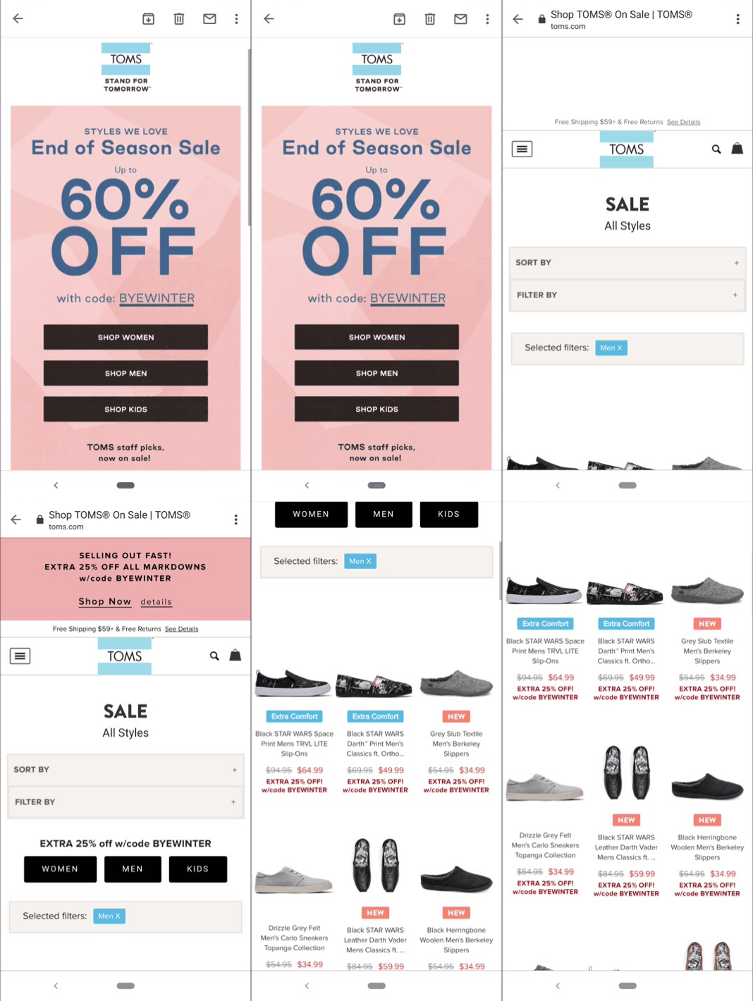
Here’s a straightforward example from a TOMS email promo. Upon clicking through the coupon, we’ve brought to the shopping page that’s specific to the promotion in the email.

This promotion from TOMS is a simple, straightforward landing page example for ecommerce

Note that landing pages are different than generic homepage links. Generally, landing pages include some sort of specific call-to-action such as signing up for a list or purchasing a particular product.

These pages work to guide visitors to take action rather than just “browse.” Also, tracking promotions with landing pages make it easier to attribute behaviors and metrics. This might include clicks, purchases, time spent on page and bounce rate.

Let’s look at a social media landing page examples from Skullcandy. Their trackable Bitly link in their Instagram bio points to a landing page for a particular product. Rather than point visitors to their homepage, they use their Instagram to highlight their latest offer.

Instagram bio links are one of the biggest places on social to funnel visitors to a landing page


After clicking through, customers land on a page for that offer.

Some landing pages are focused on a single product or promotion such as this one from Skullcandy

See how that works? Brands typically create new landing pages for product launches and new promotions. Over time, companies can understand what types of content and tactics perform well and can more quickly roll out new landing pages by plugging in new copy and creatives.

What makes a “good” landing page?

Hey, “good” question!

Businesses have tons of creative freedom when it comes to putting together their landing pages.

That said, there are some common threads between top-performing pages which we’ve highlighted below.

A good landing page guides visitors from Point A to Point B

No secrets here. Ideally, your landing page should keep visitors reading (and scrolling) as they naturally want to learn more and eventually click through your call-to-action (CTA).

Through elements of design, copy and CTA placement, brands manage to keep readers glued to the page without losing interest.

Below’s a good example from Zenni. The landing page is naturally broken up into sections, with attractive icons and photos of actual people to hold the reader as they educate themselves on the company’s offer.

zenni landing page

Rather than hit readers with a wall of text, brands are tasked with coming up with landing pages that find a balance between education, entertainment and usability.

A good landing page isn’t too “busy”

Piggybacking on the last tip, landing pages are the last place you want to overwhelm people via information overload.

Landing pages typically follow the rule of “less is more.” You’ll notice that many of them are minimalist when it comes to copy and color schemes, using only a couple of colors and brief copy to make their offer easy to digest at a glance.

For example, this landing page from Host Gator is a great piece of landing page design inspiration. The page’s rapid-fire points are coupled with a blue and orange color scheme that makes their CTA can’t miss while also being easy on the eyes.

Many of our landing page examples are simple and minimalist, such as this one by HostGator

A good landing page is mobile-friendly

Conventional wisdom tells us the majority of web and social traffic is mobile.

Meanwhile, recent social media statistics point to the need to appeal to customers on-the-go.

That’s why your landing pages should be mobile-friendly by default. Responsive design can take care of some of the legwork for you, but any social media landing page in particular needs to be scroll-friendly. The previous two tips can help make that happen.

That doesn’t mean you have to make your landing pages bare-bones, though. For example, this social landing page from Xero is effective while still including product screenshots, video and animations.

Many of our landing page examples are mobile-friendly and simple to scroll through

15 social media landing page examples (and why they work)

Now, onto the good stuff!

Below are some of the best landing page examples from social media broken down by industry.

And although many of these landing pages look totally different, they manage to get the job done in terms of driving clicks. No matter what you’re selling, these examples can inspire you.

Ecommerce landing pages

As highlighted in our guide to social media for retail, ecommerce landing pages should make the purchasing possible as direct and painless. Your end-game here is to guide shoppers to relevant product pages ASAP.

1. Black Milk Clothing

The beauty of a shoppable feed is that it makes the process of selling on Instagram a cinch. That’s the approach Black Milk takes, with its Instagram landing page serving as a feed of promos and user-generated content. Also, note the email opt-in to gather more information from prospective shoppers.

black milk landing page

Not necessarily unique to our other landing page examples, this one also featured a discount pop-up for first-time visitors. Although the use of pop-ups is hotly debated, free shipping pops are still all-the-rage for ecommerce in particular.

black milk landing page pop-up

2. Liingo

This landing page for a desktop Facebook ad from Liingo is brilliantly designed, separated into three sections as we scroll through. Note the bright orange call-to-action buttons as well as the animation from the “Virtual Try-On” section, both serving to catch the eyes of anybody scrolling through.

3. Beardbrand

Anything you can do to make your landing pages interactive is a plus. That’s exactly what Beardbrand does with its quiz-based landing page.

Upon gathering your email address, the quiz dives into questions to help guide you toward the right products.


Among our interactive landing page examples, this one from Beardbrand also personalizes product recommendations

Although a quiz might require a bit of legwork on the part of shoppers, taking the time to do so results in personalized product recommendations that require less browsing. Note also that by going through a quiz, your leads provide audience insight by giving you responses about their personal preferences. In short, a win-win.

SaaS landing pages

A crucial piece of any SaaS marketing strategy, landing pages should be straightforward in that they encourage visitors to download or request a demo. However, landing pages for SaaS aren’t always that simple.

4. Sprout Social

Sprout’s Facebook ad landing page is far from suit-and-tie. Featuring a friendly face above-the-fold and language that emphasizes our values and need for connections, we’re looking to prove to prospects that we’re about more than just software.

sprout social landing page example

The green CTA buttons are easy to see here. Meanwhile, video is noted to boost engagement and conversions and is why you’ll see it throughout our landing page examples.

5. Salesforce

Another Facebook ad landing page, Salesforce does a good job of breaking down exactly what their product does in plain English.

Coupled with imagery, actual screenshots and testimonial video below the fold, this landing page does a little bit of everything while providing essential information up-front.

salesforce saas landing page

6.Hyke

This Instagram ad landing page presents Hyke as a helpful tool, highlighting money saved without mincing words.

The remainder of the landing page includes social proof, testimonials and crystal clear pricing, while the purple CTA is can’t-miss.

hyke landing page


Hospitality and travel landing pages

Simply put, social media for travel is all about scoring bookings. These landing pages highlight how some of the biggest players in the travel industry make it happen.

7. Southwest

Coming from a Twitter video ad, this Southwest landing page is about as simple as they come.

But again, landing pages doesn’t need to be inherently complicated. Shouting “Hey, we’ve got good rates!” with a single, bright call-to-action that helps draw the reader to the natural conclusion to click-through.

southwest landing page

8. Four Seasons

If you’re in the travel industry, you know that style points matter. This Instagram landing page from the Four Seasons is minimalist but bold, offering clear call-to-actions which contrast with the rest of the landing page’s text.

the four seasons landing page

9. Disney Vacation Club

Well-organized and stylish, Disney’s landing page features videos and accommodation highlights for visitors who want to learn more than what’s above-the-fold.

disney vacation club landing page example

Landing pages for courses, courses and guides

From freebies to paid courses, these types of landing pages typically highlight benefits and present themselves as being time-sensitive.

10. Foundr

Foundr’s course landing page sort of feels like an old-school sales page but with some bells and whistles that make it more effective. For example, the offer countdown timer is a classic example of urgency marketing that still works today. Note also its use of video.

foundr landing page example

Coupled with a ton of data, social proof and testimonials below-the-fold, this busy landing page succeeds in selling itself to skeptics.

As an aside, Foundr promotes the course with a pinned tweet: a smart move for any business looking to promote a static or long-term office while still linking to their homepage via social.

foundr pinned tweet

11. Shopify

This landing page represents a style we see quite often for e-books, but this time-tested format works.

Sitting atop accompanying stats and data points, downloading Shopify’s guide doesn’t require any digging here. You know exactly what you’re getting and where to find it.

shopify landing page example

12. Skillcrush

If you’re promoting a webinar, perhaps the most important piece of your landing page is reinforcing the date and time. Skillcrush manages to do this while also highlighting its host with a human touch. The title and tagline of the webinar are all that’s really necessary to seal the deal for sign-ups.

skillcrush landing page example


Charity and nonprofit landing pages

Although social media for nonprofits is less about selling per se, landing pages for charity organizations are centered around driving donations. Here’s how they do it.

13. charity: water

The counter that’s front-and-center here helps highlight who’s contributed, serving as a sort of bandwagon effect for new donors. The clear, static donation box is also a nice touch. A simple color scheme and long-form video make this a clean, professional landing page that gets the job done.

Many landing page examples for nonprofits include front-and-center donation links

14. UNICEF USA

Not unlike a shoppable Instagram feed, this landing page allows visitors to browse and donate products that correlate with different photos. This is a creative way to encourage donations while also double-dipping your charity-related content.

unicef landing page

15. Greenpeace

Stunning imagery and a bright, static opt-in form make this landing page visually striking. The “signatures so far” bad is also a subtle touch to encourage visitors to get involved.

greenpeace landing page

As you can see, there’s a lot of room for creativity when it comes to these landing pages examples. This serves as good news as you can format and design your page based on your brand, all the while ticking the boxes of what makes a page “good”

How to optimize landing pages over time

Feeling inspired and ready to freshen up your landing pages?

Awesome! Your head is in the right place.

But before you consider scrapping your current pages or coming up with new creatives or copy, it’s important to understand what landing page optimization actually looks like.

To wrap things up, let’s talk about how to come up with a baseline for landing page performance and what you can do to give your numbers a must-needed boost.

Track the behavior of your landing page traffic

For starters, start by seeing which of your landing pages are performing well via Google Analytics.

Which pages are consistently attracting new visitors? Is there a specific call-to-action or page which drives the most clicks. You can not only set such goals in GA, but also monitor them over time to make sure they’re ticking upward.

Regardless, having this data available allows you to set expectations and goals as you look to improve your conversion rate.

Google Analytics makes it a cinch to track the performance of landing pages

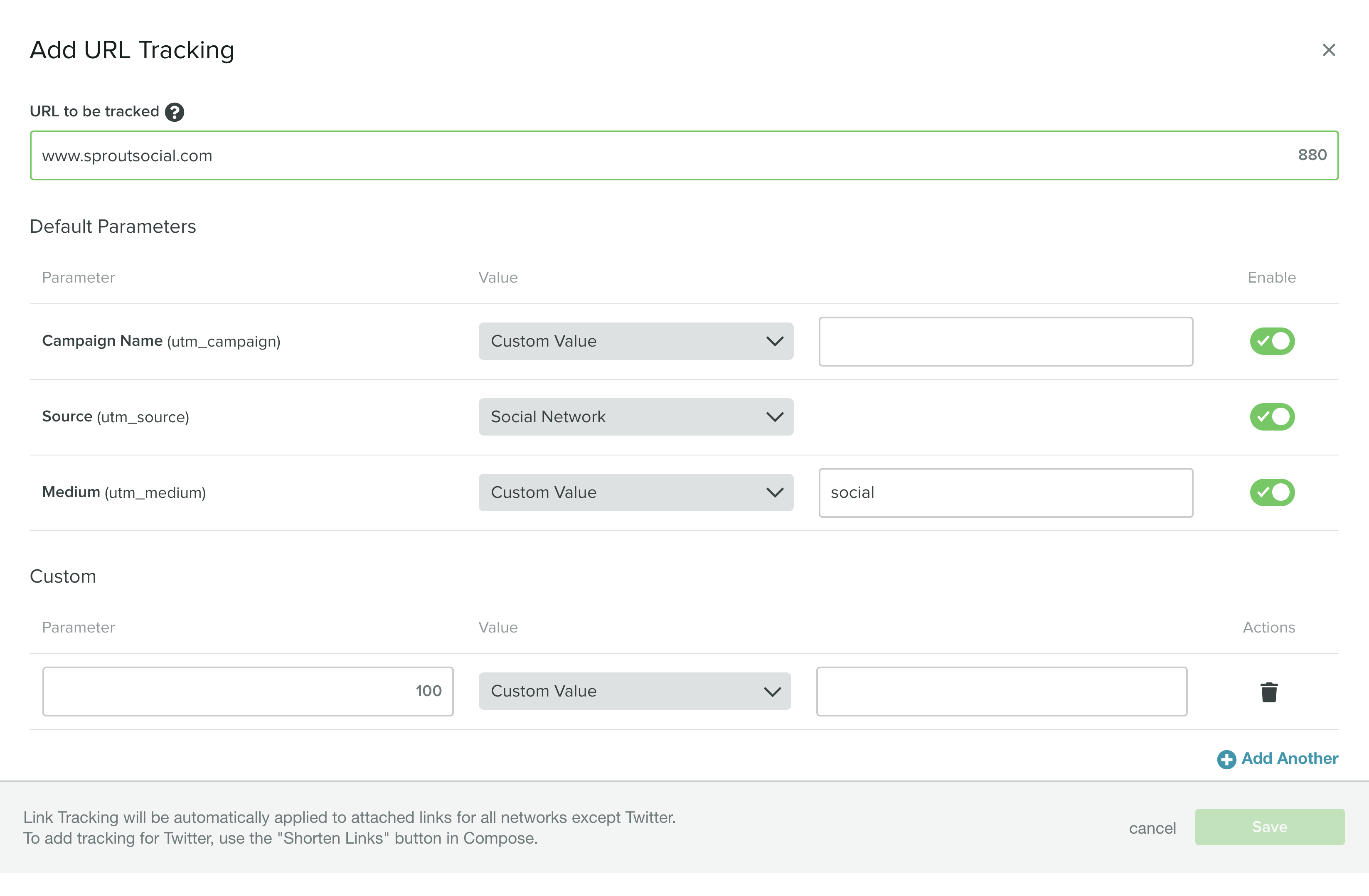
Also, tools such as Sprout Social can assist in monitoring clicks and conversions via your social media landing pages. With our URL tracker, you can identify and gather analytics for social-specific links. This includes not only bio links but also specific posts and promotions.

Sprout URL Tracking

A/B test your landing pages

Let’s say you’re ready to roll out a new landing page or want to make some changes to an existing one.

Maybe you want to try a new call-to-action or button placement. Perhaps you want to switch up your color scheme.

With tools like Unbounce, you can start with proven landing page templates and optimize them to your liking. You can also run multiple versions of the same page side-by-side, allowing you to A/B test them to see which one is the “winner.” Regular testing does double duty of refining your pages over time while also ensuring that you’re meeting your own standards in terms of performance.

A/B testing is crucial for improving the performance of your landing pages over time

Make sure your creatives and copy are consistent

A quick tip, but definitely worth mentioning!

Double-check that your and marketing messages are consistent not only across landing pages but also across marketing channels.

For example, creatives (think: imagery, calls-to-action, promotions) should ideally be consistent on your homepage, email and social platforms.

This ensures that your traffic is being sent where they’re supposed to be and likewise isn’t cause for confusion. Someone clicking through an autumn offer shouldn’t wind up on your summer landing page, right?

And with that, we wrap up our guide!

Ready to build better landing pages for your promotions?

Listen: there’s one “right” way to put together a winning landing page.

However, it’s key to understand what effective ones look actually like in the wild.

Hopefully, this list of landing page examples and best practices can help you start brainstorming your next destination page. Any landing page tips or tricks you’d like to share with our readers? How have you increased your conversion rate? Let us know in the comments below!

If you’re looking for a simple solution to organizing and reporting on your social marketing success, check out our toolkit of social templates to level up your day-to-day.

This post 15 inspiring social media landing page examples originally appeared on Sprout Social.


from Sprout Social https://ift.tt/2PqpiIg
via IFTTT

Tuesday 25 February 2020

The social media marketer’s guide to infographic marketing

With the constant demand for bite-sized information and visual content, infographic marketing is only going to grow in popularity as a format for digital content marketing. In fact, 65% of B2B marketers have used infographics for content marketing, which makes it one of the top five most used types of content. And 84% of respondents in an Infographic World survey found the medium effective.

most popular types of b2b content

So if you’re going to catch up with the competition, there’s no question that infographics should be a part of your content marketing mix. But that’s easier said than done because there’s a lot that goes into creating one. Not to mention the process of strategically promoting and distributing it.

This guide gives you an in-depth look at infographic marketing so you can successfully implement it. You’ll discover some of the top benefits of infographics as well as the best practices you should follow when creating one.

Why use infographics?

First, let’s try to understand why infographics work and why you should use them in the first place. Infographic marketing will help you:

1. Appeal to a bigger audience

Not everyone likes to read text-heavy blog posts and articles; some are visual learners and may prefer image content over text. Infographics help you appeal to people with different preferences and expand your overall reach.

2. Put a fresh twist on old content

Infographic marketing provides you with new ways to repurpose your old content and keep your blog constantly updated. Choose some of your older, text-heavy blog posts and convert the points into bite-sized information for an infographic.

Infographics’ are also a great fit for many social platforms that highly visual. They can help you expand the reach of your blog content by translating it into a format that’s perfect for platforms like Pinterest or Instagram.

3. Build high-quality backlinks

Authority sites realize the benefits of infographics too. Even sites that have an abundance of standard blog posts and may not be accepting guest posts might be interested in publishing an infographic as an alternative. This means you get to build high-quality backlinks and strengthen your domain authority.

For example, the influencer marketing platform Grin created an infographic on the ROI of influencer marketing.

In addition to publishing this infographic on their blog, they also submitted it to other authority sites including Egg Marketing PR, Venngage and Smart Insights.

4. Drive high-quality traffic

All these backlinks aren’t just for boosting your domain authority; they also help you drive traffic to your site. Some of the readers are bound to show an interest in your product or service after seeing your infographic. So they might decide to check out your site, thus boosting your traffic and getting more prospects into your sales funnel. In fact, infographics have been known to improve site traffic by 12%.

5. Establish brand authority

Besides more traffic and higher domain authority, getting published by a reputable site gives you clout. When an authority site decides to publish your infographic, it means they’re vouching for you, leading readers to see you as a thought leader in your industry.

6. Educate your audience

According to the previously-cited Infographic World survey, infographics are the most effective medium for learning and retaining information. So the right marketing infographics can help you get your message across more effectively as well as educate your audience about your products, services and industry.

7. Strengthen your social media presence

Infographics give you something visual and interesting to share with your followers. Not only will this engage them, it also makes them more likely to share your posts with their networks. This significantly boosts your reach and social media presence.

What can you create?

You now understand the benefits of infographics, so your next question may be what kind can you create? What type of information should you share and what works best in an infographic format?

If you’re looking to repurpose your own posts, look for content that can be easily summarized or illustrated. You might already have posts where quick bullet points or data visualizations help readers understand the key points of your content. These can help form the basis of an infographic. On the other hand, you want to avoid complex or nuanced topics that can’t be fully understood without a lot of clarifying copy.

Besides using infographics to repurpose information from your old blog posts, you can also create original ones to:

  1. Share relevant research data: You can present original findings from your research or survey as an infographic. Or you could even curate relevant statistics and data from multiple reliable sources and turn them into an infographic.
  2. Share relevant, fun facts: You could also put together some interesting facts relevant to your product, service or industry and turn them into an easily digestible infographic. These can be great supplements to existing posts that summarize them in a easy to scan way.
  3. Provide an easy-to-scan guide: Infographics are a great way to present instructions in a way that’s easy to process for the readers. If you have ‘how to’ content related to your products or services, create a bite-sized guide to help your readers learn how to do something. These also serve as downloadable assets that help users of your product or service always keep a reference on hand.
  4. Compare products/services: Infographics also make it easier to compare two or more similar products or services. You can compile all the essential information such as the pros, cons, pricing, etc., of different offerings within your own catalog or comparisons with competitors and turn it into an infographic.

Best practices for infographic marketing

Now that you have a better understanding of how infographics can benefit you and what you can create, let’s take a look at the best practices you should follow for effective infographic marketing.

1. Start with the right topic

Your choice of topic plays a crucial role in whether or not your infographic is a success. Ideally, you should avoid choosing a broad generic topic or you’ll find yourself struggling to narrow down on what information to include. So there’s a good chance your infographic will be all over the place.

Get very specific with the topic so it’s easier to pick out bite-sized information to include. For example, instead of creating an infographic about “blogging tips,” get more specific with a checklist for starting a blog, tips to improve blog traffic, and more.

At Sprout, for example, we created an infographic on how to build social relationships with influencer marketing. This makes a lot more sense than an “everything you need to know” type of infographic, which for a vast topic like influencer marketing will require us to fit in too much information into a single infographic. This infographic instead focuses on answering a few key questions in a visual way.

sprout infographic on influencer marketing

2. Follow a coherent timeline

Whatever story you want to tell or whichever design you plan to use, it should follow a logical timeline so people can process the information in a way that makes sense. Your infographic should have a flow that takes readers through a coherent journey. This means you should focus on creating step-by-step processes, chronologically ordering your information, numbering your information, etc.

Think of a visual storyline that fits with the information you want to provide, and then develop a follow that makes the most sense.

In our social media best practices infographic, for example, we used a list-based format to convey our message and grouped relevant data points together under each section. This infographic also follows a flow from starting with the initial steps of developing a social strategy to ending with more complex and ongoing tasks, giving it some narrative structure.

sprout infographic on social media best practices

3. Choose the right color scheme

We can’t stress enough on the importance of your color scheme when creating infographics for marketing. First of all, you should pick colors that complement each other. And it’s ideal if you can implement your brand colors into the infographic for consistent branding. But this may be a little bit tricky because you have to consider colors that are pleasant to the eye.

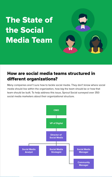
In every Sprout infographic, you’ll notice the use of defined brand colors like the shades of green that are part of our visual style guide. However, you don’t want to visually overload every single infographic with only your signature brand colors. In many cases, this can detract from readability, which is why we use white space and other balanced sections in the state of social media team infographic below. It’s likely that your design team has already defined secondary, complementary brand colors as part of your social media style guide, so this can be a great starting point for figuring out ways to vary your infographics.

sprout infographic on state of social media teams

4. Choose the right fonts

Font is another crucial consideration that can make or break your infographic design. The goal is to provide valuable information, so it needs to be readable and easy to process. It’s best to avoid fancy fonts that are hard to read and instead, go with simple ones that give your infographic a professional look.

In addition, your choice of fonts should also fit your brand image–whether it’s fun and bold or sleek and professional–as well as the topic theme. But whatever you do, make sure you don’t use every single font that looks good to you. This could result in concept overload and your infographic could end up looking messy, not to mention difficult to read.

The following infographic on strange dishes from history, for instance, only uses two typefaces that are both easy to read. Instead of using fancy fonts, they play around with the graphic elements to give the infographic some substance and a visual appeal, while keeping the larger blocks of copy highly readable.

infographic on strange dishes from history

5. Make the most of white space

White space is another crucial element in your infographic because you don’t want something that’s completely overloaded with graphics or cramped visual elements. Doing so means you’ll have a hard time conveying your message in a way that makes sense to the readers because there’s too much distraction. Make the most of white space to separate points, graphical elements and sections.

For example, check out the use of blank space in the following infographic on the history of infographics. Spacing is used to clearly separate different sections and chronologically order the flow of information.

infographic on history of infographics

6. Brand it

While the main focus of infographics is to educate your audience, your infographic marketing efforts should also help people discover your brand , especially if you want to gain links and visibility on sites other than your core web domains and social profiles. That’s why it’s crucial that you brand any infographic that you create. This involves implementing your brand colors and fonts into the design, as well as adding your brand logo at the end of the infographic.

Here’s an example from Freeflush Rainwater Harvesting.

infographic that shows brand logo from freeflush rainwater harvesting

7. Cite your sources

Unless you’re presenting original ideas and research data from your company, don’t forget to cite your sources in the footer. This adds credibility to your infographic and reinforces the reliability of the information provided. This also means you should only use information from reliable sources such as peer-review journals, surveys from reputable companies and the like.

For example, Happify created an infographic on why exercise makes you happy. And they’ve cited multiple peer-reviewed journals and other reliable sources at the end.

infographic footer citing relevant sources

Finally, promote your efforts

If you want your infographic marketing efforts to succeed, you need a consistent promotion effort. This means sharing your infographics everywhere besides getting them published on reputable sites. You should also publish them on social media and infographic directories and share them through email and blogger outreach.

You could even publish them on SlideShare if you want optimal reach. Be sure to take the steps needed to make your infographics shareable on all these platforms without sacrificing quality and design. You might need to crop them into multiple pages that meet the design specifications of each platform. Check out our always up-to-date guide on social media image sizes for more tips on resizing your content for various networks.

This post The social media marketer’s guide to infographic marketing originally appeared on Sprout Social.


from Sprout Social https://ift.tt/2Pm9ru0
via IFTTT