Thursday 31 March 2022

Benefits of Paid Advertising: Drive More Conversions in 5 Easy Steps

5 Things You Must Do Before Jumping Into Paid Internet Advertising

Paid advertising is a great way to guide more traffic to your site and increase business, but it can become expensive quickly if you aren’t careful. How do you make sure you are getting the most out of your paid ads?

A few weeks ago, I was talking to a business owner in my community. They recently started an aggressive Google AdWords campaign that was working, sort of. They getting tons of new leads, but the leads were for services they didn’t offer! The problem was their campaign was way too broad, and they were paying tons of cash for useless leads.

Don’t let that happen to you. Here are five simple things you can do to make sure you are getting the most out of your paid advertising campaigns.

What Is Paid Advertising?

Paid advertising usually refers to online methods a company uses to attract more customers by paying for ad space on search, other websites, or social media.

There are many types of paid ads but the most common ones are:

  • Paid Search: Businesses can bid to appear at the top of search—above organic results—for certain keywords. There are a few types of paid search ads, such as PPC ads, responsive ads, display ads, etc.
  • Social Media Advertising: Businesses can run ads on different social media platforms that are popular with their audience. The ad offerings and format varies by platform. The top social media platforms to advertise on are:
  • Banner Ads: Businesses can pay to put a “banner” at the top, bottom or sides of webpages. These are usually in the shape of a rectangle that looks similar to a header or footer.
  • Native Ads: Businesses can pay to run ads on other websites that have a similar look and feel to the “native” content on their own site.

Benefits of Paid Advertising

In 2021, American businesses spent 153 billion dollars on paid advertising.

Why so much? Well, there are many reasons you should invest in paid ads.

With paid advertising, you’re able to target your ads to very specific audience segments. In a survey with over a thousand respondents, 80 percent of said they are more likely to purchase from companies that run personalized ads. Paid advertising allows you to do this.

In another survey, 90 percent of respondents said paid ads influence their purchasing decisions.

Furthermore, if you don’t advertise online, you’re likely giving your competitors an advantage. After all, the most common advertising formats for small businesses are social media (64 percent of small businesses) and other online mediums like search engines and other sites (49 percent of small businesses).

1. Understand (and Use) Long Tail Keywords

Longtail keywords are keywords that are several words long. Rather than targeting “plumber,” you might target “emergency plumber near me” or “plumber to unblock a drain.” These are critical because they are more likely to match the words searchers use and they also indicate the searcher is ready to hire or buy.

Ubersuggest is a great resource for discovering keywords in your industry.

When using Ubersuggest, remember that you aren’t necessarily looking for the highest-traffic keywords. You are looking for the words your customers use to look for you.

Be on the lookout for long-tail keywords that are longer, more specific keywords that make up the majority of search-driven traffic.

Here’s a simple system you can use:

Step #1: Enter Your Head Keyword and Click “Search”

paid internet advertising tool ubersuggest

Step #2: Click “Keyword Ideas” in the Left Sidebar
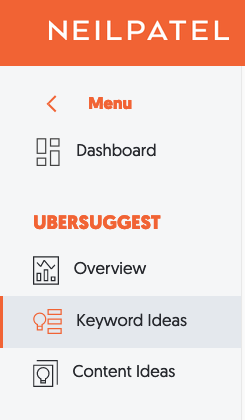
paid internet advertising tool ubersuggest 2

Step #3: Analyze the Results

paid internet advertising tool ubersuggest keyword ideas

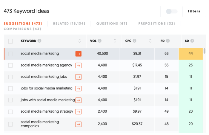
In the example above, the term “social media marketing” is considered a “head” keyword, which means it is searched for very frequently. The much less popular term “social media marketing strategy” receives fewer searches, but indicates the searcher is looking for something more specific.

You might go even further and try something like “the best social media marketing strategy.”

To find even more keywords, click the “Related” tab next to “Suggestions.”

For this particular keyword, doing so gives you nearly 16,000 more keywords, the majority of which are long-tail. For example, here’s what you see as you scroll down the results:
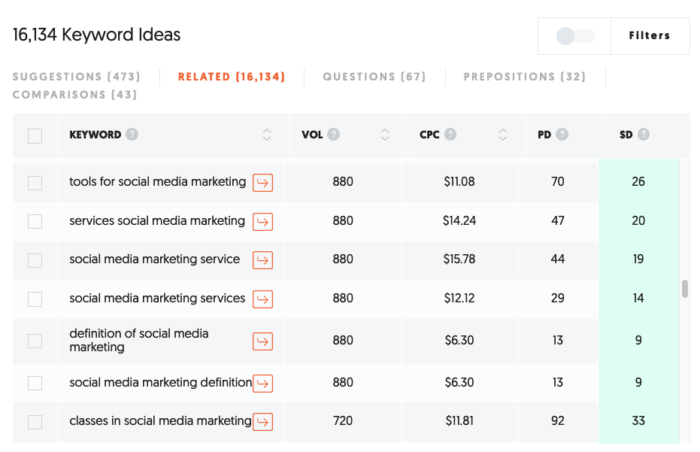
paid internet advertising tool ubersuggest keyword ideas

Once you find a long-tail keyword that piques your interest, click on it for a better idea of your competitors, both for paid ads and organic search.
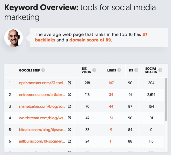
paid internet advertising tool ubersuggest kewyord overview

The big mistake that many first-time marketers make with SEO or pay-per-click advertising is choosing the wrong keywords.

When you purchase head keywords like “social media marketing,” you will spend significantly more money and reduce your ROI dramatically.

The key that you have to remember is you get a lot more bang for your buck by targeting a large number of lower-traffic terms than by targeting a small number of higher-traffic terms.

Finally, the best source of keywords can come from your own website. Consider using a survey tool like Qualaroo to find out what your customers are looking for or why they decided to do business with you (after checkout for example). The language they use can be very effective ad copy for internet advertisements.

2. Understand the Different Types of Paid Ads

There are a lot of places to buy ads and each platform has its own strengths and weaknesses. Before getting started, you should understand the major types of paid advertising as well as their pros and cons.
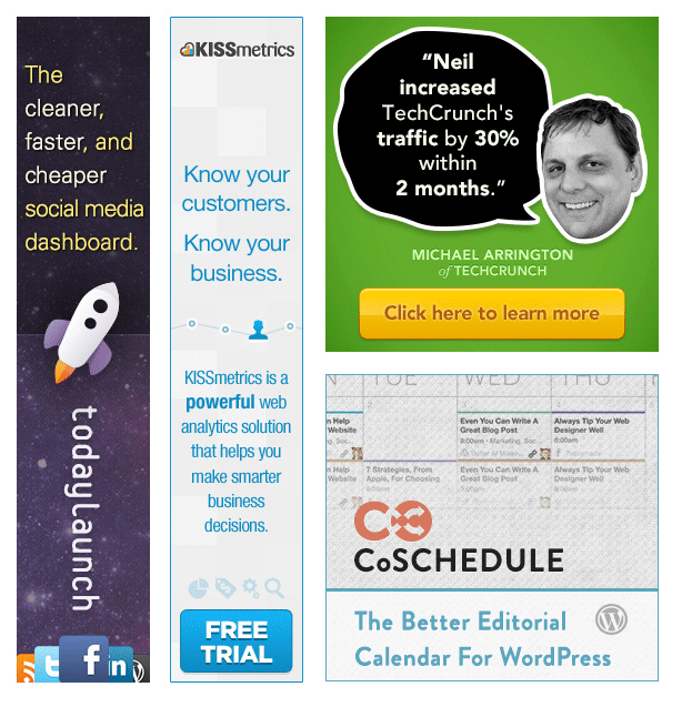
paid internet advertising examples

Display Ads or Banner Ads

Banner ads immediately come to mind when we think about online advertising because they stand out. They are very common and come in a variety of sizes. These ads can be effective, but they tend to target customers who are not actively looking for something new.

For example, a person may be reading a newspaper article and not be interested in a new social media course. Display ads can be successful, but they need to be used properly. Display ads can be purchased using a pay-per-click model or they simply can be displayed for a certain length of time.
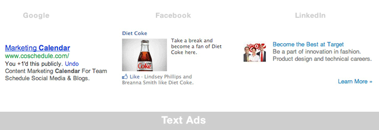
different type of internet ads display ad example

Text ads are the type you usually see on the primary Google search page. These ads generally are less expensive than display ads and target customers that actually are looking for something specific. They can be very effective but depend heavily on good keyword research and A/B testing (a topic we will discuss later in this post).

Here are a few of the places you should try listing your ads, though there certainly are many others:

Google Ads

Google Ads (previously Google AdWords) are an obvious choice for many businesses. They offer display and text ads in association with highly targeted keywords. AdWords are a clear choice for any campaign.

Bonus Tip: Your Google Adwords ads will produce a better return on investment the longer you use Adwords. Google rewards long-term customers with better “quality scores”.

Bing or Yahoo

Bing and Yahoo both offer alternative ad platforms that work similarly to Google’s. They combine display and text ads with targeted search terms. Some brands find that, while these options bring less traffic, the overall ROI is a bit better.

Social Media Ads

Social media advertising has grown enormously in popularity over the last few years. These ads combine text and display elements and are targeted based on user preferences, demographics, and location. Depending on your business type, Facebook, LinkedIn, Instagram, and TikTok are valid options to consider.

BuySellAds or Direct Buy

BuySellAds.com is a great place to go to find additional display ad opportunities. These usually allow you to “rent” space on a site or a blog for a fixed cost. Additional opportunities like this can exist if you contact some of your favorite bloggers directly.

Can’t decide between Facebook or Google (two popular options)? Then check out this video for some guidance:

Start by trying several of these options and use hard data to make final decisions about where you want to put your money. Rely on hard data, not guesses, to understand what platforms provide the best return.

3. Track Your Paid Ad Results

If you aren’t able to see how each of your ads is performing, then you shouldn’t be buying paid advertising at all. The beautiful thing about online advertising is that you get the opportunity to track everything. Google Analytics is an absolute must when it comes to online ad buying. This analytics package is free and easy to install.

Once you have it set up, you should become very familiar with Google Analytics Custom Campaigns. These options allow you to create a customized URL for each ad that will help you see overall performance for all of your advertising. Using Google Analytics in this way will give you a single dashboard for comparing all of your advertising campaigns.

4. Create a Landing Page

It is important to send incoming visitors to a unique page (called a landing page) on your website, rather than your homepage. This may seem counter-intuitive, but there are three very good reasons for using this strategy:

  1. Landing pages allow you to customize your message for incoming visitors. This means that you can continue the message you started with your ads, which creates a more cohesive experience.
  2. Custom landing pages allow you to push visitors toward specific actions, such as downloading a free ebook. (Displaying traditional navigation may distract your visitors.)
  3. Landing pages make tracking your visits very easy. This is especially important.

When you combine this strategy with easy funnel-tracking tools, you quickly can gain a lot of information about how to reach and sell to your new visitors.

In some cases, you can create a single landing page for an entire ad campaign. In other cases, you may want to create a specific landing page for each keyword that you purchase.
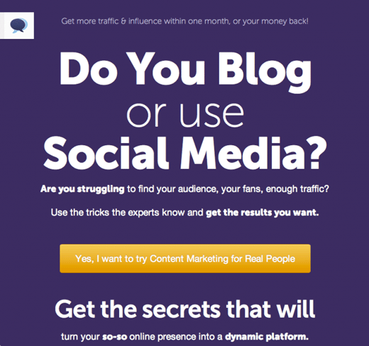
landing page example paid internet advertising

This landing page helps us track who comes to the page and exactly how effective our ads are.

It is important to remember to block your custom landing pages from search engines. This can be done with a simple edit to your “robots.txt” file. This is an important step that will make your ad tracking more reliable. If you allow Google and Bing to send non-paid visitors to your page, you may get a false sense of how your page is performing.

Here are two more tips to create high-converting landing pages associated with your paid ads.

Create a Call to Action

Once you have a visitor on your landing page, how do you convert them into a lead or a customer? Every page you send them to should have a clear call-to-action. Think about this one carefully, because it’s the difference between a sale and wasted money.

I like to decide what the “number one” desired outcome for each page is before I design a landing page. Simply ask yourself, “What do I want them to do the most?” Then create the page accordingly.
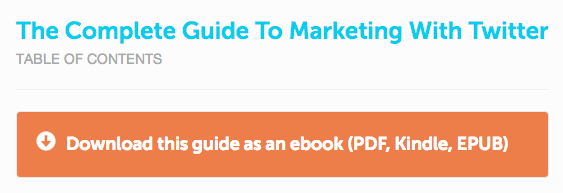
a good call to action example paid advertising guide

A good call to action will tell your visitors exactly what you want them to do.

Everything on your page should push your visitors toward the action you want them to take. Without considering this, you’re throwing money away.

Use A/B Testing

You may have launched your page, but you aren’t done yet. Small tweaks and adjustments can make a huge difference in your overall conversion rate. If you’ve followed the tips above, you should have the proper landing page and conversion tracking to make this task very easy.

A/B testing is being scientific about testing which methods work best. When you go about A/B testing, it is important that you make only a single, testable, change each time. For example, you could test the effectiveness of your page’s headline or button placement, but not both at the same time.

By testing a single change, you will be able to see conclusive results about what works best. A/B testing is an ongoing process, too, so don’t stop. Keep testing and modifying your page. You might be surprised at what it does to your overall conversion rate on your paid ads.

5. Review Your Paid Ad Results Regularly

Whatever you do, don’t look at your results every day. This practice can lead to hasty changes based on incomplete data. It is best to wait so that your analytics have time to accumulate accurate trends and information. Then determine a set time period for reviewing your statistics and making changes. It might be monthly, it might be weekly. Checking monthly is a good plan for picking up broad shifts.

Consider setting up spreadsheets to track your statistics. It’s easier to pick up on trends and understand what you’re seeing when you dig into your analytics to pull out the numbers for your spreadsheet.

tracking metrics for paid internet advertising

Use simple spreadsheets to track your incoming ad traffic.

Be prepared to kill keywords that are under-performing. Remember, conversion rates are your most important statistics for paid advertising, not clicks. Clicks just waste money if they aren’t driving leads or sales.

In paid advertising, the longer you run your ads, the better your rates and quality score will become. This will be true particularly if you rely heavily on good A/B testing and are constantly refining your ad buy.

5 Steps to Getting Started with Paid Advertising

Time needed: 6 minutes.

Not sure how to get started with paid ads? Here’s five steps to make sure you don’t waste your investment.

  1. Understand (and Use) Long Tail Keywords

    Long tail keywords are less competitive and mimic the way people search.

  2.  Understand the Different Types of Paid Ads

    Each type of ad has different costs, audiences, and reaches. Understand the difference so you don’t waste ad spend!

  3. Track Your Paid Ad Results

    If you aren’t able to see how each of your ads is performing, then you shouldn’t be buying paid advertising at all. T

  4. Create a Landing Page

    Landing pages help drive conversions and make it easier to track. Don’t forget to add a CTA and use A/B testing.

  5. Review Your Paid Ad Results Regularly

    Check your results weekly or monthly to make sure your ads are driving results, not just clicks.

Conclusion: Benefits of Paid Advertising

Paid ads are not a get-rich-quick scheme. Don’t expect to be finished in a week or two. Give your ads time and finesse your plan to get the best results. Cumulative trends and information will give you a clearer picture of which ads actually convert.

Start by setting a small budget, and increase it as you gain confidence in your paid advertising strategies. If you need help getting started, feel free to reach out to my team. We can help create an advertising plan that works for your business.

Are you considering adding paid ads to your online advertising strategy? What is holding you back?


from Neil Patel's Digital Marketing Blog https://ift.tt/YjnQEta
via IFTTT

Instagram Reels vs. TikTok: which is the best short-form video platform?

Trying to decide between Instagram Reels vs. TikTok?

You’re not alone — brands are going all in on bite-sized video content right now.

Food for thought: a staggering 89% of marketers plan to increase (or maintain) their investment in short-form video in 2022.

That’s because short videos are the perfect way to build brand awareness and educate customers without losing their attention.

But content on Reels and TikTok is totally different than pretty much anything else you need on social media. If you don’t quite “get it,” we can help!

In this guide, we’ll break down these two dominant short-form social platforms including similarities, differences and best practices for both.

What is TikTok, anyway?

With over 1 billion monthly active users, TikTok is booming as the hub of short-form video on social media.

TikTok’s trademark? Loud looping videos that you share with your friends.

The platform is infamous for off-the-cuff video content that doesn’t take itself too seriously. Unlike other social networks where videos might be meticulously edited, unpolished and organic content tends to perform best on TikTok.

Here’s a quick rundown of the types of videos that are popular on TikTok:

  • Hashtag challenges
  • Skits and memes
  • Product showcases, reviews and recommendations
  • How-tos and tutorials
  • Explainer videos

Although TikTok’s reputation is anything but businesslike, the platform is rightfully attracting interest from brands. Product-centric posts and recommendations dominate the platform.

This signals a huge window of opportunity for marketers and advertisers. In fact, 84% of marketers are increasing their spending on TikTok.

The good news? All of the content types above are totally fair game for brands. TikTok’s emphasis on community and sharing empowers brands to make connections with customers while also showing off products in action.

For example, brands like Yours Skincare have built an organic and ad presence on TikTok that centers around skincare tips, product showcases and explainer videos breaking down beauty product ingredients.

Yours tiktok feed

Coupled with fast edits, voice-overs and in-app music, these videos seamlessly blend entertainment value with education. This not only empowers brands to show off what they’re selling but also lets their brand voice shine.

Yours tiktok post

If you’re still trying to wrap your head around the platform, check out our quick guide to TikTok.

What are Instagram Reels?

Released in 2020, Reels represent Instagram’s response to TikTok re: short-form video.

That’s kind of where the “Reels vs. TikTok” narrative comes from. Reels shares many of the same features and functions of TikTok which is why the two platforms are often thought of interchangeably when it comes to video content.

Recent Instagram stats reveal that Reels are among the platform’s most popular features. Coupled with Stories, carousels and even longer-form video, the release of Reels allows brands on Instagram to cover all of their bases when it comes to visual content.

Whereas TikTok leans heavily on trends, videos on Reels tend to resemble more “traditional” video content that’s simply stylized to fit the vertical format.

In the early days of Reels, many brands would simply cross-post content directly from TikTok. That changed quickly when Instagram announced that their algorithm would deprioritize content containing the TikTok watermark. This has not only reduced direct cross-posting but also encouraged brands to reimagine what they should do with Reels at large.

Popular among ecommerce brands, Reels are typically used to:

  • Show off products in action
  • Highlight collaborators and influencers
  • Hype up announcements (product launches and drops, for example)

Check out Stitch Fix’s Reels tab, for reference. Notice the combination of seemingly “organic” content versus the more traditional videos with stylized text and backdrops.

The videos themselves aren’t so different from what you might see on TikTok in terms of visuals and music (although they’re arguably a bit more polished).

Think of Reels as an extension of your existing Instagram presence where your brand can be discovered beyond your feed via Instagram’s native search or the Reels tab on any profile.

This is where TikTok differs since their content discovery primarily happens through your “For You” page (FYP).

To learn more, check out our breakdown of how Instagram Reels work.

Instagram Reels vs. TikTok: comparing features and characteristics

The battle of Reels vs. TikTok seems like an even matchup considering both platforms encourage short-form video content.

That said, they’re far from the same.

Let’s take a deeper dive into the similarities and differences shared by both networks.

Reels vs. TikTok: how they’re similar

There’s no denying the similarities between the platforms. After all, Reels was a direct result of TikTok’s growing popularity.

And so you’ll often see the same pieces of content overlap across branded accounts with subtle differences in terms of creatives, captions and hashtags. See hair care brand Arctic Fox Hair Color’s content below:

Tiktok and instagram reels side by side comparison

Beyond what we’ve already discussed, here’s a quick rundown of what Reels and TikTok have in common:

  • Both platforms are centered around short-form video. Again, both Reels and TikTok are prime places for fun, off-the-cuff videos. There’s arguably no better place to see brands flex their creativity. Product shout-outs and recommendations are fair game, granted whatever you post is loaded with entertainment value.
  • Access to a sound library. Both platforms allow users to seamlessly attach sound effects, music, and audio snippets to any given piece of content. From memes and original audio to what’s on the radio and beyond, access to sound libraries encourages brands to make their videos “loud”.
  • Filters and visual effects. Aesthetics matter for brands on social media. Visual effects and filters make your videos “pop” and allow you to put your trademark on anything you post.
  • Ads. Surprise, surprise: short-form video is becoming an increasingly popular avenue for ads. Although TikTok ads are still relatively young, they’re becoming a staple of influencer marketing campaigns as creators show off their latest purchases.
  • Opportunities for accounts to interact. Through Reels’ “Collab” option and TikTok’s “Duet”, accounts can interact side-by-side and create totally new pieces of content together.

Reels vs. TikTok: how they’re different

We’ll say it again: TikTok and Reels aren’t identical! Here are the key differences that marketers should know:

  • Video length. Both TikTok and Reels have actually expanded the duration of their videos since launching. TikTok began with 15, 30 and 60-second uploads but now allows for videos up to 10 minutes long. Instagram Reels also offers three video lengths of 15, 30 and 60-seconds. Even with these expanded options, data says that creating shorter-form videos is ideal for both platforms.
  • Music and sound options. TikTok users have a wider selection of audio materials while Instagram business accounts are not allowed to use copyrighted music. That said, recent updates on Reels will include new text-to-speech and voice effect features.
  • Audience. While both platforms are popular among younger audiences, social media demographics point to how popular TikTok is with Gen Z and teenagers.
  • Availability. If you’re already on Instagram, you already have access to Reels (which are available to access in 50 countries). On the flip side, TikTok is banned in some regions due to censorship laws and has faced some scrutiny due to privacy concerns.
  • Analytics. TikTok analytics tracks both the overall profile and individual video performance. This includes big-picture metrics like total playtime, average watch time and geolocation. While Instagram users similarly had to rely on general Instagram analytics, the platform rolled out Reels-specific data to get specific insights. This covers metrics such as plays, interactions, reach, “likes”, comments, and saves.
  • Advertising opportunities. Both platforms are rolling out new ad features and rightfully so. That said, TikTok puts a much greater emphasis on creator-based ads and campaigns versus Instagram’s more traditional, shoppable ads via Reels.

Can’t pick between Reels vs. TikTok? Why not both?

Both TikTok’s rapid growth and the popularity of Reels signal the importance of short-form video moving forward.

While competition is fierce in industries such as fashion and beauty, there are so many opportunities when it comes to short-form branded videos.

Whether you stick to one platform or go with both, you need to brainstorm how to tie your social video campaigns to actual business goals.

If you haven’t already, make sure to read our guide to building a social media marketing strategy that does exactly that.

The post Instagram Reels vs. TikTok: which is the best short-form video platform? appeared first on Sprout Social.


from Sprout Social https://ift.tt/MYfzBFR
via IFTTT

Content Marketing Analytics: 9 Ways to Use Data To Transform Your Strategy

Content Marketing Analytics: 9 Ways to Use Data To Transform Your Strategy

Content marketing isn’t an exact science. After all, the way people interact with content changes constantly.

However, a deep understanding of content marketing analytics can help you make more informed, even scientific, decisions about your strategy.

If you aren’t already using analytics, you’re behind your peers. Only three percent of bloggers never use analytics. A whopping 29 percent track every single one of their posts.

Even if you are using analytics, you may not be using the right tools or looking at the

Luckily, from the free and comprehensive Google Analytics to paid tools like HubSpot or ClickFunnels, there are dozens of content marketing tools to choose from. Perhaps even more important than the tools, though, is the strategy behind them. How can you use these tools to gain insight that you can then apply to your strategy and campaigns?

In this post, I’ll explain the importance of content marketing analytics and the different ways you can use complicated, detailed analytics to improve your content marketing strategy.

Why Are Content Marketing Analytics Important?

There’s proof using analytics helps your content marketing strategy succeed. In the most recent B2B content marketing survey from the Content Marketing Institute, 90 percent of the respondents who ranked their company’s content marketing efforts as “successful” measure their content’s performance. On the other hand, only 34 percent of respondents who report disappointing content marketing results measure their content’s performance.

As a content marketer, data and analytics should guide your decisions about your content marketing campaigns and strategies.

What does this look like more specifically? Data can answer many questions, including:

  • Are my current marketing efforts working?
  • What types of content resonate most with my audience?
  • What types of content are not relevant to my audience?
  • Are there gaps in my current content marketing strategy?
  • What pages are most effective at building traffic?
  • What pages are most effective at driving conversions?

The answers to these questions should inform your content marketing strategies.

9 Ways to Use Content Marketing Analytics

For beginners and seasoned marketers alike, content marketing analytics can be overwhelming. This is especially true when it comes to applying the insights to real-life campaigns. Here are nine ways to use content marketing analytics to your advantage.

1. Use Bounce Rate to See Which Pages Have the Highest Engagement and Identify Common Themes

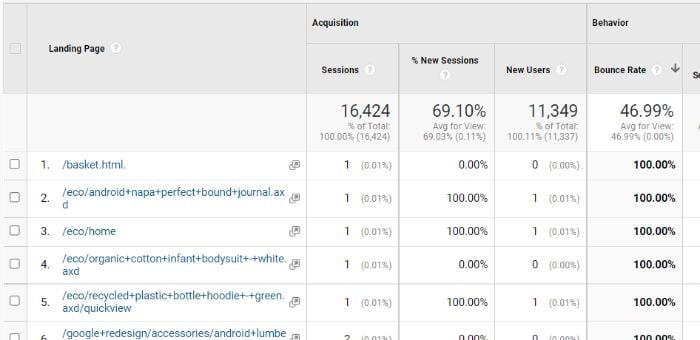
According to Contentsquare, the average bounce rate for e-commerce sites is 47 percent. When your pages are above that average, you may consider those “high” bounce rates. The good news is that you can actually use high bounce rates to your advantage. Traffic is going to the page in question, so where are these visitors going?

From the left navigation in Google Analytics, go to Behavior > Site Content > Content Drilldown. To determine which pages have the highest bounce rate, click the “Bounce Rate” metric. A down arrow will appear, which indicates the metric is sorted from highest to lowest.

content marketing analytics

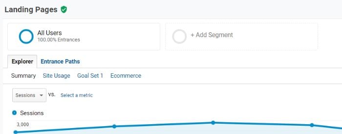
You’ll see a lot of the top pages have a very low number of sessions. To filter those out, we’re going to create a segment. Click “Add Segment” to the right of “All Users” at the top of the report.

How to Use Content Marketing Analytics - Explore Data from Landing Pages

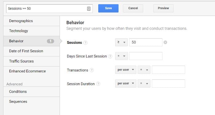
Click the red “+New Segment” button and then select “Behavior” from the left side options. Here, you can decide what pages to exclude by adding a quantity next to “Sessions.”

Click Save, and when you return to the report you’ll now see the bounce rate by two segments: All Users and the new sessions segment you just created.

How to Use Content Marketing Analytics - Use Sessions Segment

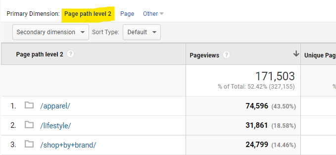
Click the first webpage on the list. You’ll notice the Primary dimension above the chart changes to “Page path level 2.”

How to Use Content Marketing Analytics - Page Path Level 2

This is the breakdown of the pages the user went to after they bounced from the initial page. With this information, you can understand how users navigate your site as well as what may have been missing from the bounced page to bring them to the next one. This knowledge can help you improve the page content.

2. Use Content Marketing Analytics to Identify Content Gaps and Create New Content

Not only can analytics tell you what pages your users visit, but it can also tell you what content your visitors want but aren’t getting. What do I mean?

Content marketing analytics tools look at the user journey from how users get to your website to where and when they leave. The “how” part of that journey can tell you what users are searching for before they ultimately make it to your site.

This is a major concern for businesses of all kinds. Just consider that 66 percent of businesses want to increase their content creation spending, and it makes perfect sense.

Using Ubersuggest’s free keyword tool, you can see what search terms get the most traffic and the top pages that rank for those terms.

How to Use Content Marketing Analytics - Identify Content Gaps

To identify content gaps, you can cross-reference these keywords with the page’s analytics. You’ll want to pay close attention to bounce rate, exit rate, and time spent on site.

What will this tell you?

Pages with consistent traffic but high bounce or exit rates aren’t meeting the needs of the visitor. With keyword research, though, you can determine what visitors are specifically looking for and add content that covers it.

3. Research What Terms Your Top Pages Rank for and Create Content for Related Terms

Speaking of how visitors get to your site, you can also reverse engineer your page rankings to see what terms your top pages rank for. With this information, you can then create content on related search terms.

With a tool like Google Search Console, it’s very easy to see what keywords each page on your website ranks for. Here’s how.

Note that the steps below assume you have a Google Search Console account with a verified web property.

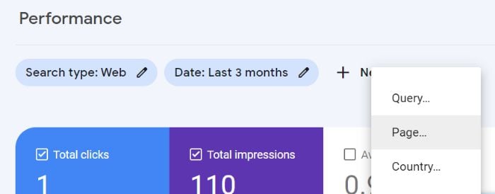
Log in to Google Search Console and then go to “Performance” in the left navigation. Click “+ New” and select “Page” from the dropdown menu.

How to Use Content Marketing Analytics - Google Search Console Performance Page

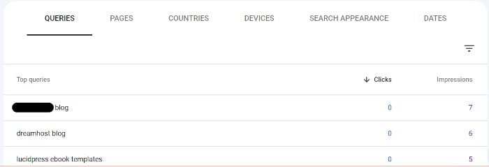
Here you can enter any URL on your website, including blog posts. Add the desired URL and click “Apply.” Now scroll down to Queries to see a list of top queries for that URL, including impressions and clicks.

How to Use Content Marketing Analytics - Google Search Console Page Results

You don’t have to enter a specific URL, either. You can look at queries for your entire website, which could be a useful way to research if your website or blog is relatively small.

Using the data from above, you can then use a keyword research tool like Ubersuggest or Google Ads keyword planner to find related keywords that you’re not currently ranking for.

This helps decrease content gaps (like those discussed in the previous section), increase impressions, and increase clicks on your current URLs. With organic search driving 53.3 percent of content consumption, now is as good a time as any to take control over targeted keywords.

4. Compare Engagement Across Platforms to Determine Mobile-Friendliness and Implement Changes

Do you know how and on what devices your website’s visitors are using your website? If not, you may have a poorly optimized experience for a large number of your visitors. This not only drives traffic away but can also harm your overall brand strategy.

Worldwide internet traffic is broken down by device as follows:

  • 56.05 percent mobile
  • 41.52 percent desktop
  • 2.43 percent tablet

The breakdown varies for each country, region, and website, but the fact remains that mobile devices are used by the majority of users on a regular basis.

How can you learn about your visitors’ platform habits? Google Analytics offers such content marketing insights!

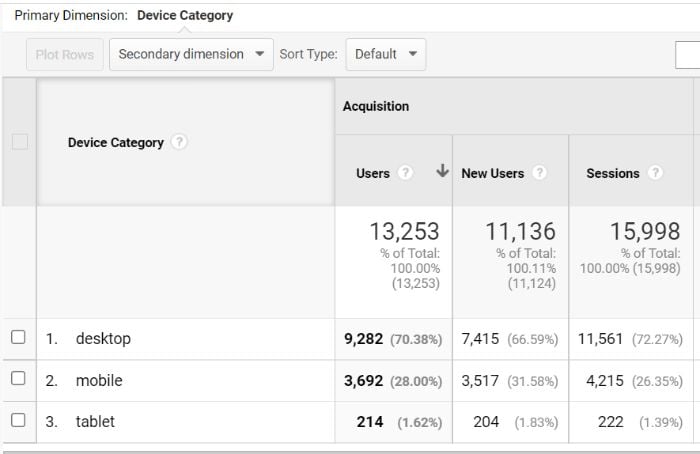
Log in to your Google Analytics account. In the left navigation under “Reports,” go to Audience > Mobile > Overview.

How to Use Content Marketing Analytics - Google Analytics Device Breakdown

Here you can see device categories (i.e., desktop, mobile, and tablet) as broken down by acquisition, behavior, and conversion metrics.

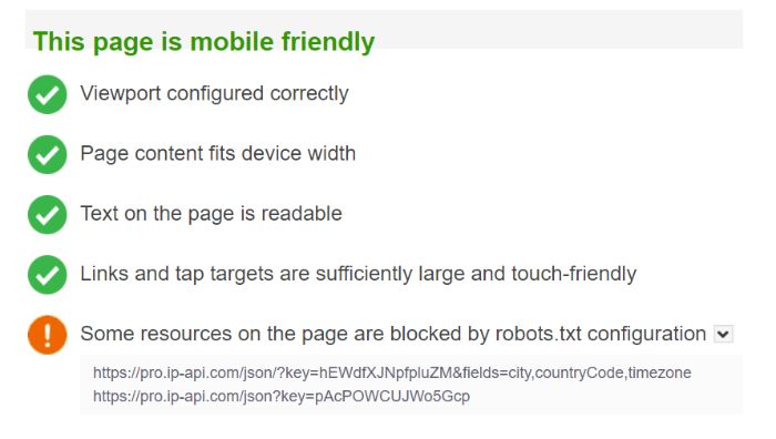
For this step, you’ll want to focus on conversion metrics and how they compare across devices. What can these metrics tell you? Let’s say the desktop conversion rate is 2.73 percent, but the mobile conversion rate is only 0.89 percent. This tells you to investigate the mobile-friendliness of your website using tools such as those offered by Google or Bing.

How to Use Content Marketing Analytics - Bing Mobile Test Results

Even if your site is overall mobile-friendly, these tools can offer insights to help you make it even better.

5. Use Audience Data to Find High Traffic and High Bounce Groups to Identify Issues and Improve Experience

Bounce rates vary by website type and even by page type on individual websites. For example, the average bounce rate for a blog page is 82.4 percent.

While this is a helpful guideline, it can sometimes be more helpful to look at audience segment bounce rate instead of page type. If certain demographics have high traffic and high bounce rates, we can use that information to improve the experience.

There are a few reasons why you may see this traffic/bounce rate combination. Just a few examples include:

  • your page ranking for an unrelated topic
  • your page ranking for a closely related topic
  • your page containing outdated or incorrect information

By focusing on audience segments with high traffic and high bounce rates, you can find those sorts of issues and more.

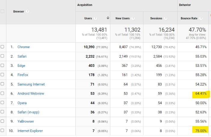
How can you identify these issues? Various audience segmentation tools like Kissmetrics, Adobe Analytics, or Google Analytics can help. Here’s how to narrow down audience segments in Google Analytics.

First, go to “Audience” in the left navigation. Here you can look at different audience breakdowns by Demographics, Interests, Behavior, and Technology. This is where you’ll initially pinpoint segments with high bounce rates.

How to Use Content Marketing Analytics - Bounce Rate by Browser

Once you have a list of audience segments with high bounce rates, you can play around with custom segments. At the top of any report, click “Add Segment.”

How to Use Content Marketing Analytics - Add Segment

Here you can add a combination of demographics, technology, traffic sources, and more to get a more in-depth look at audience behavior. How can you make the most of this segmentation?

In the left navigation, go to Behavior > Site Content > All Pages. This report offers a breakdown of page performance metrics, including page views, average time on page, entrances, bounce rate, and exit rate.

How to Use Content Marketing Analytics - All Pages

Using your custom segment, you can now see which pages on your site are the most impacted by the traffic/bounce rate disconnect.

6. Utilize a Visual Conversion Funnel to Identify Areas of Fall Off and Increase Conversions

A conversion funnel is a visual representation of the stages of a user’s journey through your website.

This is helpful for understanding where users enter your site, how they interact and behave while on the site, and where and how users finally convert. It can also highlight particular areas of fall-off, which is important to decipher if you ever hope to get your conversion above the average rate of 2.35 percent.

You know that not all users will convert–whether that’s to sign up for a newsletter, share a post, or make a purchase. There are roadblocks to any user’s conversion, but some are more insurmountable than others. This is where the visual conversion funnel can come in handy.

There are plenty of paid sales funnel software tools like ClickFunnels, Leadpages, and Wishpond. If you’re looking for a free solution, though, look no further than Google Analytics.

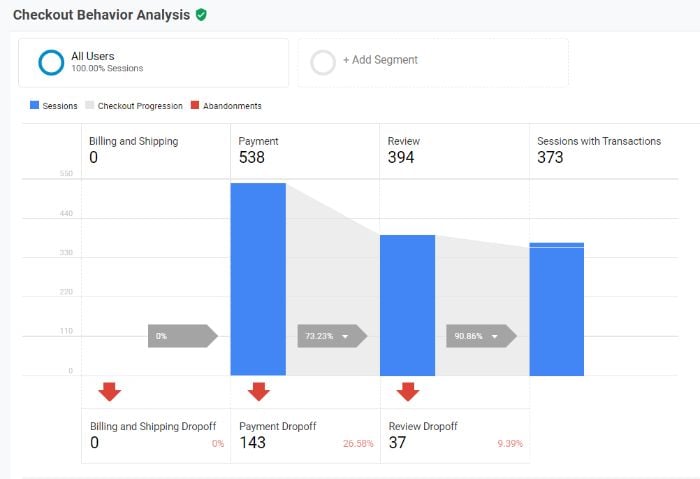
With Google Analytics, you can create a custom funnel. These take time to build and time to collect data. In the meantime, you have the option to use pre-built funnels for quick results. To access the funnels, go to Conversions > Ecommerce. From this dropdown list, you can choose either “Shopping Behavior” or “Checkout Behavior.”

How to Use Content Marketing Analytics - Checkout Behavior Analysis

These funnels allow you to identify the exact step users are falling off your site or abandoning the checkout process. You can even use segmentation to target specific audiences for greater insight.

Once you have an understanding of which steps have the greatest fall-off, you can perform a full-funnel analysis to find ways to remove roadblocks and increase conversions.

7. Measure the Performance of Your Marketing Campaigns to Identify Wins, Losses, and Opportunities

The purpose of a marketing campaign is, typically, to attract new customers. As you create more campaigns, you should be using the results of past campaigns to guide your strategy. After all, segmented campaigns have been shown to increase revenue by as much as 760 percent.

Let’s start with Google’s Analytics’ Key Performance Indicator (KPI) dashboard.

Google Analytics allows you to create custom dashboards so you can see important KPIs all in one place. The KPIs may change for each campaign, but I can show you how to create your own custom dashboards and a few widgets to include.

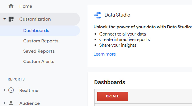
To do this, go to Customization > Dashboards in the left navigation. Then click the red “Create” button to start a new dashboard.

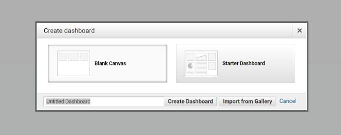
You can choose either “Blank Canvas” or “Starter Dashboard,” but I strongly recommend blank canvas for full customization capabilities.

How to Use Content Marketing Analytics - Black Canvas Starter Dashboard

Once you’ve clicked “Create Dashboard,” you’ll find there are dozens of widgets to use. These widgets can be customized with metrics, statistics, and graphs. While the KPIs will vary for each campaign dashboard, here are a few recommendations.

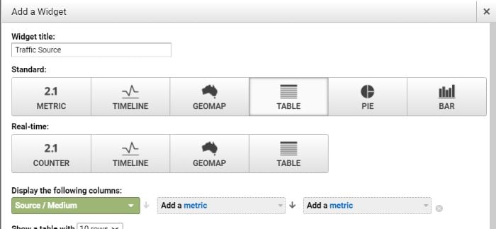
Traffic Source

This widget will tell you what traffic sources have the greatest impact on your campaign performance.

Select “Table” from the options and then set Source/Medium as your first metric.

How to Use Content Marketing Analytics - Traffic Source Widget 1

In the two remaining metrics dropdowns, you can select a few different options. Sessions and Revenue are two that make a lot of sense if you want a quick way to sort tangible results by traffic source. You can also select custom goals as a metric that’s often conversion-based.

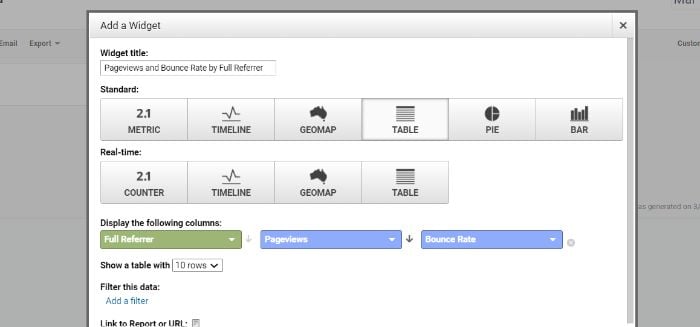
Pageviews and Bounce Rate by Full Referrer

While sessions and pageviews can be helpful metrics, what matters more is the quality of those sessions and pageviews. This is why I like to look closely at visitor retention with the below widget.

Select “Table” again as an option in the widget creation tool. Then select the following three metrics: Full Referrer, Pageviews, and Bounce Rate.

How to Use Content Marketing Analytics - Full Referrer

This widget will offer insight into the quality of the traffic you’re receiving from each referrer (e.g., direct traffic, Google search results, affiliate links, etc.). This will go a long way in helping you narrow in on your most successful campaign referrers so you can leverage that in the future.

8. Use Heat Maps to Understand How Visitors Use Your Website so You Can Improve Flow and User Experience

While tables, graphs, and flow charts can provide useful information, sometimes visual data can be more helpful. Heat maps come in handy, especially when understanding how visitors interact with the elements on your website.

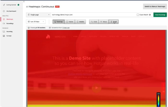
Heat maps are visual representations of where users click on your webpage. They can also provide insight into how far users scroll, where they look, and where they hover their cursor. More advanced tools can even track eye movement. A study by Google and Carnegie Mellon found just a 64 percent correlation between mouse movement and eye movement. This means for the full picture, you should track both.

How to Use Content Marketing Analytics - Hotjar Heat Map

The obvious benefit of heat mapping is to improve user flow and user experience by removing roadblocks. How does this benefit your content strategy?

For one, a more user-friendly website will make it easier for visitors to navigate your blog content. This includes increasing click depth and the duration of time spent on the site.

However, you can also use it more directly to benefit your content creation process. For example, if you typically write 4,000-word blog posts, but users are only scrolling halfway through the post, this may indicate your audience is looking for shorter content. The same can be said for how users interact with hyperlinks, buttons, and content forms.

9. Understand Organic Search Metrics to Create Content Marketing Templates for Your Blog

If you’ve been blogging for any amount of time, you know there are numerous types of blog content:

  • listicles
  • how-to guides
  • case studies
  • infographics
  • interviews
  • cheatsheets

With so many content types to choose from, you may wonder which ones are right for your audience. The good news is that you don’t need to wonder.

By analyzing the performance of the content on your blog now, you can learn which types of content your audience prefers. You can then use this in future blog posts and campaigns.

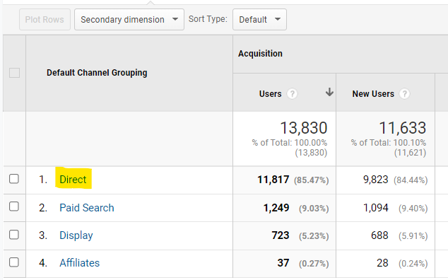
In Google Analytics, go to Acquisition > All Traffic > Channels. We’re interested in organic traffic, so click “Direct.”

How to Use Content Marketing Analytics - Understand Organic Search Metrics

You’ll see a table that breaks down organic traffic by landing page. If your website has a URL structure that includes “blog” in the slug, you can search for that in the search bar of the table. If not, you’ll need to find the posts manually.

What are you looking for?

Content pages with low bounce rate and high session duration. This tells you that the organic traffic led to this page is liking the content they see. If it has a high number of sessions, it’s also telling you that search engines like this type of content (for the time being, anyway). It also likely means you’re ranking on the first page (and even more likely the top five) since the first five organic results account for more than two-thirds of all clicks.

You can use these results to 1) create content that your users interact with and 2) use content formatting similar to the higher traffic pages to continue to rank highly on search engine results pages.

Content Marketing Analytics Frequently Asked Questions

What are the most common KPIs for content marketing analytics?

The KPIs most commonly used for content marketing analytics are page views, revenue, and conversion rate.

Is it expensive to track content marketing analytics?

The majority of content marketing analytics can be tracked using free tools like Google Analytics. However, more advanced analytics tracking may require paid services and tools.

What tools should I use for content marketing analytics?

Google Analytics is a free, easy-to-use content marketing analytics tool for website owners. You should also consider heat mapping tools (such as Crazy Egg) and customer journey tools (like FullStory).

Can I do my own content marketing analytics?

You can do your own content marketing analytics in-house, or you can hire an outside agency.

Conclusion: Content Marketing Analytics

Your content strategy should be constantly changing. How can you know which direction to shift? With content marketing analytics.

Analytics can be overwhelming initially, but they can provide you with invaluable data you might not otherwise get from just seeing the surface-level results of your campaigns. These insights can allow you to shift your strategy to improve overall performance.

Which content marketing tool do you use to inform your marketing strategy decisions?


from Neil Patel's Digital Marketing Blog https://ift.tt/KybZUWM
via IFTTT
15 Examples of Effective Pop-ups to Use on Your Website

15 Examples of Effective Pop-ups to Use on Your Website

Pop-ups on websites are annoying. There, I said it.

Yet, if you look on my site, you’ll see I use them. In fact, I’ve always used pop-ups.

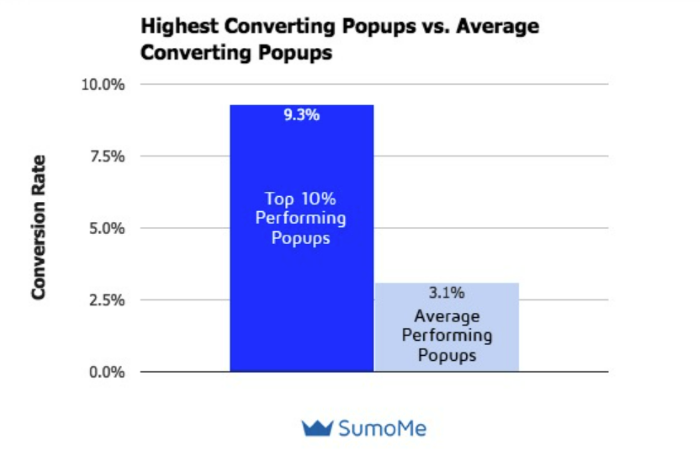
There’s a reason I use them—they work. The top 10 percent performing pop-ups have a whopping 9.28 percent conversion rate, according to a Sumo analysis.

Despite how annoying pop-ups can be (when used incorrectly), they’re incredibly effective at driving conversions, increasing email lists, and encouraging users to convert.

When used right, pop-ups aren’t annoying; they are helpful. Below, I’ll explore 15 suitable pop-ups and explain why they work.

First, let’s talk about what a pop-up on a website is and why so many sites still use them.

What Are Pop-Ups on Websites?


Pop-ups are graphical overlays that “pop up” on a website, usually after a user takes a specific action or is on the site for a certain amount of time. Unless you’re brand new to the internet, there’s a good chance you’ve seen a pop-up or two.

Many websites use pop-ups to gather email addresses, but you can also use them to:

  • gather leads
  • recover abandoned carts
  • promote new products
  • increase demo sign-ups
  • segment your email list
  • recommend related products
  • suggest a different asset
  • ask users to submit a question

Pop-ups are a little controversial though.

That’s because when pop-ups first came out they were everywhere. Sites would use two, three, even four pop-ups at a time. Some sites used them for spam or to play loud music.

Which means they were annoying.

As a result, many marketers (and regular internet users) hate pop-ups on websites.

I get it. However, things have changed, and I’ve seen the results myself.

Pop-ups on websites don’t have to be annoying—they just need to be useful.

In 2016, Google started cracking down on interstitials, especially on mobile devices. That meant sites with those annoying pop-ups had to get rid of them or risk falling in rankings.

Still, the sour taste lingered, and many websites and business owners think pop-ups are spammy.

The truth is, they can be incredibly effective—if you use them correctly.

Pop-ups on websites can encourage users to take any important action. As they “pop” up on websites unexpectedly, they grab users’ attention.

Even better? They won’t impact SEO if implemented correctly.

Why Do Websites Have Pop-Ups?

There are plenty of ways to encourage users to sign up for an ebook, join your email list, or watch a demo. Why use pop-ups on your website?

You should use pop-ups because they’re effective. According to OptiMonk, the average pop-up conversion rate is 11.09 percent. Other studies show a much lower conversion rate for pop-ups.

Sumo, for example, puts the average conversion rate around 3.1 percent.

pop up on website - example conversion rate

This means if you get 1,000 visits a month, you could be losing up to 100 conversions a month by not using pop-ups.

Other reasons sites use pop-ups include:

  • the targeting options make it easy to reach the right customers at just the right time
  • A/B testing is simple and can help you quickly figure out which pop-up is most effective
  • they’re attention-grabbing, which is crucial when attention spans get shorter
  • pop-ups can be used to gather leads, drive email sign-ups, and increase sales
  • Google doesn’t punish pop-ups if you use them correctly

15 Pop-Up Examples and When to Use Them

Now that you know why pop-ups are so popular, let’s look at a few examples from top-rated sites.

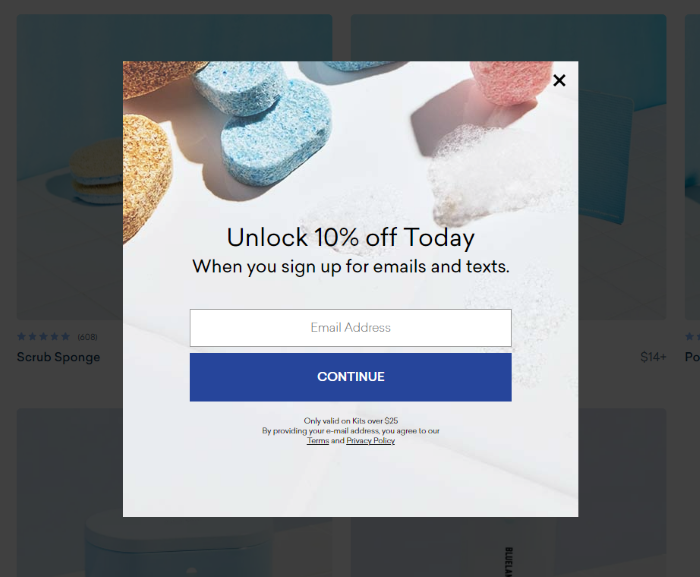
1. Get More Email Sign-Ups Using a Coupon, Like Blueland

Blueland is an eco-friendly cleaning supply company that offers everyday cleaning supplies like dish detergent and hand soap in low-waste packages.

The company grew more than 400 percent last year and drastically increased customers’ lifetime value. While they didn’t share exact conversion metrics for this pop-up, it’s clear they’ve been effective at drawing in new customers.

Pop-Up on Websites Examples - BlueLand

Why It Works:

The first reason these pop-ups work is the coupon offer. Sixty percent of customers who receive a coupon are willing to try a new product. That’s ideal for a company like Blueland looking to disrupt a well-established market.

The pop-up also keeps it simple by asking for just the email address and uses a bright blue button to drive conversions. The pop-up might perform better by changing the “continue” button to something like “get mine,” but perhaps they’ve already tested it!

2. Double Up on Deals Like Victrola

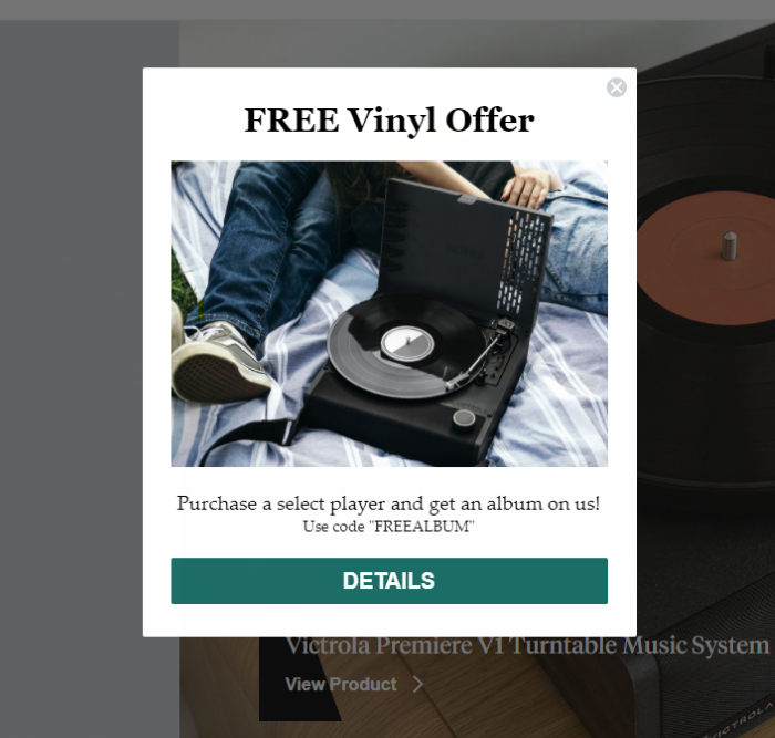
Victrola, a turntable and record company, doubles up on pop-ups, which I generally wouldn’t recommend.

However, they manage to make it work by layering the pop-ups on top of each other. If you close out the 10 percent off pop-up, you’ll see this one hiding behind it with a more tempting offer:

Pop-Up on Websites Examples - Victrola

Why It Works:

There are two reasons I think this set of pop-ups work. First, they offer users two different options. That might sound like overkill, but it means users can choose the offer that is most exciting to them.

Keep in mind, these pop-ups don’t pop up separately; they are triggered at the same time, so there’s no frustration of closing one out just for another to open.

There’s another reason it works. According to Sumo, pop-ups on websites that provide context convert 40 percent better than pop-ups that don’t.

The Victrola pop-up example provides context by explaining exactly how users redeem the deal, which instills trust. It’s also a free offer, which users generally love.

3. Use Targeted Pop-Ups Like Leadfeeder

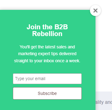
Leadfeeder is a B2B traffic tracking tool that shows companies who visits their website. They use pop-ups to increase email sign-ups, drive demo conversions, and share useful content.

However, they don’t share the same pop-up with every visitor. Rather, they use targeting to share relevant offers based on the pages a user visits. For example, when I visited their podcast page, I was greeted with this pop-up asking me to sign up for their podcast newsletter:

Pop-Up on Websites Examples - Leadfeeder

When I visited a page about sales tactics, I saw this pop-up offering a free account-based marketing guide. This is a popular sales and marketing strategy, so the offer is targeted and relevant.

Pop-Up on Websites Examples - Use Targeted Pop-ups Like Leadfeeder

Why It Works:

Leadfeeder’s use of targeted pop-ups helps them deliver more personalized offers—but they don’t overdo it. A recent report found that consumers are more than 3X more likely to abandon brands that “over-personalize.” Leadfeeder’s pop-ups strike the perfect balance.

From a design perspective, they use a simple design and brand colors to grab attention without overwhelming viewers.

4. Use Timed Pop-Ups Like Panther

One of the best ways to overcome the pop-up hate is to wait until users are engaged with your website to show them a pop-up. According to Campaign Monitor, properly timed pop-ups can generate conversions as high as 60 percent—much higher than average.

Panther, a global payroll platform, uses this pop-up strategy on its website.

If you visit their site, you won’t see a pop-up right away. After you’ve looked around for a few seconds, you might notice this at the top of the site:

Pop-Up on Websites Examples - Panther

Why It Works:

Using a time-delay trigger means Panther only shows the pop-up to users who find their site valuable. Placing it at the top of their website is less intrusive and doesn’t block users from viewing the page.

5. Get More Demo Sign-Ups Like Zendesk

Most pop-ups on websites are used to drive email sign-ups. While it can be an effective way to increase your list, pop-ups can do a lot more.

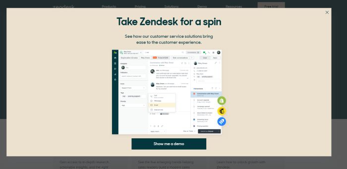
Zendesk, for example, uses a pop-up to increase demo sign-ups:

Pop-Up on Websites Examples - Zendesk

When users stay on the page for several seconds, they’re greeted with this large pop-up that covers most of the page.

You might think the size could cause issues with Google, but it seems to be disabled on their mobile site, so I think they’re safe from the algorithm.

Why It Works:

This pop-up works well due to its simplicity. They use casual language, which is on-brand, and includes plenty of white space. They also offer context, which we already know can increase conversions.

Allowing users to see the dashboard is also helpful in convincing them to take a deeper look at the platform.

6. Keep Users On-Site Like Sitepoint

Nearly 98 percent of site visitors will leave your site without taking action—whether that action is making a purchase or signing up for your newsletter.

One way to improve your conversion rate is to keep users onsite longer, giving you more time to convince them that your company is worth their time.

Increasing time on site is exactly what Sitepoint is going for with this banner pop-up:

Pop-Up on Websites Examples - Sitepoint

Unlike other pop-ups, which often obstruct the website, this pop-up is small and easy to dismiss. It also has a unique goal—they aren’t trying to get you to fork over your email address or make a purchase (at least, not right away.)

Instead, the pop-up focuses on value: “Look at the 600 courses we offer!”

Why It Works:

This pop-up works because it’s unobtrusive, focuses on value, and uses a bright CTA button to attract attention. It also focuses on the value Sitepoint offers, rather than asking the user to give something (like their email address!)

7. Drive Sales Using an Exit-Intent Pop-Up Like OptinMonster

OptinMonster is a marketing tool to help websites improve conversions and monetize their traffic. Unsurprisingly, they have a highly effective pop-up.

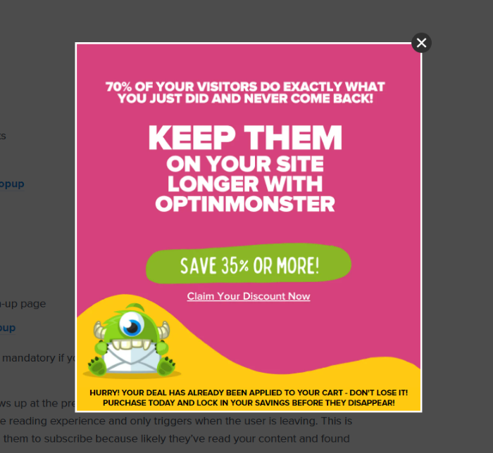
Rather than showing every user a pop-up, they use exit-intent software to track cursor location and show a pop-up when users move to close the site or hit the back button. Exit-intent is highly effective, where Popup Smart reports customers see a 4.1 percent increase in conversions and a 53 percent increase in cart recovery after implementing exit-intent pop-ups.

Here’s OptinMonster’s exit pop-up:

Pop-Up on Websites Examples - Optinmonster

Notice the use of on-brand colors, bold text, and a great offer to draw users in. They also create a sense of urgency with the “Hurry!” copy, which encourages users to convert right now.

Why It Works:

This pop-up works on websites for a lot of reasons. It uses exit intent, which can be incredibly effective on its own. The bold colors and text are eye-catching, and 35 percent off feels like a great deal.

They also create a sense of urgency and describe exactly how their tool can help. The cute monster doesn’t hurt, either.

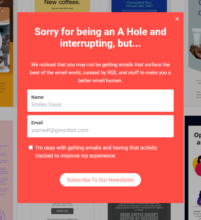
8. Stand Out With On-Brand Messaging Like Really Good Emails

Really Good Emails is a depository of emails from brands. I love using them for inspiration, and I often use their examples when I talk about email marketing.

That said, I love their pop-up. The brand generally uses casual language, so this pop-up is right on brand. It’s also a bit self-deprecating and acknowledges that many users don’t like pop-ups.

Pop-Up on Websites Examples - Really Good Emails

They also keep it simple: there are only two form fields and plenty of white space.

What stands out for me, however, is the copy. In addition to acknowledging some users don’t like pop-ups, they also explain the benefit of signing up.

Why It Works:

This pop-up is effective because it is simple, to the point, and uses on-brand humor to grab users’ attention. The bright colors are also very eye-catching.

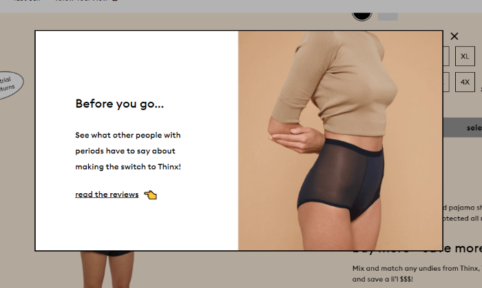
9. Use Exit-Intent Pop-Ups Like Thinx

Here’s another exit-intent pop-up from underwear brand Thinx. Like OpintMonster, they only display the pop-up when users are ready to leave their site.

Pop-Up on Websites Examples - Thinx

They also include a clear product image that shows off one of their best-selling items. According to OptiMonk, a pop-up on a website with images has an 11.09 percent conversion rate, making them a valuable addition to your pop-ups.

They also encourage users to read reviews, which can increase conversions.

Why It Works:

Thinx uses both exit-intent and product images to increase pop-up conversion rates. They also leverage white space to draw attention to the copy and use an emoji hand to direct attention to their social proof.

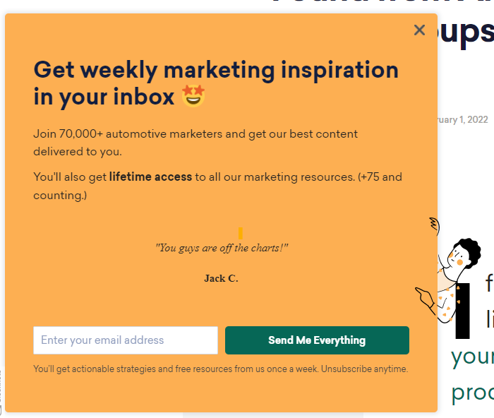
10. Use Social Proof in Your Pop-Up, Like Sleeknote

Social proof is powerful. A study by Bizrate Insights found that 32.1 percent of shoppers say a high review or rating is the most important factor when making a purchase decision.

Sleeknote leverages the power of social proof right in their pop-up with this fantastic pop-up example:

Pop-Up on Websites Examples - Sleeknote

There are two versions of social proof here; the top line encourages you to “Join 70,000 automotive marketers,” while the center of the pop-up uses a direct review from a happy customer.

Why It Works:

Sleeknote combines the power of pop-ups with the conversion power of customer reviews. They also keep the pop-up simple, only offering a few lines of copy spread out over a large background. Plus, they only ask for one single piece of information—your email address.

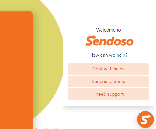
11. Qualify Leads With Pop-Ups, Like Sendoso

Twenty-seven percent of marketers say their greatest challenge is gathering leads and generating traffic. If you struggle gathering leads, use pop-ups on your website.

Sendoso is a marketing platform for account-based direct mail campaigns. When you visit their site, you’re greeted with this pop-up:

Pop-Up on Websites Examples - Sendoso

Compared to other pop-ups, this one looks pretty plain. There are no images, no form fields, no social proof. So, why is this one on my list of the most effective pop-ups?

The goal of this pop-up isn’t to increase leads or promote a sale; rather it’s looking to separate people who need support from visitors who are still in the buying funnel.

It separates users even further by asking whether they’d like to speak to sales (meaning they are likely ready to convert) or just want to watch a demo.

Why It Works:

Generating leads is hard. Qualifying leads is even harder. This pop-up directs users to the information they need, making it useful for both the brand and users. They also keep it simple and use branding to build trust with their audience.

12. Offer Something Unique, Like Peter Shankman

Just about every website pop-up offers a 10 percent off coupon, an ebook, or a white paper. While plenty of customers like those offerings, there’s also value in standing out.

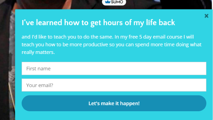
Peter Shankman, the founder of HARO, uses this pop-up to attract email sign-ups.

Pop-Up on Websites Examples - Shankman

Rather than offering a small discount or download, his offer is a free five-day email course on how to get hours of your life back. Most of us want more hours in the day, making this an incredibly valuable offer that stands out.

Why It Works:

As we’ve seen with other pop-ups, simplicity works. This pop-up uses just a few lines of copy, strong language, an enticing offer, and only two form fields. He also offers an email course, which is different from other offers on the list.

13. Use Striking Images, Like America’s Test Kitchen

Images are important—but not just any image will do. A Venngage study found 40 percent of marketers found original graphics are the most effective type of visual content.

This means your stock photos might not be cutting it.

America’s Test Kitchen website put this strategy to the test with high-quality, original images in their pop-up.

Pop-Up on Websites Examples - America Test Kitchen

The pop-up features two mouth-watering images of recipes from their book and shows the smiling faces of two of their cooks. Using images of people can also increase conversions, so this is a one-two punch.

Why It Works:

America’s Test Kitchen’s pop-up features high-quality images and an enticing offer of free recipes and episodes. They only ask for one piece of information (an email address) and use their branding to build trust.

14. Keep It Simple, Like Patagonia

Patagonia is an eco-friendly outdoor supply company known for its less traditional marketing strategies.

Here is its pop-up:

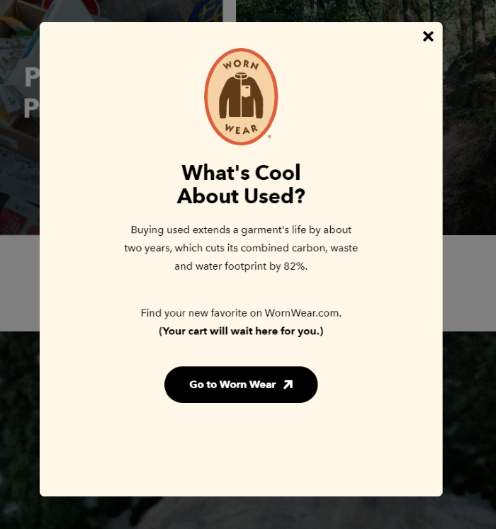
Pop-Up on Websites Examples - Patagonia

After users add items to their cart, this pop-up appears and prompts them to look at their used items. This seems counterintuitive since used items are less expensive.

However, it works well with Patagonia’s dedication to sustainability. While showing visitors used items might lower their average order value, it also reinforces the company’s dedication to doing things a little differently.

Plus, when users feel like they are getting a good deal, they might actually spend more.

Why It Works:

Patagonia reinforces one of its core brand values (sustainability) by offering shoppers their used options. This builds customer loyalty and promotes a new initiative. The pop-up is simple and confirms that the customer’s cart won’t be affected (which is important to online shoppers.)

15. Offer a Valuable Solution, Like Neilpatel.com

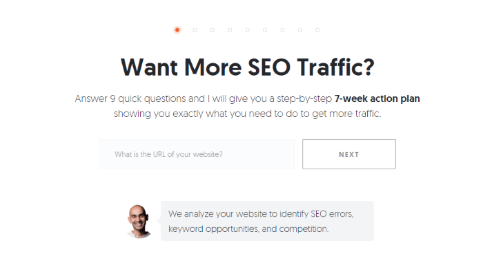
I’ve spent a lot of time testing different pop-ups on websites over the years. For the past few years, I’ve used this one:

Pop-Up on Websites Examples - NeilPatel

The goal of this pop-up is to drive users to sign up for my free tool, Ubersuggest. It doesn’t gather email addresses at this stage; instead, it focuses on offering value. Just plug in your URL and I’ll deliver a step-by-step action plan to improve SEO on your site.

Why It Works:

This pop-up works well for several reasons:

  1. First, it’s an incredibly valuable offer. The heading focuses on exactly what the tool delivers: traffic.
  2. The form is simple and only asks for one piece of information. This is crucial, as HubSpot found the more form fields a form has the less likely users are to fill it out.
  3. There’s also an image of my face. As we discussed above, adding a human face often increases conversion rates.

Pop Up on Website Frequently Asked Questions

What tools do I need to put pop-ups on my website?

Generally, you’ll only need one tool to install your pop-up. Common pop-up tools include OptinMonster, Wisepops, and Sleeknote. If you use WordPress, there are several plugins you can install.

What's the most common reason for including a pop-up on my website?

The most common reason sites use pop-ups on websites is to gather email subscribers, but they can also help qualify leads, increase customer lifetime value, or encourage demo sign-ups.

Is it expensive to put a pop-up on my website?

No. Several pop-up tools offer limited free plans. Affordable paid plans start as low as $10 a month for a single site with lower page views. For example, OptiMonk has a free plan with unlimited campaigns for sites with 15,000 page views or less.

Do pop-ups on websites work?

They do! The average pop-up has a conversion rate between three and ten percent. If yours converts at a lower rate, test a few of the strategies listed above including focusing on value, limiting form fields, and using timed pop-ups.

Conclusion: Examples of Effective Pop-Ups


Pop-ups on websites are an effective way to increase conversions, build loyalty, and increase customer engagement. To be effective, however, you must consider the user experience. Google lowers the search engine ranking for sites using annoying pop-ups.

Start with a simple pop-up with just one form field and offer something of value. Then, use A/B testing to see if features like timing, targeting, and images impact conversion rates.

Over time, you’ll learn what pop-up features are most effective with your target audience.

Do you use pop-ups on your website? Why or why not?


from Neil Patel's Digital Marketing Blog https://ift.tt/W0apOiV
via IFTTT