Monday, 3 October 2022

How To Use Twitter Campaign Planner

How To Use Twitter Campaign Planner

You’ve probably all done it: launched an ad campaign only to find it didn’t quite hit the spot. Perhaps you didn’t quite reach the audience you wanted to, and the ads didn’t convert the way you hoped.

It’s a waste of time and money, isn’t it? So wouldn’t it be good if there was a simple tool that could help you forecast your ad campaigns before putting them out there?

Well, there is.

It’s called the Twitter Campaign Planner, and it could make all the difference to your success if you want to grow your business with Twitter.

How does the Twitter campaign planner work? Read on, because I will talk you through it and explain what it could do for your marketing plans.

What Is Twitter Campaign Planner?

Twitter’s campaign planner lets you forecast your advertising results before going live with your ads by using a set of estimation tools.

You can use Twitter’s campaign planner to estimate:

  • Forecast reach
  • Impressions
  • Average frequency
  • CPM

It also takes into consideration your:

  • Audience
  • Campaign duration
  • Frequency setting
  • Ad placement
  • Budget for auction-based campaigns

It’s not open to everyone, though.

Currently, Twitter is only offering it to managed partners (official companies that Twitter partners with), and it’s available only in the United States, United Kingdom, and Japan. However, it does have expansion plans.

With this said, although the campaign planner isn’t widely available yet, by finding out more about it now, you can understand other users’ experiences and the potential this could have for testing your own ads.

How Does Twitter’s Campaign Planner Work?

As I’ve mentioned, the new feature could be a game changer for advertisers who want to test campaigns before launching live.

As Jon Morgenstern, Senior Vice President and Head of Investment, VaynerMedia, who has trialed the planner, said:

‘With Campaign Planner, our teams are better able to forecast campaign performance outcomes prior to going live, helping ensure our Twitter activations are set up for measurable success out of the gate…’

Want to test it out for yourself?

To try it, you can find the Twitter campaign planner under your Twitter account.
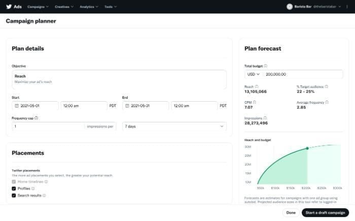
Twitter's Campaign Planner Tool.

Here, you enter the details of your campaign, such as:

  • Objective(optimizing your campaign’s reach)
  • Your start and finish dates
  • Frequency cap (How many impressions/days)
  • Placements (search results or Twitter profile)

You then get a forecast predicting:

  • Reach
  • Target audience
  • CPM (cost per mille, or cost per thousand impressions)
  • Average frequency
  • Impressions (how often advertisements get served on a page)

As pictured below, you can also set up a draft campaign.
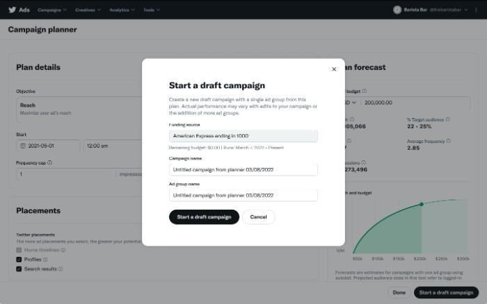
Starting a Twitter Campaign draft.

Is Twitter Campaign Planner a Good Fit for Your Business?

It depends on several factors, including the stage of your business. However, you should also consider that the results are merely estimates, and you won’t necessarily see the predicted results.

That aside, here are a few scenarios that might make this new tool a good fit for you:

  • If you’re a new company with a limited budget, you may want to use the Twitter campaign planner before committing money to live ads.
  • An established business looking to break into a fresh niche. You could use Twitter’s campaign planner for a test run before launching any ads.
  • Perhaps you’re new to Twitter advertising and unsure where to place your ads or how to long run your campaign. You can test out advertising in your profile and search advertising to view your potential results and vary lengths to get an idea of the likely results; if you are new to all this, my guide to Twitter ads will get you off to a running start.
  • Do your ads reach your target audience? That’s something else you can establish with the new tool.

If it works, you keep spending on those areas. If it doesn’t, you would go back to the Twitter campaign planner and try a different strategy.

However, because this Twitter tool is still in the early stages of rollout and isn’t available to vast numbers of advertisers, it’s probably a good idea to watch and wait. See how others are using the tool, what it’s doing for their success rates, and learn from case studies.

As the campaign planner reaches a wider audience and is more accessible, then you can start to get a better idea of how it could work for you and ways to apply it.

How To Set Up Twitter Campaign Planner

Are you ready to get started with Twitter’s campaign planner? It’s simple. All you’ve got to do is follow these step-by-step instructions.

Go to the campaigns drop-down menu in the left-hand corner and find the ‘Campaign planner’ option.

  1. Fill out your Plan Details, including your aims, budget, beginning and end dates, and a frequency cap (how often people can see your ads).
  2. Next, go to placements to choose where you want your ads to appear. Twitter sets ‘Home Timelines’ as a default, so you can’t move it. You can also choose to include your ads in profiles and search results.
  3. Now, select your demographics. Which group(s) of people are you trying to reach? You can choose from demographics like age, language, gender, and location. However, the Twitter campaign planner ‘only supports country-level targeting in the United States, United Kingdom, and Japan,’ and language targeting is optional.
  4. Next, it’s time to choose your devices. This step is optional, and you can select from the operating system, carrier, and device model.
  5. Customizing your audience is another optional step. Custom audiences allow you to focus on existing followers to develop re-marketing campaigns. You can target people by website or app activity, app activity combination audiences, and lists.
  6. Targeting features (optional) Here, you can target by keywords, interests, look-alikes, etc.
  7. With all your information completed, select the ‘Start a draft campaign’ button and choose a funding source. You also need to give your new campaign and ad group a name. With that done, click on ‘Start a draft campaign’ to save everything and to copy your settings over.

When you look at the plan forecast, you can:

  • Make adjustments to your budget.
  • Select another currency.
  • Adjust the reach and budget curve. This is done by hovering along the pictured curve to see your estimated impressions and the potential reach that is possible if you change your budget. If you click on the curve, it moves the selected point to that budget level.
Twitter's Campaign Planner budget tool.

Integrating Planner Into Your Twitter Campaigns

Perhaps you’re an e-commerce company specializing in bridal flowers and want an efficient way to run campaigns. Trialing ads with Twitter’s campaign planner could be just what you’re looking for.

Here are some potential ways you could use it.

  • The first thing you could view is whether advertising on Twitter would increase your reach and impressions. From there, you could determine if launching a live ad may be the way forward.
  • Then you could test location or maybe interests and keywords to analyze whether this could get your ads in front of your ideal audience.
  • Frequency and reach are other elements you could try to see how this might increase brand awareness or campaign lengths to see if you could build further awareness of your business.

However, as I stressed in the last section, you don’t need to start making decisions about using the campaign planner yet. Learn all you can from others’ success, and when the tool becomes available to you, use their experiences as a guide.

FAQs

What Is The Twitter Campaign Planner?

The Twitter campaign planner allows you to test your advertising campaigns before launching them live. It forecasts the likely results, and you can test core areas, including impressions and reach. Twitter released the tool in late 2021 to a limited audience and it plans a wider release at some point.

How Do I Edit My Campaign?

You can edit the campaign while it’s in draft.

What Are the Minimum Budget Requirements For Twitter Campaign Planner?

The Twitter Campaign Planner has a minimum budget of $1,000 or the equivalent in the marketer’s chosen currency.

What Is the Minimum Campaign Length For Twitter Campaign Planner?

The minimum length is three days.

Conclusion

Even if marketers have an ample budget, they don’t want to waste their time or money on ineffective ads that don’t grow their business.

However, unless you’re familiar with Twitter ads and how to run them, there’s always a chance your ads will fall flat.

The Twitter campaign planner hopes to change all that by giving advertisers a prediction of the possible results.

With a better idea of what to expect, marketers can launch their ads confidently or tweak them and try again.

Although the Twitter campaign planner isn’t open to everyone at the moment, you’ve got plenty of opportunities to learn from others and how it works for them.

Would you use the Twitter campaign planner?


from Neil Patel's Digital Marketing Blog https://ift.tt/bDcJwrv
via IFTTT

Sunday, 2 October 2022

How to spot fake Instagram followers

Instagram heart with a hooded, shaded character lurking on a phone

Ever wonder how someone got so many Instagram followers? We have great news for your ego: Some of those followers might be fake.

It's likely that, even if you've never bought followers, you've still been followed by a few bots. This is largely unavoidable — and many bots are harmless — but you should still report them to Instagram. The more volatile bots might try to phish you by sending spam or harmful links via DM, and it's not worth the risk of keeping them around.

Instagram cracked down on third-party apps that boost your account using fake followers and likes in 2018, promising that there would be repercussions for users who continued to buy bots. (It's unclear what, exactly, those repercussions were.) But that didn't mark the end of fake followers: In fact, according to research conducted in 2022, 1 in 4 Instagram influencers paid for 15% of their followings. According to CNBC, fake followers on influencer accounts cost brands an estimated total of $1.3 billion in 2019.

How to spot a fake account

To spot a fake account, watch for a few telltale signs. For instance, if you notice a user liking a random assortment of your photos or leaving random, generic comments ("great post!") in rapid succession, there's a good chance it's affiliated with a third-party booster and is trying to tempt you into following it back. At the very least, it's someone trying to rapidly inflate their follower count -- probably not a person you want to follow anyway.

Illustrated version of instagram logo
Watch out for generic comments. Credit: Vicky Leta / mashable

It's also helpful to look at the profile itself. If the user is following thousands of people but doesn't have many followers or posts themselves, or if their account appears to have been inactive for a long time, feel free to be suspicious. Of course, there are sneakier bots who do post a lot of content in an attempt to appear real. If you're not sure, pop a photo or two into a reverse Google image search and see if it's been lifted from another user -- or another website entirely.

And we've all seen those super obvious fake accounts. There's the bot that posts a bunch of stolen photos of different women as if you will not notice they're not the same person. Then there's the fake discount account, which promises low prices on luxury items (frequently Ray-Bans) in an attempt to get you to click on a suspicious link.

Let us not forget the most obvious culprit of all: the account with nothing on it. No picture, no posts, no followers. Their handle is "Chloe8438488382" or some garbage like that. Goodbye, bot. You did not even put forth an effort.

Finally, it must be said: Just because someone meets one of these criteria does not automatically make them a bot. They could simply be really bad at Instagram.

How to tell if a user has lots of fake followers

Not sure if someone's followers are real, but don't want to spend your valuable and finite time inspecting each one individually? There are a few ways to tell if a big chunk of someone's followers are bots.

'Fake followers, for the most part, don't do anything except follow you.'

First, look at how many likes the user gets per post. If it's only a tiny portion of their follower count -- as in, the ratio is really, really off -- there's a good chance many of their followers are inactive bots. Fake followers, for the most part, don't do anything except follow you.

There are a number of third-party websites (we'll let you Google) that allege they can detect which of a user's followers are fake. Those results, however, should be taken with a grain of salt. You can also try running the account through the social media statistics website SocialBlade, which will inform you of any sudden jumps in follower count. If a user's follower count skyrockets for no discernible reason, it's likely they've paid to inflate their numbers.

In general, it's a bad idea to get involved with bots at all — and inflating your follower count artificially won't have any benefits that are actually meaningful. The better option is to grow your account organically as best you can. You can still use as many annoying hashtags as you want.


from Mashable https://ift.tt/nZMNwp5
via IFTTT

Beware the QR code scams

QR code at a restaurant

By now, most internet users know the usual scams to look out for: Phishing emails trying to steal your account logins, misspelled URLs attempting to access your bank accounts, fake online storefronts charging you for products they never intend to send.

Well, it's time to be on the lookout for yet another growing scam: fake QR codes.

What's a QR code? You've likely seen them as their use skyrocketed during the pandemic. Many restaurants have started using QR codes to replace physical, germ-covered menus. QR codes are those little square barcodes that take you directly to a website or app when you scan them with your smartphone camera.

QR codes seem like they were made to deter phishing. There's no need to type in a link and accidentally misspell it, which could result in the user being sent to a scam website meant to mimic the actual legitimate site they meant to visit. Just scan the QR code and you'll go right to the real website you intended to go to.

However, as with most new and growing technologies, scammers have found a way to weaponize QR codes too.

In December 2021, QR codes started popping up on public parking meters in San Antonio, Texas. Simply pull out your phone, scan the familiar barcode, and pay for your parking spot. Quick and simple, right? Not so. When the San Antonio Police Department was notified, they alerted the public that the QR codes were a scam. 

Fraudsters had actually placed their own QR codes on public parking meters across the city. Drivers who used them to pay the meters were actually sending their money or sensitive financial account information to the scammers. As Ars Technica points out, other major cities in Texas, such as Austin and Houston, have reported similar parking meter grifts.

QR codes still make up just a small fraction of the scams proliferating across the web. However, the Better Business Bureau has experienced a noticeable enough uptick on its scam tracker to put out its own "scam alert" on QR codes in 2021. The technology has become accessible enough where anyone can make their own QR codes now.

So, what should you do to avoid scammy QR codes?

Treat QR codes you come across you just as you would any other email you receive or link that gets text messaged to you. All the QR code is doing is directing you to a link, whether that be a login screen or a payment form, for example. Double check the source of the QR code and the URL the QR code sends you to just as you would when you receive an email with a link inside.

If something feels off about a page that the QR code displays, type out the URL yourself if you know it. These links are accessible without the barcode. Be on the lookout for advertisements and public notices that are tampered with too. A fraudster can easily stick their own QR code over a legitimate one on a poster or flyer you come across offline.

The BBB suggests going a step further by downloading a QR Scanner with built-in security features, such as the Kaspersky QR Scanner (available on iOS and Android).

Even the most publicized online scams are still tricking people. Let's nip this in the bud and try to minimize the harm caused by QR code scams before they blow up.


from Mashable https://ift.tt/muNMZvb
via IFTTT

How to block spam messages on WhatsApp

Phone with red exclamation point coming out of the screen

Pretty much every medium we use to communicate will be vulnerable to spam at some point or another. Texts, emails, social media, and messaging apps. Yep, even WhatsApp.

Spam messages, beyond being super freaking annoying, are potentially harmful in that spammers often try to get you to divulge your personal information, or click on dangerous links. It's challenging to find ways to protect yourself from spam completely, but here are some things you can do to prevent and block spam on WhatsApp.

Block or report a contact

WhatsApp block contact screen
Find "block contact" and "report contact" at the bottom. Credit: Screengrab: whatsapp
  1. Go to the message thread that contains the spam message (be careful not to click on any links within the message).

  2. Tap on the contact at the very top of the page.

  3. Tap "Block Contact" at the bottom (to block) and "Report Contact" (to report).

  4. Then tap "Block" again (or "Report" again) when prompted. You can also just tap "Report Contact" and you'll have the option to do both at once by tapping "Report and Block."

Adjust your WhatsApp privacy settings

WhatsApp account settings
Find your account settings. Credit: screengrab: whatsapp
  1. Navigate to your WhatsApp settings.

  2. Tap "Account."

  3. Tap "Privacy" at the top.

  4. In your privacy settings, you can control who can see your online status, profile photo, "Last Seen," and your "About" section, as well as who can add you to groups.

  5. Edit these settings to your liking by tapping each one and choosing either "Everyone," "My Contacts," or "Nobody" — "Nobody" obviously gives you the most privacy while "Everyone" gives you the least.

WhatsApp privacy settings
Check out your privacy settings. Credit: screengrab: whatsapp

We know it can sometimes be hard to tell if a message is spam or not. Sometimes it's obvious, but other times the message can look totally authentic, which of course, is by design. WhatsApp offers some helpful information about what spam messages can look like and how to spot them. You can find that info by going to the "spam and unwanted messages" section of the WhatsApp Help Center.


from Mashable https://ift.tt/EmrbA2F
via IFTTT

Saturday, 1 October 2022

5 Rules for Your Sub-Brand Keyword Strategy

If you’ve tried Coca-Cola, you’ve probably had a Diet Coke.

If you use Google as your preferred search engine, chances are you have a Gmail account.

What’s the link between the two? Both are high-profile companies with high-profile sub-brands.

Think of a sub-brand as a room in a house and the house as your brand. Successful sub-branding means targeting the right audience with the right product.

If sub-brands are part of your company’s brand architecture, a well-defined sub-brand SEO strategy helps keep the lines clear.

Brands like Coca-Cola and Google do this well, making it clear how their sub-brands are related to but different from the parent brand. From an SEO perspective, this makes for an ideal keyword strategy.

I want to help you do the same with your brand architecture.

These five rules will help keep your sub-brand SEO keyword strategy true to your brand image while allowing your sub-brands to uniquely stand out.

Why Do Businesses Create Sub-Brands?

To sub-brand or not to sub-brand?

That is the question.

As you build your business’ brand, it’s tempting—and often strategic—to widen your footprint over time.

Companies across all industries have portfolios with multiple brands. Sometimes they develop these brands themselves. Sometimes they acquire them.

There are a lot of good reasons to create a sub-brand. Here are a few:

To Target Specific Audiences

In some cases, a business might want to distinguish between its flagship brand and sub-brands that target more specific audiences.

Take the car brand Toyota and its luxury sub-brand Lexus, for example. The brands operate independently under the Toyota umbrella, but they market to different target audiences. Having separate brands allows them to connect with each on a deeper level.

To Tap Into New Markets

Sub-brands are an opportunity to reach new audiences. Appealing to a new niche allows the parent brand to:

  1. Build a stronger bond with their current customer base
  2. Attract new customers
  3. Expand into a new, profitable revenue stream

Another approach might be for product expansion. Companies can use sub-brands to test a product on the market under a different brand name.

Who can say where they might end up?

To Uniquely Market Different Products

Whatever the motivations, sub-brands should stay true to the parent brand’s mission as they develop.

Each product has its own personality, feel, and set of features even though they are all separate items under the same umbrella company. This also means each sub-brand needs a separate budget for marketing and promotion.

So, of course, your sub-brand SEO keyword strategy needs to be sharp to support it.

Influencing search engines will take time, but it pays off when the conversions your strategy drives show up in audience and revenue.

#1: Think About the Audiences for Your Main and Sub-Brands

Look at the demand of your audience and prospective audience. How are you going to meet their needs with a sub-brand?

To answer this question, you must determine their search intent. Use keyword research to formulate this strategy.

Your content needs to provide them with the information they need. From your branding to your content, you want to spark a unique relationship with your target audience.

As I’ve said in the past, brand-loyal people want to find a brand to be loyal to.

The company’s business goals should serve as the cornerstone of the choice to expand. How you go about your sub-brand SEO strategies is unique to your desired outcome.

For example, I bet you didn’t know Converse was a sub-brand of Nike.

Well, if you’re on Converse’s marketing team, using “running shoe” as the sub-brand’s SEO keyword would be “off brand.” A more fitting keyword for the strategy would be “high top sneakers.”

So, while Converse is a sub-brand of Nike, their keyword strategy sets them apart from the parent company to see self-sustaining conversions.

You’ll notice when the right combination of keywords serves the company and sub-brand’s goals.

How will you know you hit that sweet spot?

Your audience will tell you.

Insights from your content performance metrics and ROI will reveal a wealth of resources. Then, you can sustain those wins by following that same strategy, adjusting as needed.

#2: Keep an Eye on Your Competition

You’ll need to keep an eye out for the competition as you expand. A strong sense of your audience and competitors will help differentiate your sub-brand.

Say you want to step into a market and challenge the industry norms.

Think of some of your favorite parent companies. Now, think of some of their spin-off ideas that have been successful.

Who did you think of?

I thought of Apple.

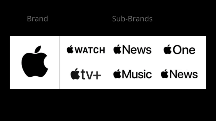
Apple's parent brand and some of its sub-brand companies.

For instance, Apple offers a variety of tech products. These products bear the Apple logo and support the parent company.

Apple is not a product in and of itself, but each sub-brand leverages Apple’s brand value and appeals to various market niches.

When Apple first started, they wanted to be perceived as the alternative to the mainstream. Sub-brands help carry out this plan. Think about how users proudly declare their loyalty to Apple products: “No PCs for me; I am a Mac guy.” “I don’t have an MP3 player; I have an iPod.” “It’s not a Blackberry; it’s an iPhone.”

Sub-brands allow Apple to stand out from the competition in completely different markets. Google’s algorithm favors domain diversity, meaning that you’re not likely to see a ton of pages from the same domain in a given SERP. This means that when talking sub-brands, you want to use as many domains as possible.

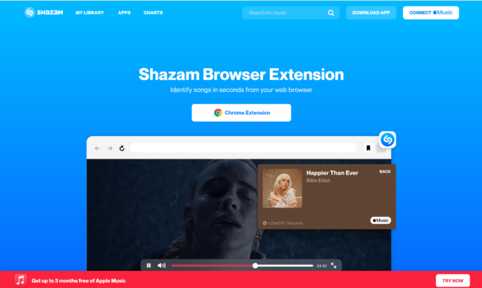
The homepage of Shazam, a sub-brand under the Apple the brand.

While the previous examples leveraged Apple’s brand equity, the company has also had success with sub-brands that stand alone.

A multi-domain SEO strategy, not to be confused with subdomain, helps them market Shazam as a sub-brand under the Apple brand. While branded as an individual product, Shazam is set up as a separate domain that drives traffic back to Apple’s domain. It feeds in users through Apple Music.

While it’s not a go-to SEO technique like keyword optimization, a multiple-domain SEO strategy is an out-of-the-box play that doubles your chance to rank for multiple domains.

With sub-brand SEO, you can implement a multiple-domain strategy without devaluing the brand by strengthening its approach to their audience and against competitors.

#3: Avoid Keyword Cannibalization at All Costs

Before you make your way down sub-brand SEO street, don’t take a wrong turn with your content due to keyword cannibalization.

If more than one of your pages pop up for the same search query, you’re competing against yourself. Because they target the same keywords, your pages eat into each other’s performance (hint: why we call it cannibalization).

Be mindful of keyword cannibalization when developing a sub brand SEO strategy.

Keyword cannibalization problems don’t come with a “one-size-fits-all” solution. There are unique approaches to address different cannibalization issues.

Those approaches include:

  • Merging Page Topics: Try to merge pages with similar topics that are getting in the way of how the page is competing among others.
  • Page Re-optimization: Taking another stab at the topic by re-optimizing pages helps set clear intentions for the page.
  • Redirect lesser-performing content: Once you determine which of the cannibalizing pages is the strongest, remove other pages and broken links you no longer need. From here, you can perform regular content audits. You’ll want to make your topics come first and have your keywords work for them.

Fix cannibalization issues and you’ll pull in your audience, further establishing brand authority in your industry.

#4 Be Realistic About Keyword Difficulty

Estimating keyword difficulty reveals how hard it will be to rank first on Google. As you brainstorm the “keyword bank” you want to use for your sub-brand, remember it needs to be realistic and profitable.

The difficulty of a keyword is determined by variables like domain authority, page authority, and content quality. So, use these points to guide you toward the ones that fit your sub-brand best.

Say your sub-brand is a dog treat expansion from your main dog food line:

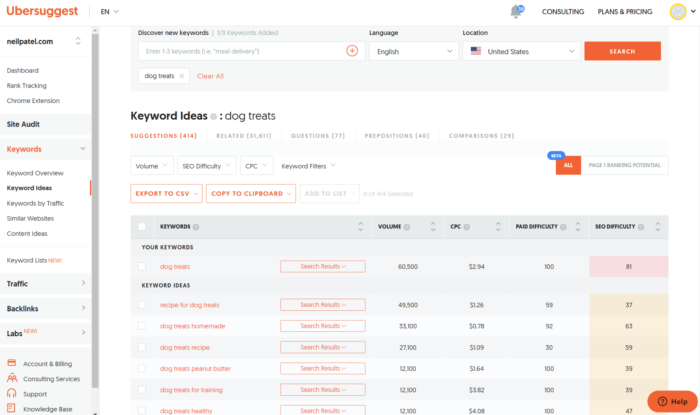
Use the SEO tool Ubersuggest to find strategic keywords for sub brands.

An SEO tool like Ubersuggest tells you which keywords are most difficult to rank for. An easy keyword difficulty score lands between 0 and 29. From the list above, you can see they all rank over 30, meaning the competition is tough. This report also gives you a sense of the keywords your competition is targeting.

Another helpful highlight is user search intent. Before stepping into a particular market, this helps see how your potential audience might benefit from using your sub-brand as their solution.

Sub-brand SEO optimization is like a marathon and may not reach its full potential overnight.

However, targeting a term with a high keyword difficulty like “dog treats” is still worthwhile. If the ROI is good enough and the potential conversion rate is acceptable, go for it!

Even if a keyword has a low difficulty rating, is it really worth targeting if the ROI shows that there is little chance of making money from it and that it is not frequently searched for?

#5: Think About Brand Architecture at All Times

You are placing your company in danger if you don’t keep a sub-brand in step with its parent company. You’re not taking full advantage of the parent brand’s equity if you implement a sub-brand’s strategy in isolation.

This could potentially hurt the parent brand’s credibility. We saw this when Old Navy overtook the Gap as a sub-brand by strategizing in isolation.

A crucial component of the brand architecture “home” is the strategy it takes to build out a room (a sub-brand). Remember the house example I explained to you earlier? With a sub-brand, you have to think about the layout and how it fits within the parent company, or “home.”

Examine the brand strategy of your parent company while keeping in mind the prospect of future sub-brands. How can you expand to offer more solutions to your audience? What new markets do you want to conquer?

FAQs

What is a sub-brand?

A sub-brand is formed when a brand extends to one or more new individual product categories. Based on the outcomes of this expansion, sub-brands can be an effective marketing tool.

A sub-brand uses a unique name to develop its own brand, though that name sometimes complements or plays off the name of the parent brand. A sub-brand also has its own client expectations and personalities distinct from the parent company.

What does a sub-brand mean?

A sub-brand is created when a primary brand expands. Take Diet Coke for instance. It has a unique color code, yet it incorporates the iconic Coca-Cola logo with the recognizable bottle shape.

Sub-brands are frequently developed as a way to connect with untapped markets. Sub-brands can then establish themselves in the new market on behalf of the parent company.

Conclusion

The idea of sub-branding is not new.

Through sub-branding and brand extensions, iconic companies have discovered how to increase brand recognition and “go global” over the years.

Maintaining your parent brand’s vision for the future is easier if you map out how the sub-brand’s growth will affect it, and vice versa.

Your brand is only as strong as your brand architecture. So, be strategic about how you build out your “home”—from parent company to sub-brand(s).

Sub-brand SEO helps you be deliberate with how you build out this idea.

The more in-tune you are with your long-term goals, the easier it is to figure out your initial direction for a new product line.

Keep your intentions clear at all times, making sure that each new entity has a stand-alone personality and functions within the larger framework of your parent company.

Are you considering launching a sub-brand? Do you need to review your brand architecture so your SEO efforts work in your favor? Get in touch with my team and we will help you brainstorm your options.


from Neil Patel's Digital Marketing Blog https://ift.tt/npm68ih
via IFTTT

Friday, 30 September 2022

Common UX Accessibility Mistakes Found on Websites

Common UX Accessibility Mistakes Found on Websites

Tim Berners-Lee, the inventor of the World Wide Web, says the web is for everyone. Unfortunately, that isn’t always the case.

Poor design decisions can present barriers for many different groups of people. In fact, research by WebAIM finds that across one million homepages, there were over 50,000,000 “distinct accessibility errors” at an average of just over 50 per page.

These errors don’t just make people feel marginalized; they stop hundreds of thousands of people from interacting with your brand or buying your product.

Few webmasters want to purposefully marginalize people or limit access to their site. That’s why it’s so important to understand the most common web accessibility issues and learn how to resolve them with clean design.

Let’s get started.

Why Is UX Accessibility Important?

Because the internet has become an essential part of the day-to-day lives of more than a billion people, site owners must take steps to make sure everyone can access it equally. It’s not just a matter of human rights, however. There is an obvious financial case for making your site accessible. Given that 61 million people in the United States have some form of disability, an inaccessible site could be harming your bottom line. Make your site accessible, and you potentially open the door to thousands of more customers.

Complying with UX accessibility design trends can bolster your company’s reputation. Making an effort to cater to a particular group of disadvantaged users proves your company cares about all of its customers. This added step may encourage potential customers to do more business with your brand going forward.

There’s also the small matter of legal compliance. While there’s debate about whether the 1990 Americans with Disabilities Act includes websites as well as physical stores, that hasn’t stopped thousands of lawsuits getting filed with federal courts each year. You may not be punished for a lack of ADA website compliance, but the threat of legal action is clear.

Ultimately, designing with UX accessibility doesn’t just improve the browsing experience for users with disabilities; it improves the user experience for everyone. Even users with perfect vision benefit from a better color contrast and more labels — and your SEO certainly benefits from things like added alt text and better link descriptions.

The 7 Most Common Web Accessibility Mistakes

Making your website more accessible is as much about avoiding common issues as it is about integrating new technology. Avoid the following seven mistakes, and you’ll go a long way to making your site more accessible than your competitors.

1: Missing Alt Text on Images

Alt text is an HTML attribute that describes what an image represents. From an accessibility perspective, alt text provides information for screen readers to accurately describe images to visually-impaired users. If you don’t provide alt text or your alt text isn’t very descriptive, then you aren’t making your site’s images available to everyone.

There’s a difference between empty alt text and missing alt text. Sometimes images can be for purely decorative purposes. Where this is the case, an empty alt tag can be used, which appears as alt=””. This is ignored by screen readers and doesn’t impact usability.

Often, alt text isn’t empty but missing completely. When a screen reader comes across a missing alt attribute, it will assume that the image is important and inject the file name. For images like graphs and infographics that are fundamental to a user’s understanding of a webpage, the file name won’t be sufficient. That’s why it’s essential to create alt text for all of your images.

2: Weak Color Contrast

Have you ever tried to read a white font on a yellow background? Not easy, is it? But that could be how many users feel every time they visit your site. The truth is some people struggle to read text unless the color contrast between the font and the background is very stark. It’s why black font on a white background is such a popular choice.

The easiest way to improve color contrast is to avoid using similar colors for backgrounds and text. That means no orange font on a red background. Or green text on a blue background. Pay particular attention to design features like your website’s header or the submit button on forms, too. These features tend to incorporate brand colors and are more likely to cause contrast issues.

Alternatively, you can use a tool like the Contrast Checker from WebAIM to quantify your contrast ratio. The higher your ratio, the better the contrast and the more readable your website will be. The tool will tell you whether your colors pass or fail. As a rule, text and background colors should have a contrast ratio of at least 3:1 for large text and at least 4:1 for normal-sized text.

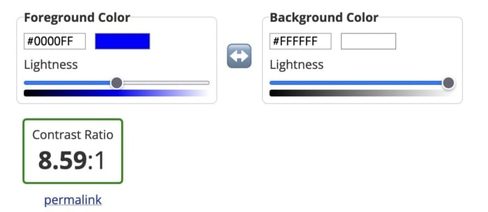
As you can see from the images below, dark blue text on a white background has a great contrast ratio.

Example of a good contrast ratio of colors with dark blue on white.

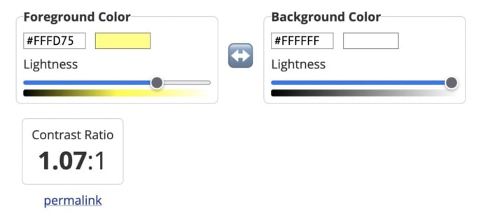
But yellow text on a white background has a terrible contrast ratio.

An example of bad color contrast with yellow on white.

3: Poor Link Text

Links are a vital part of a web page, both from a user experience perspective and for SEO. But you need to accurately describe them using link text to make them effective.

While those versed in SEO might never dream of missing a chance to add a keyword in an internal link, missing link text is surprisingly common. Logos, buttons, and icons are all guilty of having no text, which means screen readers will ignore them. That’s not great if you want users to click your CTA button.

Vague or ambiguous link text is also an issue. Not only does a phrase like “click here” offer no SEO value, but it can also hamper users accessing your site via a screen reader. Including the entire http:// link without any anchor text whatsoever is even worse. Neither version contains the information these users need.

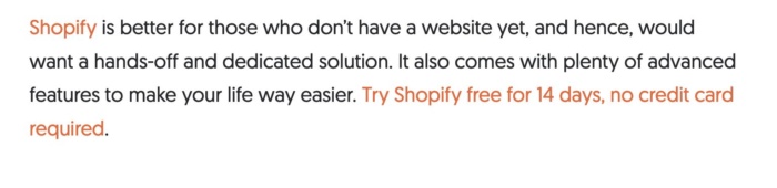
Instead, make sure the clickable text describes exactly what the user can find on the next page. In the example below, for instance, you know that by clicking the link, you’ll be directed to a page where you can get a 14-day free trial of Shopify.

The 14 day free trial for shopify.

Then there are navigation links. These can also create problems for screen readers if they are poorly coded. That’s because screen readers will not skip over them, meaning users will have to listen to your navigation menu every time they open a new page. Solve this by assigning ARIA roles to your navigation menus to indicate their purpose. This will help screen readers to avoid them where necessary.

4: Missing Form Labels

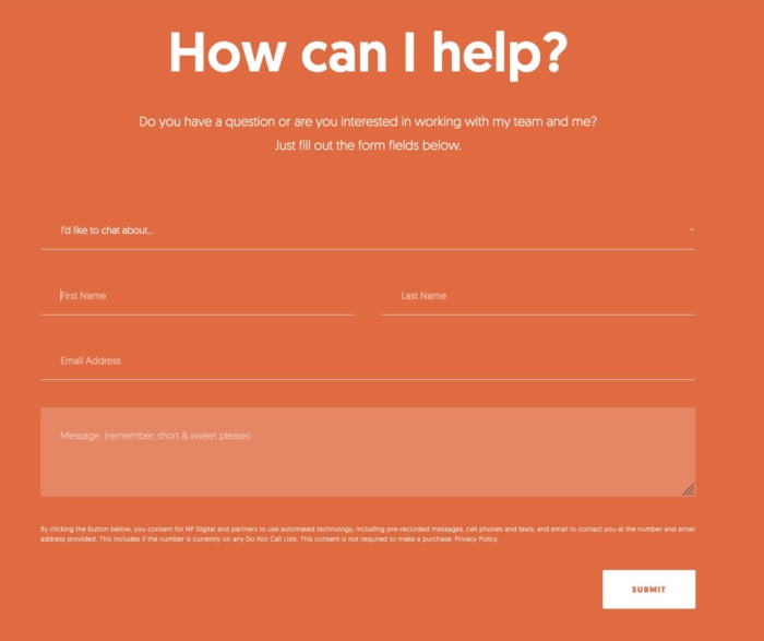
I’m almost certain your website has at least one form on it, even if it’s only on your contact page. But does every field have a label telling users what information they need to input? If not, your forms aren’t accessible to everyone.

A "how can I help" form.

Just like with link text, form input fields need a label so screen readers and other accessibility devices can understand them and help users navigate them. A label isn’t just the placeholder text you can see in the form field, though. You also need to add a description in the form’s code. That’s because placeholder text is usually ignored by screen readers. It also doesn’t help that placeholder text usually lacks a strong color contrast.

Ideally, you’ll have a visible label inside a <label> element so everyone (users, screen readers, bots) can understand what’s meant to go in each field.

5: No Markup For Data Tables

Tables are something of a nightmare for screen readers and other accessibility devices. When screen readers come across a table, they tell the user that there is a table with a given amount of columns and rows and then proceed to list out all of the data. Unfortunately, that data may not be read in the correct order. Worse still, screen readers can’t read out tables where there is more than one set of row or column headers.

In truth, the best way to make tables accessible is to not have them at all. Of course, that’s not going to work for some websites. So, where tables are required, you need to make them as simple as possible and use the correct markup. ID, HEADERS, and SCOPE attributes should be used to correctly label each part of your table. You can also use table captions to provide additional information to users about how to best understand your table.

Another alternative is presenting your data as an image file, with appropriate alt text listing out the data. However, for complex tables, that may not be feasible.

6: Lack of Keyboard Accessibility For Screen Readers

Not everyone is going to use a mouse to navigate your website. Many visually-impaired people will use a keyboard or another accessibility device to move around your website. And that means you need to pay special attention when designing and creating the layout of your site.

Specifically, users must be able to navigate your website using the space bar and tab key. Simple sites built in semantically correct HTML may make this possible without any adjustment, but more complicated websites will need to code in digital landmarks that better allow keyboard users and screen readers to move about.

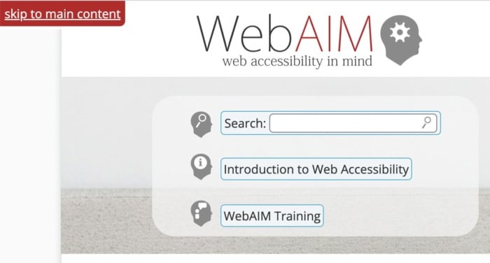
Adding skip-to-content links at the top of each page can also save your users from having to tab through every menu item every time they open a new page. These buttons, which appear when you push the tab key, allow users to navigate the site using the tab and spacebar keys to skip the navigation and head straight to the main content of the page.

WebAIM's search function.

7: Non-HTML Content WIthout Proper Markup</h3>

It’s easy to forget about non-HTML elements when optimizing your site for accessibility. But content like PDFs and Word documents can also be an issue. Out of the box, users cannot customize these documents to make them easier to read nor do they work well with assistive technologies. Accessibility issues are even worse when documents are produced as image-only PDFs.

One solution is to solve navigation mistakes by tagging these resources for navigation by screen readers. Another is to use Office’s built-in Accessibility Checker to improve the accessibility of these documents when you create them.

Interactive content like sliders, accordions, and drag-and-drop widgets can also affect accessibility. So, too, can dynamic content like pop-up boxes and confirmation messages. If the screen reader can’t understand when these pieces of content are loading, it won’t be able to tell users about them.

Once again, you can use ARIA attributes to resolve this issue. Tagging these interactive and dynamic elements with the correct ARIA attribute will notify screen readers that the page’s content has changed. Alternatively, you can design your site in a way that avoids the need for pop-ups and other forms of dynamic content. Static websites may not look as flashy, but they are much more accessible.

FAQs

What are the four significant categories of accessibility?

The Web Content Accessibility Guidelines are built upon the four principles of POUR: perceivable, operable, understandable and robust.

What is ADA compliance?

If your site is ADA-compliant, then it meets the recommendations set out in the Americans with Disabilities Act of 1990 and is accessible to someone with a disability. 

How do I make my website more accessible?

You can make your website more accessible by improving color contrast, adding alt text, or adding keyboard accessibility for screen readers.  

What is an example of website accessibility?

Allowing users to navigate your website using a keyboard instead of a mouse is an example of website accessibility. So is adding alt text to every image on your website.

Conclusion

Unfortunately, even the best designers and web entrepreneurs can create inaccessible websites. It’s why it’s so important to keep referring back to these mistakes whenever you build a website or create a new piece of content.

It’s more effort to include alt text on all images, add markup data to tables and improve the quality of your link text, but millions of users will thank you for it.

But don’t stop there. Next, learn how to create inclusive content and improve the overall user experience of your website.

What UX accessibility mistakes are you going to correct first?


from Neil Patel's Digital Marketing Blog https://ift.tt/o3yv1Bl
via IFTTT

As Hurricane Ian made landfall, it was just another strange day on the internet

a man holding a phone in flood waters of hurricane ian

I was online, like I always seem to be, when Hurricane Ian made landfall in Florida earlier this week. I flicked through Twitter and endlessly scrolled TikTok as the afternoon stretched into evening.

It was a weird, troubling experience. Being online during a natural disaster like Ian is a strange mix of live devastation and the usual internet oddities. Flood waters rising and people memeing it in real time in an endless stream of updates. That is the essence of being online in 2022: Everything is awful, let's keep scrolling.

We're just now beginning to see the actual toll Ian took. The Sun Sentinel reported at least 21 people have died in Florida, with thousands more people left unaccounted. Millions were without power Friday after the Category 4 storm pummeled the state with high winds and flooding. Even for a state quite familiar with hurricanes, Ian proved to be particularly awful.

"This could be the deadliest hurricane in Florida’s history," President Joe Biden said Thursday afternoon. "The numbers are still unclear, but we're hearing early reports of what may be substantial loss of life."

As this deadly storm reached its peek this week, the first viral video I saw was...of a shark. It's a bit of internet lore: a fake image of a shark swimming through a disaster zone that famously resurfaces during big storms. The first illegitimate photo, of a shark swimming on a highway, appeared in 2011 amid Hurricane Irene. Since then, there's been various reiterations of the meme. So when a real video of what appears to be a small shark (or some other type of fish) thrashing about on a flooded street in Fort Myers, Florida, surfaced during Ian, people immediately started sharing it across their feeds. The short clip has since racked up more than 13 million views.

Hurricane Shark wasn't the only video to go viral as Ian hit. Some dude ran out to fly a Philadelphia Eagles flag as the storm made landfall. In another clip, people swam in the storm surge (which we definitely don't advise). On TikTok, you could watch as zookeepers cheerfully walked storks and other animals to a bathroom for safety.

I'd categorize all these videos as curiosities: surreal clips of animals outside of their habitats and people making bad decisions, two hallmarks of the internet. You might even call it fun, depending on which social media platform you were on. Because over on a different corner of the internet, the legitimate horrors of Hurricane Ian were inescapable.

On TikTok, people went live as their homes were flooded, seemingly unprepared for the damage and dealing with real, serious danger. As The Washington Post's Taylor Lorenz noted on Twitter, TikTok is the place for real-time news. Scrolling through my FYP was like watching a found-footage horror movie in real time. The footage became so overwhelming that I had to put my phone down. Seeing all these people in real-life danger was harrowing to watch, and it made me feel helpless. There was no relief from TikTok's savvy algorithm.

Of course, there was also your usual clout-grifting off the wake of the storm. Lorenz noted people were stealing streams and pretending they were authentic. NBC News culture reporter Kat Tenbarge posted that people were asking for engagement on their content as the storm played out.

This is all to say that while there may be a very real Hurricane Shark out there, swimming down a Florida street, the internet in which it exists hasn't changed very much since 2011. People are still exploiting a natural disaster for clicks, even those at the center of the storm. There's a fine line between documenting an event and filming things for clout, asking people to follow along. And even the same hoaxes popped up on our timelines (Hurricane Shark, meet Street Manatee). Even as the internet evolves, our online behavior doesn't.

As Bo Burnham once sang, the internet is a little bit of everything all of the time. Even in the eye of a storm, that remains true.


from Mashable https://ift.tt/JDx41zT
via IFTTT