SEO isn’t very technical.
But it becomes technical because so many marketers and content creators are using the latest “hack” to increase their rankings. The more information there is, the more differing opinions you hear, the more complicated it becomes.
But at the end of the day, it boils down to a couple things:
- Getting backlinks to your site
- Satisfying users
The more quality sites you have pointing to yours, the more credible Google will view your site. Backlinks maybe aren’t as important as they once were, but they’re still valuable.
This blog post will cover #2. You need to satisfy users. That covers a lot of things, but there’s one that’s often overlooked.
So here’s the best, most overlooked SEO that I can give you.
Drumroll please…
Make sure users don’t go back to the search page
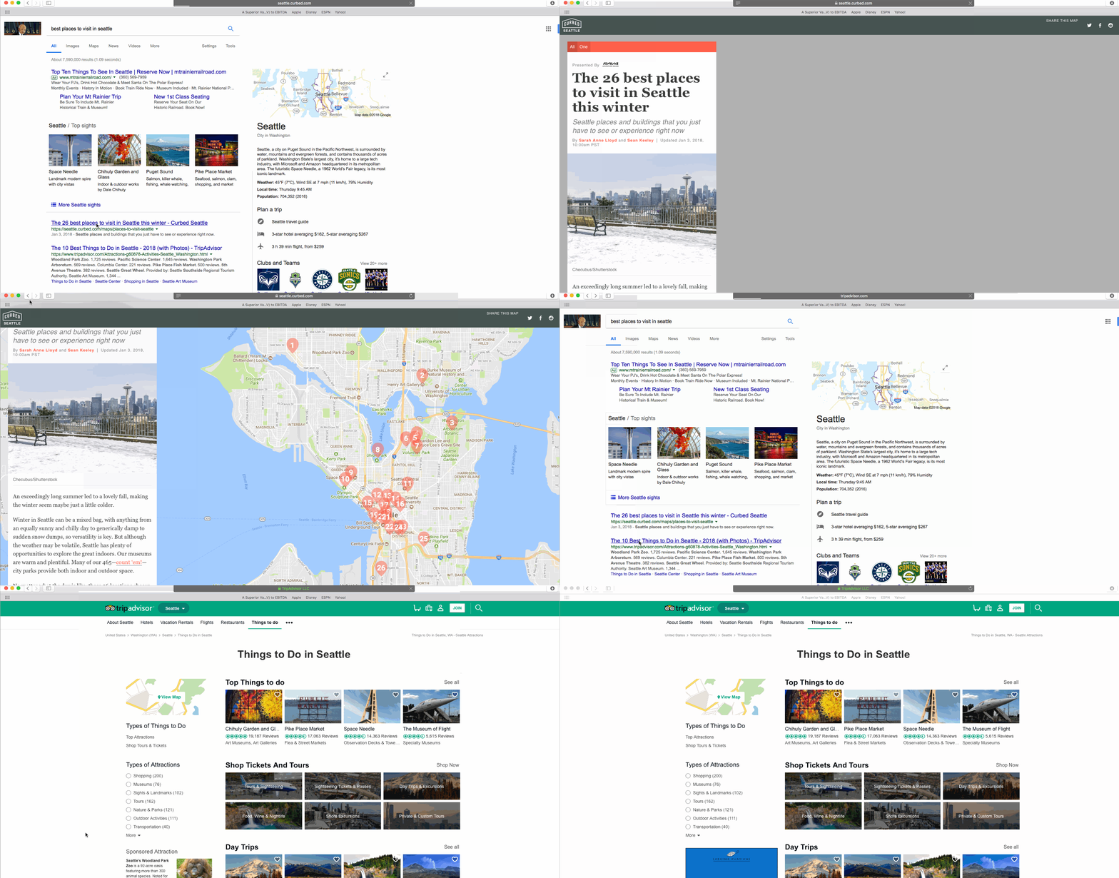
What do I mean by that? Here it is in practice:
Rand Fishkin refers to this as pogo-sticking. He says:
For every search result, there’s some different pogo-sticking rate. But great pages and sites tend to have the trait that they’ve got really low pogo-sticking rates….That means that a searcher is made happy, and they’re not coming back and doing other searches and clicking other results. Sometimes this might be okay. Maybe there are some sorts of searches where Google says, “Oh, lots of people do click multiple times, and lots of people do bounce back and forth and it’s fine.” But for the vast majority of searches this is really important to get right.
While you will likely have to stay on the first website for a few moments, if Google notices that you go back to the SERP and click on another site and don’t go back, that means that that site was more useful for you.
People search Google for a reason. They either want to find a website (i.e. branded searches) or they have a question that needs to be answered. That’s Google’s job. They answer questions for people.
People are becoming increasingly used to asking a machine a question and getting an answer. Siri, Alexa, and Google Home provide answers for people. They don’t even need to search to find answers.
You know why Wikipedia ranks so well? Because each article has thousands of words, and it answers the question that the searcher was looking for. And it’s continuously updated with new information.
It continues to rank well because people know that Wikipedia has lots of great information, so it becomes a preferred result of many searchers. They’ll seek out Wikipedia over other sites.
This comes down to answering questions and satisfying users.
Making users never want to click the back button
That’s your goal. To make sure a user who visits your site from a search never thinks about clicking the back button.
So, how do you do that?
Well, for branded searches it’s pretty easy. If someone searches for your company name, your company will be the 1st result and they’ll visit your site. The question is answered; there isn’t a worry about them clicking the back button.
If you have a blog or any online publication it becomes much more difficult. Those 9 other sites on the SERP are your competition, and they think that they can deliver a better answer to users.
Here are some examples of well-ranked sites that answer users questions without getting in the way.
Rotten Tomatoes
If you want to know if critics and an audience liked a movie, you go to Rotten Tomatoes. There isn’t any other place that can consistently answer that question.
I’ve heard the movie Three Billboards Outside Ebbing Missouri is good. So, I Googled it:
Was Three Billboards Outside Ebbing Missouri Good?
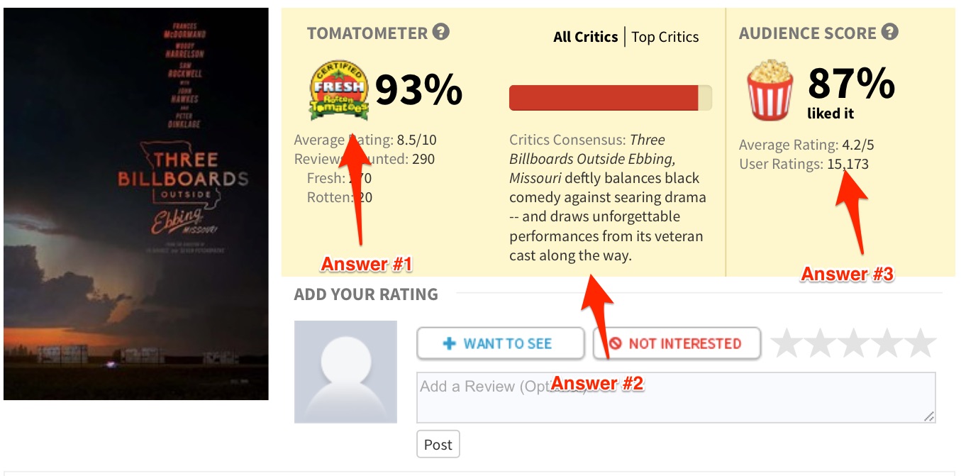
Rotten Tomatoes was the first result. I clicked and they gave me an answer:
My question is answered – looks like it’s a good movie!
Putting this information at the top of the page with the yellow background helps visitors find the information they need quickly. There no need to scroll through a long page to find the answer.
Yahoo! Answers
Is Yahoo Answers a bit stale?
Yes.
But it continues to ranks well because it answers users questions.
Let’s try a query. Recently I had a “knocking” noise coming from my refrigerator. So, hesitant to call a repairman, I decided to Google it:
what is causing knocking noise in my refrigerator?
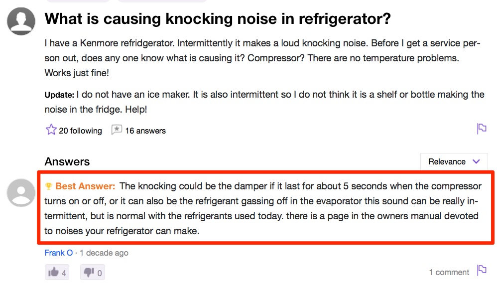
Yahoo Answers was one of the first results. I clicked on the result, and they delivered the answer:
A simple answer that makes sense. Thanks, Yahoo Answers.
Check out when that question was answered. A decade ago! Yet it’s still a favorite result from searchers.
You can remember hundreds or thousands of times where you’ve searched for something and wound up finding your answer on Yahoo Answers.
The only issue Yahoo! Answers has is that it isn’t authoritative. For example, an unqualified person can answer a medical question and if it’s rated as the answer then that is what users will see. It becomes Google’s job to put these results much lower than they would have been and place a site like Mayo Clinic higher, which they (usually) do.
wikiHow
Just think of how many times you’ve had to Google something that starts with…”how to…”
The brillance of wikiHow is that they set out to answer every question that begins with “how to…” and they do a good job of it.
I recently had to put a suit on that came with cufflinks. In a moment of embarrassment, I didn’t know exactly how to put cufflinks on. I didn’t want to look like a fool and ask one of my buddies to help me put my cufflinks on.
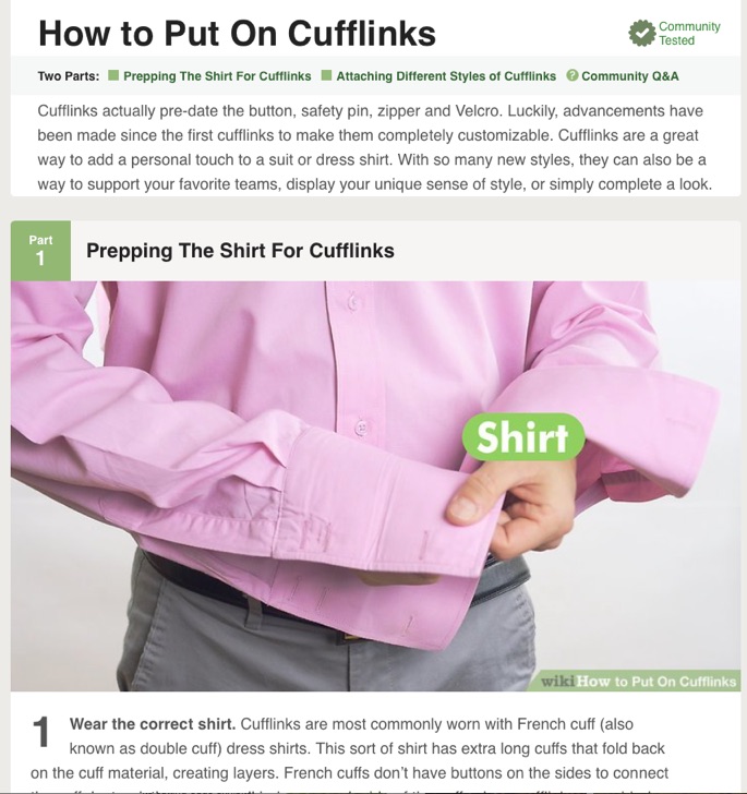
So I Googled it and landed on Wikihow. And they provided me with this wonderful answer (with pictures):
Think about how much time that took someone to write that article. They started with a blank page and wrote detailed step-by-step instructions that were crisp and to the point. Then they added pictures and gifs to help the visual learners. It probably took at least a few hours, but now they outrank everyone, including YouTube.
Tips to help you
So how do you create content that satisfies users? Here are a few of my tips:
Make it Easy For The People That Scan
Most people won’t read your entire article when they are looking for an answer to a simple question. They’ll scan and find their answer and move on. You need to help these “scanners” find their answer. It starts with putting the answers and important parts in the headers.
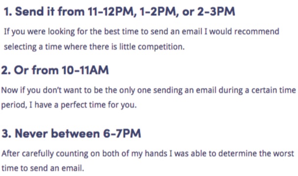
KISSmetrics has a blog post that discusses the best time to send a newsletter. People that are coming to that page are looking for an answer. So the answers are placed in the headers:
Take a look at the blog post to see the full list of tips. If you were coming from google looking for the best time to send a newsletter, you’d quickly find your answer. Why would you hit the back button?
If you have a blog post like this, then you should put the answers in the headers.
Use lightboxes and bold words to emphasize
You can also bold words and use large font to highlight the parts you want to get across.
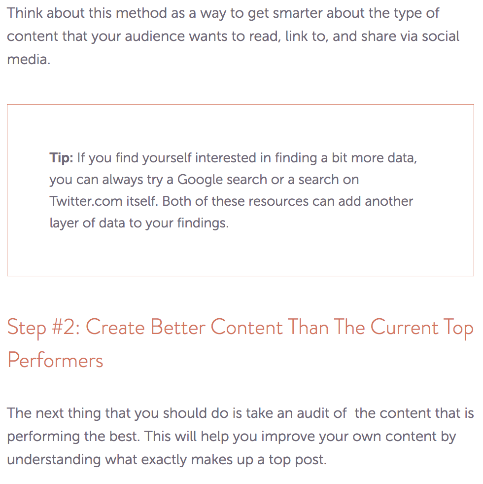
This blog post from CoSchedule uses an unobtrusive box to show readers their tips:
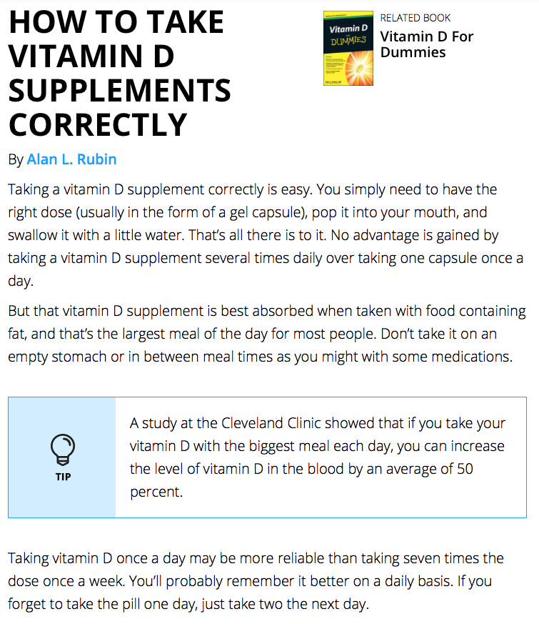
Dummies.com puts tips in a box as well, making it easy to find the most important information:
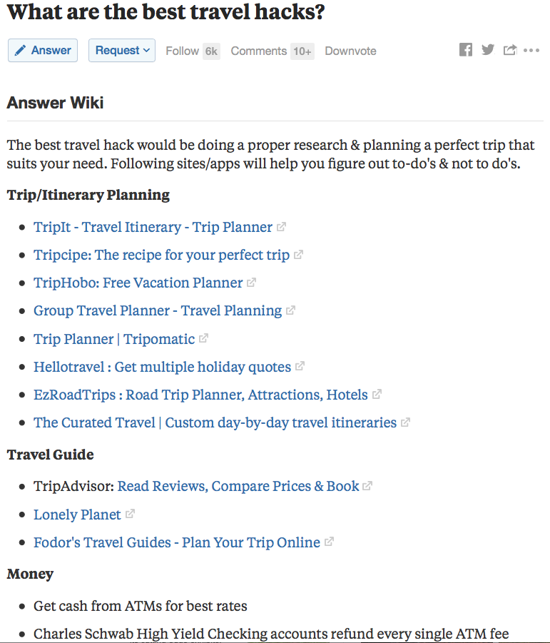
Quora is a great Q&A platform, but sometimes people don’t want to search through dozens of answers on Quora in order to get their answer.
So Quora has an “Answer Wiki”:
Here are all the answers from the Quora community, organized into one section. Is there a better travel hacks page on the web? All the information you’ll need is on one page.
Provide summaries
Often times people searching just want a quick answer. They don’t want to read a 3000-word article to answer their question. This is why summaries placed at the top of your article can be helpful.
Examine.com answers a common question at the top of the page:
There’s your answer. No searching a web page or hitting Command + F to find an answer. It sits right at the top, immediately below the question. If I wanted more information, I’d scroll and read the entire article.
In a similar fashion, ScienceDaily puts a summary at the top of each article:
Business Insider is reducing news stories to bullet points:
It’s important to remember that word count and detailed articles still matter. Yes, Business Insider uses bullet points, but they also have an entire news article.
Don’t skimp on quality or use bullet points because it’s easier for you. It’s about making it easier for visitors. Again, it’s about satisfying users. They won’t click pogo-stick (hit the back button) and they’ll be sure to visit your site again.
Use Videos and GIFs for Instructional Content
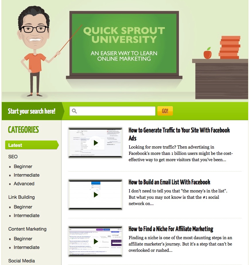
If your content contains a lot of how-tos and tactical information, it may be useful to spend some time creating videos. I’ve done that with Quicksprout University:
The university has hundreds of videos, along with the transcript of each video.
When a visitor lands on this page, they know what to do. Watch the video, read the description, and the transcript can help them reference certain parts of the video.
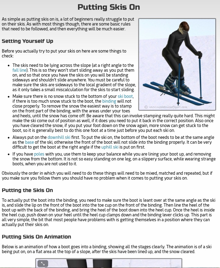
Mechanics of Sport contains great how-to content for learning how to ski and snowboard. Just check out their page and video for instructions on putting skis on:
There are four sections to this page:
- Setting Yourself Up
- Putting the Skis On
- Putting Skis On Animation
- Common Mistakes
Take a look at that page and ask yourself, “if I wanted to know how to put skis on, is there a page that could answer the question better than this?”
You should be asking yourself the same question when you’re creating how-to content. Look at the entire body of work and ask yourself if there’s any site that answered the question or gave the instructions better. If there is, you still have work to do.
Don’t use elements that make visitors want to leave
Sometimes marketers will get in the way. They’ll shoot themselves in the foot by adding too much to a page, and it ends up making visitors click the back button and never coming back.
That’s why it’s important to not add things that make visitors leave. Here are some things you’ll want to avoid:
- Autoplay videos
- Obtrusive advertisements
- Slow page loading
- Paywalls
- Surveys (i.e. fill out a survey before viewing content)
- UNresponsive design
- No message match (what visitors click on and what they see on your page don’t match)
If visitors must leave, try to get some information from them
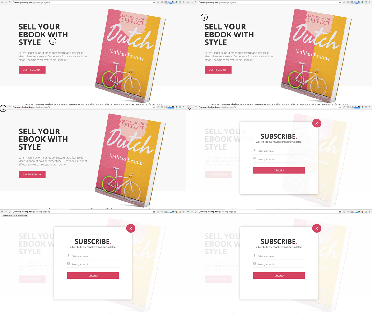
Overlays work based on mouse movement. If the software detects that your mouse is moving up towards the top of the screen, with the intention of closing the tab or clicking the back button, the overlay will appear. Here it is in action:
These are becoming more common around the web, and yes they are annoying, but they are also very effective.
Your goal is to get something from each visitor; the most common first step is the visitor’s name and email address. And overlays can deliver that. They’re great for building your email list.
My thinking is this: if visitors are going to leave my site, I at least want some information from them. The overlay is the best tool for that.
I’d recommend experimenting with an overlay. Over the long term, the best option is to hire a developer to create one for you. That way you aren’t paying hundreds (or thousands) of dollars every month to keep it running.
If you can’t start with a developer, or prefer to use a tool, I’d recommend Hello Bar or Sleeknote.
Just remember not to use interstitials or popups on mobile devices – or you’ll get an SEO penalty.
Want more SEO tips? I’ve got 3 more in this video:
Conclusion
SEO can get complicated pretty quickly.
There are so-called experts around the web promising easy ways to increasing rankings using a simple hack. Or worse, trying to sell you their service and promising you the first spot on Google.
Yet through all this noise, we often forget the fundamentals – satisfying users.
As content creators, we need to provide users with great content that helps people find what they’re looking for. That’s an answer, a how-to, or something thought provoking.
The goal is to get users to stay and consume our content. To make sure they don’t click the back button.
About the Author: Neil Patel is the cofounder of Neil Patel Digital.
from The Kissmetrics Marketing Blog http://ift.tt/2GLBcGA
via IFTTT



No comments:
Post a Comment