If you’re looking to take your business to the next level and help your products stand out, you can’t afford to ignore the power of product tutorials.
Ever tried to use a product without any instructions? It’s not a fun process, is it?
Product tutorials solve that problem by helping current and future customers understand the value of what you’re selling because they showcase exactly how to use it.
But when a product tutorial is too lengthy, too complicated, or doesn’t look like something your customer needs, they might end up abandoning it all together.
And that’s not a good sales strategy for anyone.
Because the end goal isn’t to get a customer, it’s to keep a customer.
And that means creating a product tutorial that makes it super easy for a new customer to start using—and succeed at using—your product.
So much so that they want to keep on using it. You know, forever.
Here are a few companies that did just that.
1. Buffer keeps it simple
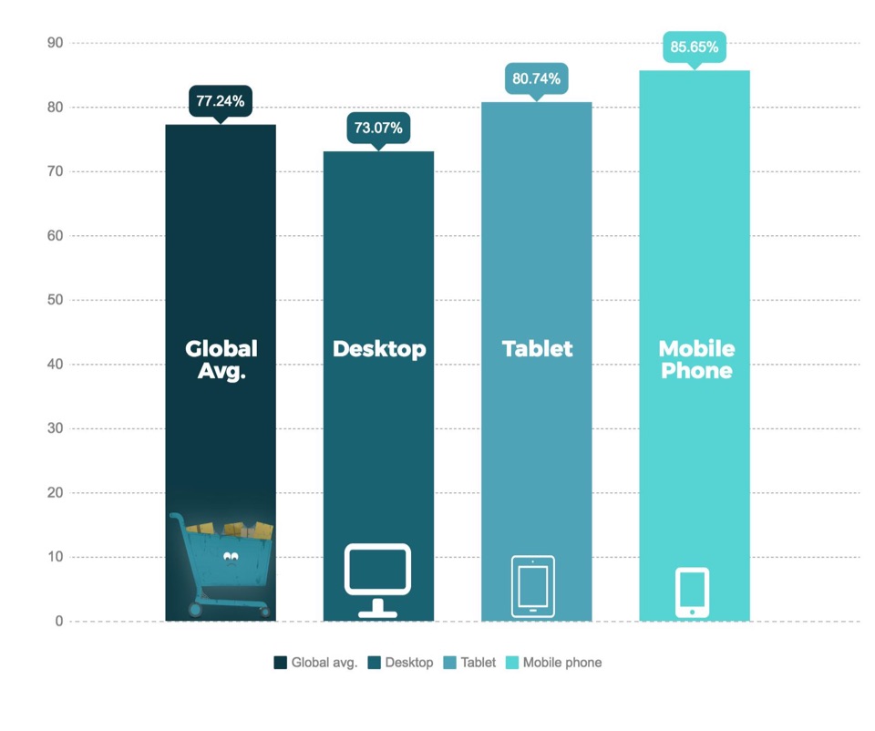
The global average for cart abandonment across desktop, tablet, and mobile devices is a staggering 77.24%.
That means there is an extremely likely chance you’ll lose your hard-won customers before they even make it through the onboarding process.
Avoid this classic pitfall by keeping your product tutorial super simple. Just like Buffer.
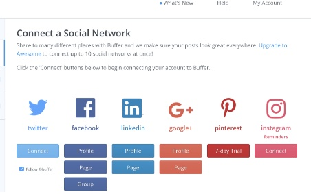
To get started, you just have to connect your social network accounts.
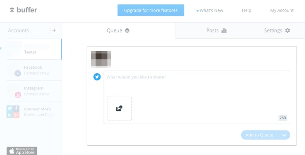
And compose your first social media post.
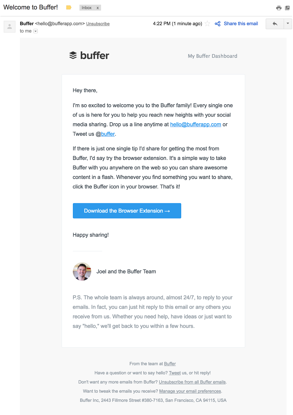
Buffer sends a series of onboarding emails to customers to help them navigate their service, starting with this welcome email:
The email cross-promotes the Buffer browser extension and provides a brief breakdown of why it’s useful.
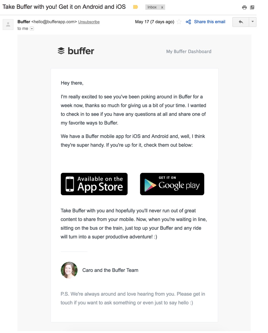
A few days later, the company sends a similar email that explains their Android and iOS app.
The entire signup process takes less than five minutes and is virtually foolproof. The onboarding email series guides customers along the way without overwhelming them.
The Co-Founder of Buffer, Leo Widrich, explained it best in this Chargify blog post:
“As entrepreneurs we’re often so excited about the possibilities of our product that we feel like we need to show our customers everything the second they sign up for our product.
Instead of doing that, at Buffer we focused on taking a step back and think about what the most successful customers did when they first joined Buffer.”
Try a similar approach with a series of short onboarding emails about your products and services.
Mint breaks their product tutorials down into small tasks to keep things simple, transparent, and easy.
2. Mint breaks it down into smaller tasks
The goal of many online products is to make something that is ordinarily complex, simple.
Mint, a financial services company, allows customers to view all of their banking accounts, credit cards, loans, investment accounts, and properties in one place.
But to see all of this information in one spot, a user first has to sort through all of their accounts, remember usernames and passwords, and upload them to Mint.
As you can imagine, this can be a rather arduous task.
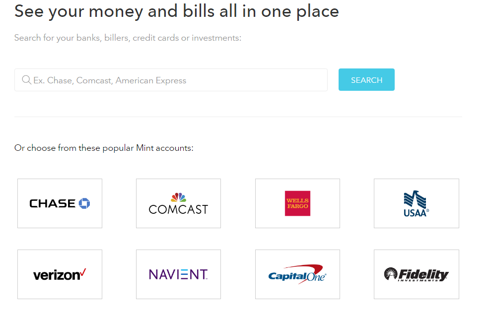
That’s why Mint breaks up a rather lengthy onboarding process into just one task: Add a bank account.
That’s it. Just one bank account.
Once a customer has added an account, they can already see a small picture of their finances.
They already have a taste of success.
It’s so easy—and so gratifying—that it makes them want to do it again. And again.
And the onboarding emails sent by Mint are one of many reasons why the company grew to 1.5 million users in just two years.
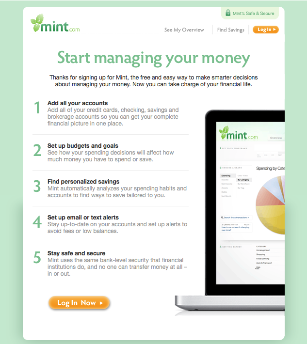
Once customers sign up for the service, Mint sends out a welcome email to help users “manage their money” in five short steps.
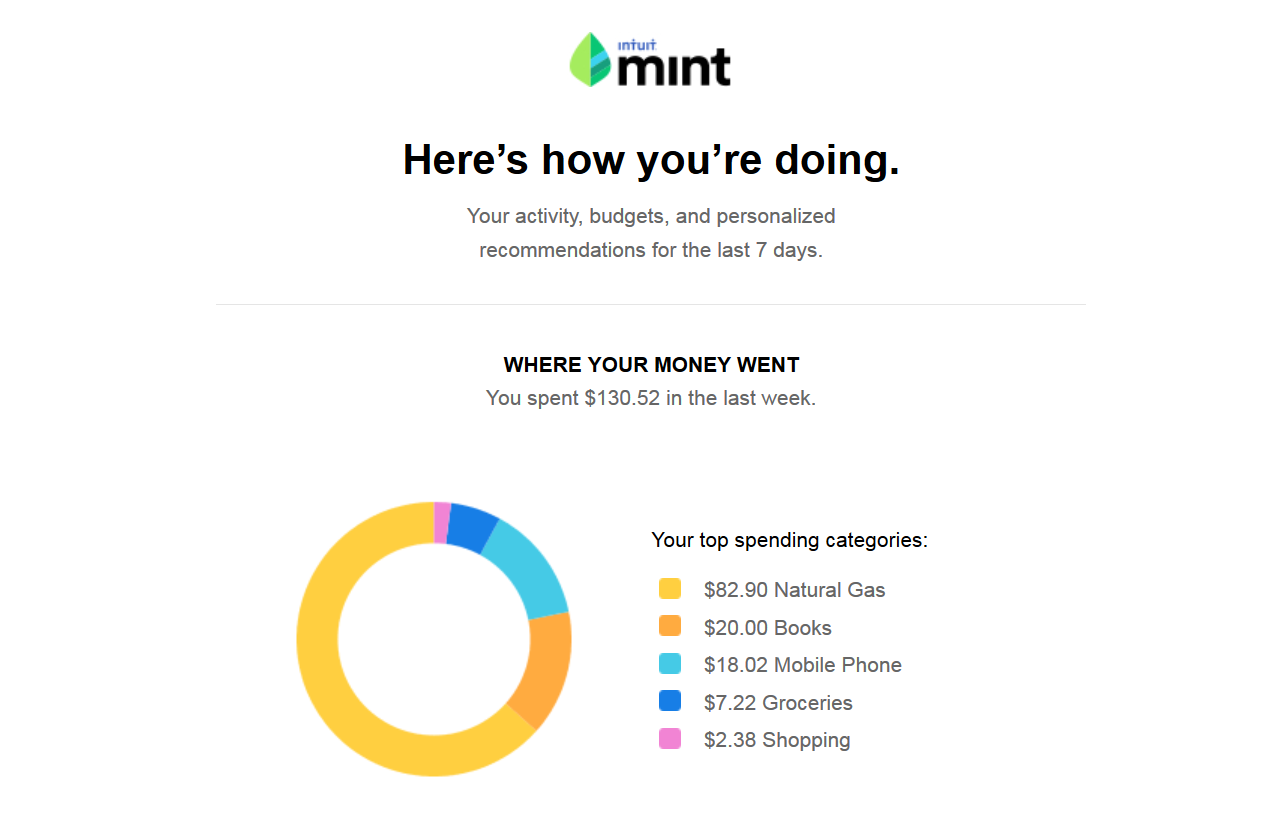
From there, users receive customized weekly emails summarizing their account activity.
By simplifying a complex process into smaller, more manageable steps, you’ll increase the likelihood that your customer will stick around to complete them.
It doesn’t hurt to have a little fun throughout the process.
3. Canva makes it fun
Virgin America rocked the airline industry when they introduced a safety video people actually wanted to watch.
It was so good that more than 12 million people voluntarily watched it on YouTube—without ever stepping foot on an airplane.
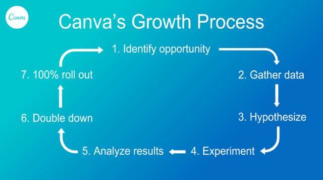
Your product tutorial can be the fun part. Take Canva for example. Their growth process is simple, fun, and proven to work.
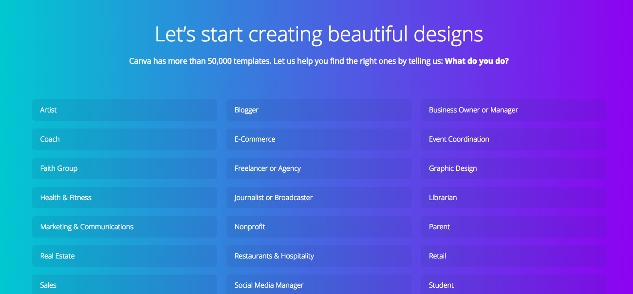
Once the customer opens the program, they’re immediately taken through the process of creating their first Canva design.
The customer can pick what they want to use the design platform for.
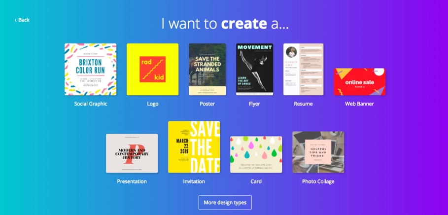
And what they want to design.
Then Canva uses animation to show them how to create design elements.
As the customer works their way through the design process, they can choose the colors, fonts, graphics, and design elements they want to create just about anything.
The fun, personalized product tutorial resulted in a 10% boost in activation for the company.
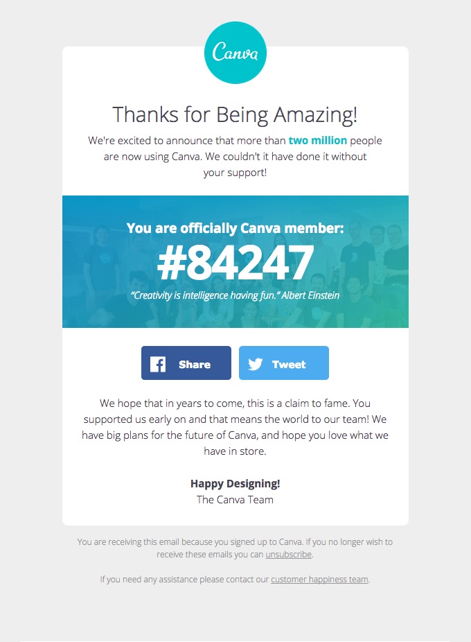
Canva’s emails are just as fun. They list which “Canva member number” that each new user is:
You can find similar success by creating exciting product tutorials and onboarding emails.
4. Evernote gets you to start now
As Ankit Jain puts it, “The key to [product tutorial] success is to get the users hooked during that critical first 3-7 day period.”
That means your customer needs to experience a taste of what your product has to offer as quickly as possible.
That’s exactly what Evernote does.
The note-taking program gives customers an opportunity to stay organized while keeping track of their meeting notes.
To get customers hooked, Evernote wants their customers to write their first notes right away.
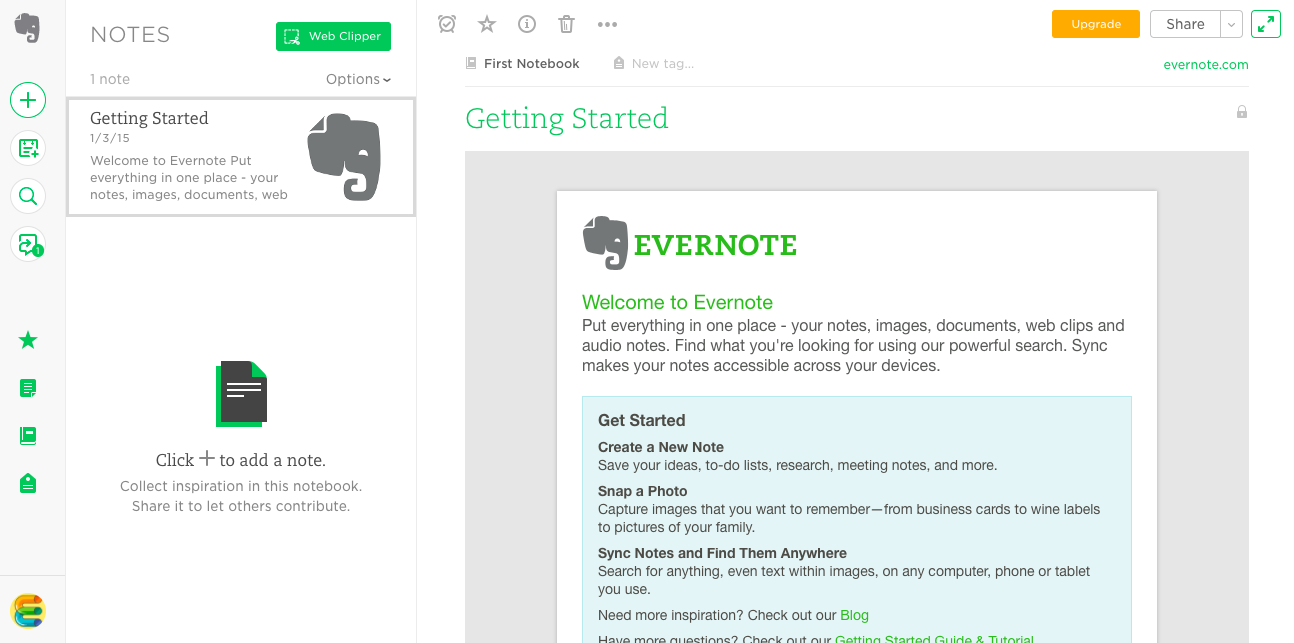
So the second the customer signs-up there is a note there waiting for them.
It tells them how to compose their first note and all the fun things they can do with it.
Once the customer starts taking notes, they’ll likely be hooked.
In fact, they might eventually have so many notes that they need to pay for a premium Evernote account.
That’s probably why more than 220 million users use Evernote.
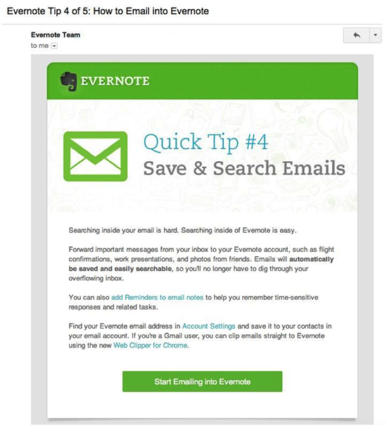
Evernote introduces new users to their service with a series of onboarding emails that teach them how to use the service to its full potential.
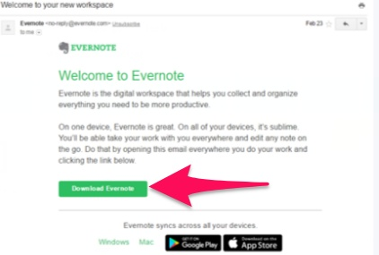
The series starts with a welcome email that wastes no time at all. There is a “Download Evernote” button right in the email body.
Cut to the chase quicker, just like Evernote, to activate more of your sign-ups.
5. Maven makes it personal
We know that email marketing is much more effective when it’s personalized. So why aren’t our product tutorials personalized as well?
For example, remember when doctors used to make house calls? Yeah me neither.
Despite the fact that house calls were way before my time, I still yearn for that level of personalized care.
I don’t want to look up answers to my health challenges online. That does nothing to reassure me.
And I don’t want to go to an urgent care clinic where no one knows me. They’ll just prescribe me something I don’t need.
Instead, I want to feel heard. I want to feel as though I’m taken care of.
And that’s exactly what Maven Clinic taps into.
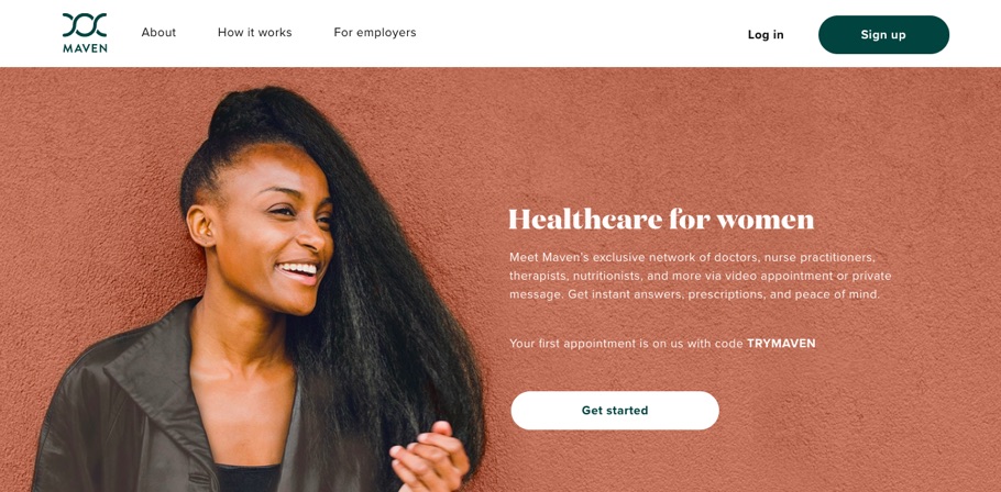
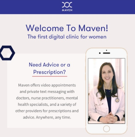
Maven Clinic allows customers to schedule video appointments with doctors, physical therapists, and mental health professionals.
Even though it operates entirely online, it still feels personal, and they reinforce that level of intimacy throughout the entire product tutorial process.
And the company’s emails follow the exact same tone.
Maven’s founder, Kate Ryder, says that this personal touch is what makes the company such a success.
“The responses we get from clients after launching Maven are fantastic — they get great feedback from their employees about how this sends a positive message about supporting a family-friendly culture.”
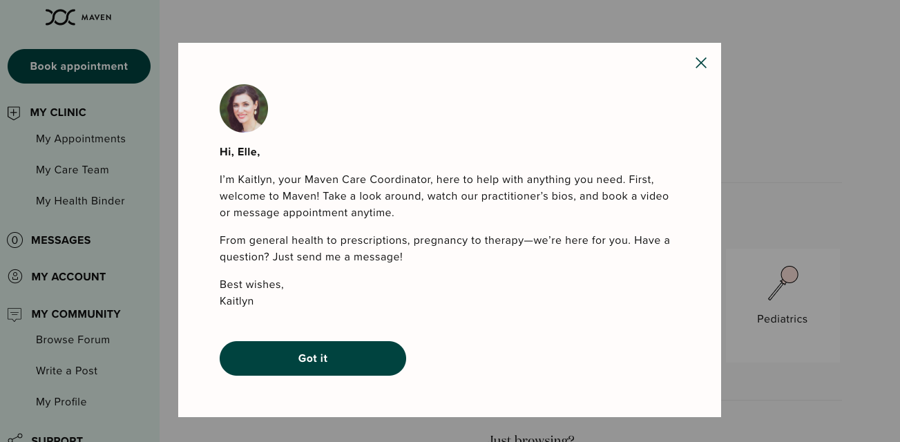
The second a customer signs-up they receive a welcome note from their own personal wellness coordinator.
The note gives the customer the opportunity to feel welcome, to feel taken care, and to feel as though there is someone available to care for their needs.
This level of personalization is important. Especially in a field as intimate as health care.
Customers want to feel as though they are part of something bigger. They want to feel connected to the world around them.
They don’t want to feel as though they are all alone in the world.
And companies are reaping the benefits. One Maven client offered unlimited maternity leave to employees.
But with the personal features offered by Maven, the longest leave taken was only 7.5 months.
Tap into that emotionality by personalizing your product tutorial.
Customers that feel included are more likely to engage with what you’ve created for them.
6. Asana lets you customize
The point of a product tutorial is not to help you get more customers, it’s to help your customers use—and love—your product.
If your customer goes through your product tutorial only to find that it doesn’t meet their needs, they’re never going to use it again.
But if you use the product tutorial as a way for your customers to customize the experience of your product, that’s a win-win.
Asana, a project management tool, does this brilliantly, which is probably why the company is worth over $600 million.
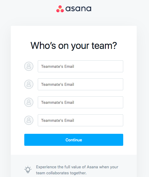
And because there is an infinite number of reasons a team might need a project management tool, the first thing Asana does is ask the customer to customize it to their needs.
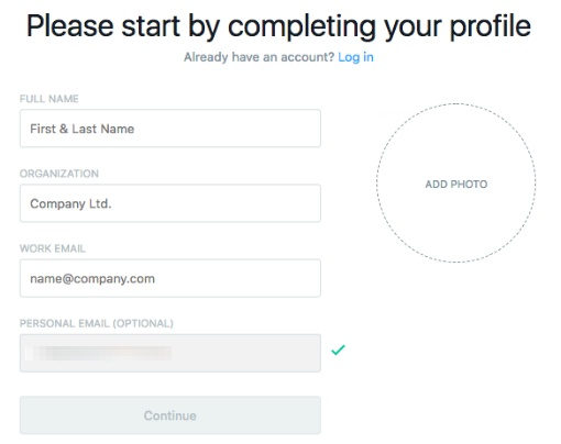
It asks about their teams:
Their first project:
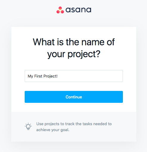
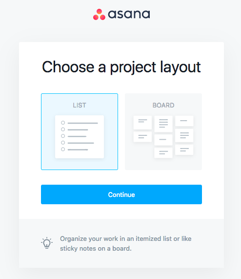
And how they want that project laid out.
From there, the customer can start adding tasks to their projects.
And by the end of the product tutorial, the customer will have a product that is specifically catered to their needs.
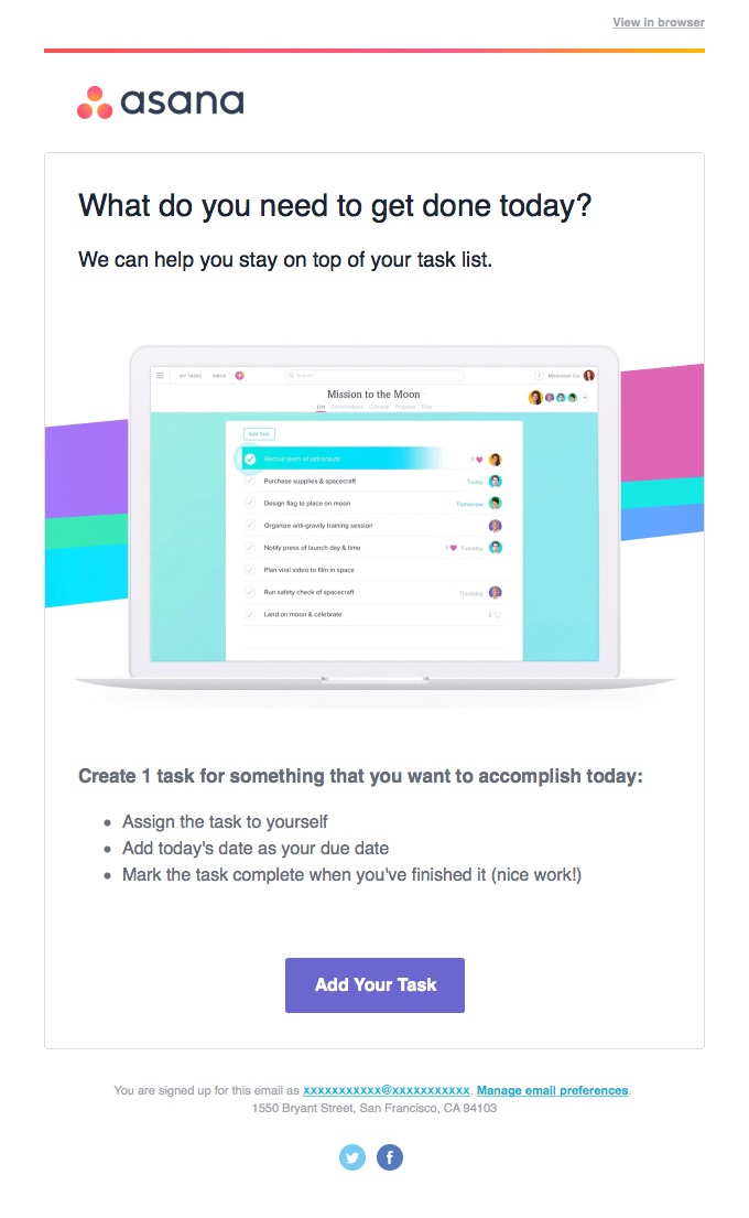
Asana’s welcome emails are just as effective. The headline reads: “What do you need to get done today?”
The result is that the customer always gets what they want.
And that’s always a winning strategy.
7. Timely has two fields
How many fields do you really need your customers to fill out?
Historically speaking, analysts have recommended using no more than three form fields on a landing page.
Yet so many onboarding processes ask for way too much information. Do you really need your customer’s first name? Last name? Phone number?
Every field you ask your customer to fill out is another chance they might not stick around to get through it.
This is an era of instant gratification we’re living in.
If you don’t need a field, don’t ask for it.
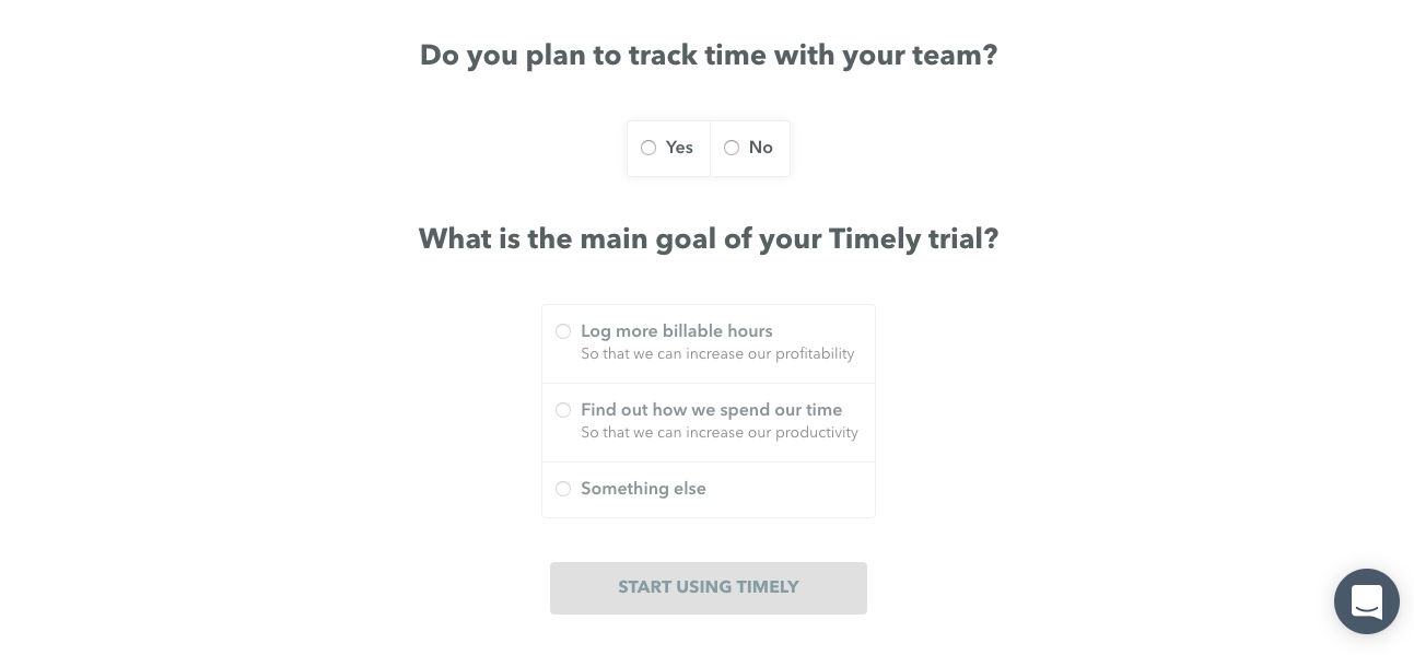
In the case of time management software Timely, they only ask for two fields.
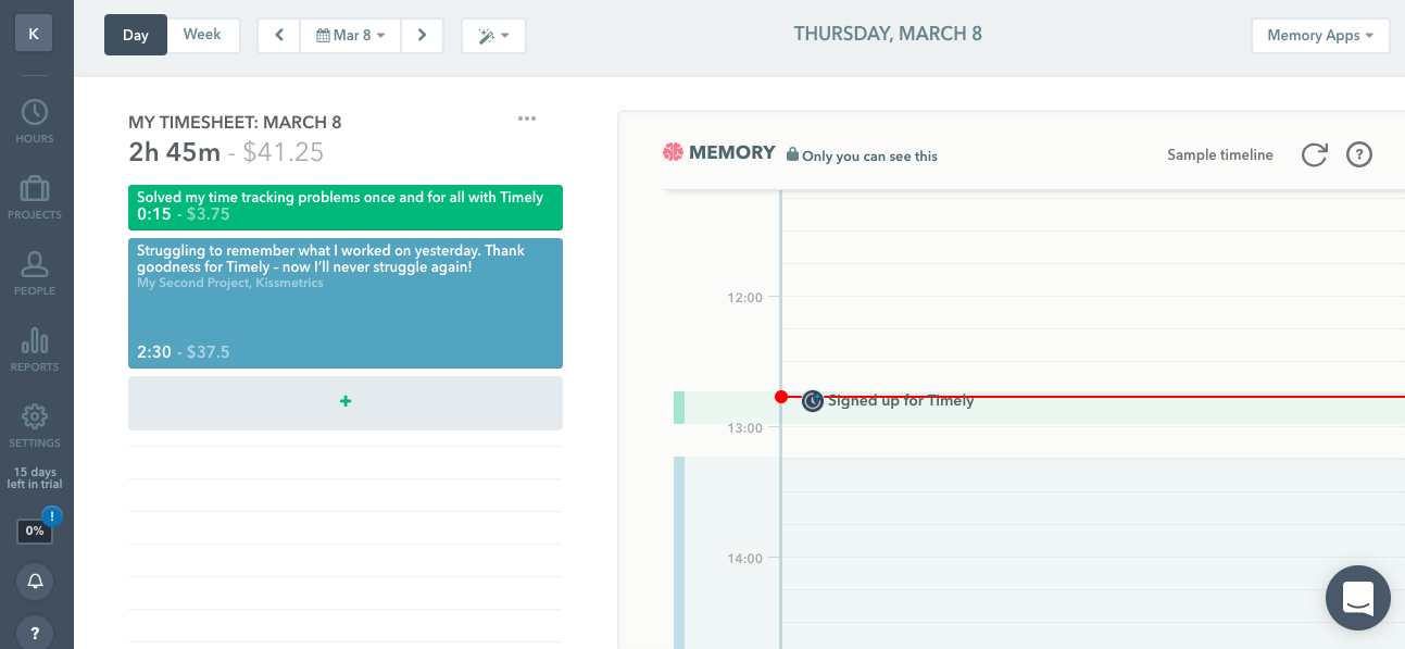
From there the customer can get right to managing their time.
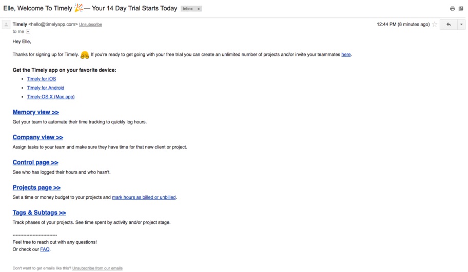
And if they need more information, there’s an email for that.
Timely understands what their customers are looking for and they only need two pieces of information to give it to them.
A good product tutorial should do the same. Ask only for what is most vital to getting your customer into your product and engaged with it.
Anything extra is just giving your customer an easy out.
8. Slack gives you the basics
I know. You want to teach your customers all about your product.
After all, you created all of those amazing features and benefits just for them.
But if your product is a little more complicated to use, please don’t try to teach your customer everything they can do with it at once.
Instead, start with just the basics. Give your customer the bare minimum of functionality they need to get started.
Once they’re hooked, you can teach them more. But at the beginning, the last thing you want is for your customer to get overwhelmed and quit.
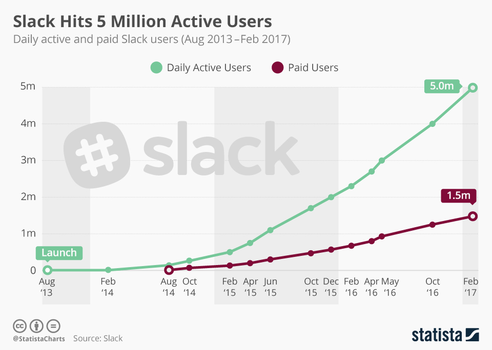
Take Slack for example. The company has over 5 million daily active users and 1.5 million paid users.
The workplace communication service was designed to roll email, instant messenger, and video chat into one app. And they even do so much more than that.
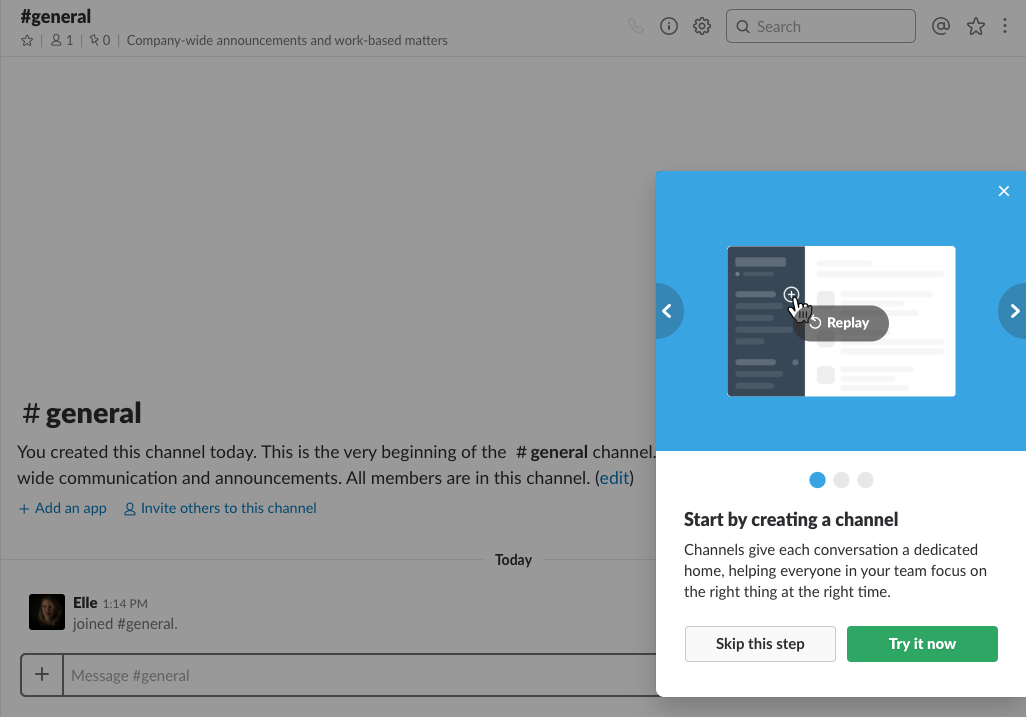
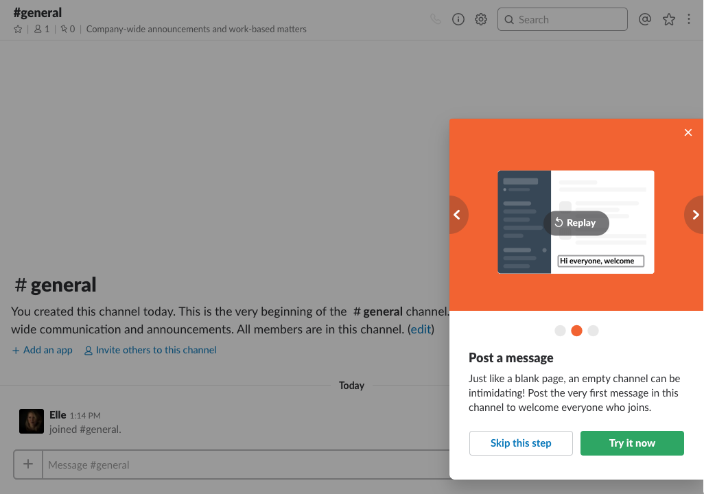
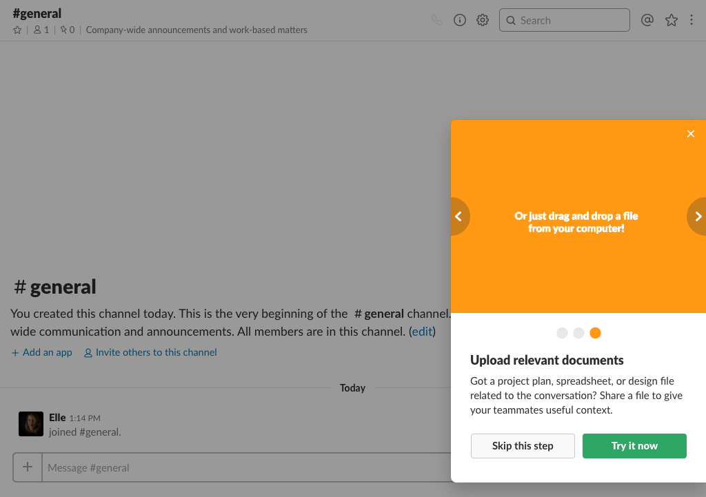
But they don’t tell you that all at once. Instead, they tell you the three most basic things you can do with their app.
They tell you all about channels:
Messages:
And uploads:
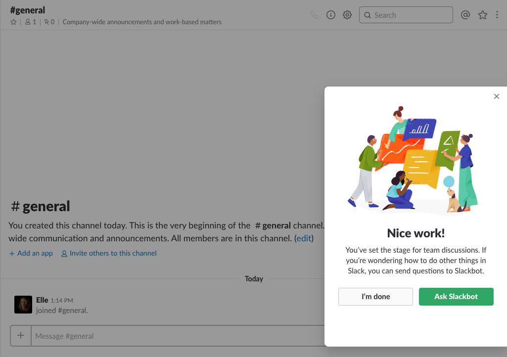
Once you have the basics mastered, Slack tells you how you can learn about the rest when you’re ready:
Slack CEO Stewart Butterfield explained this tactic in an interview:
He said, “It’s less (about) features that are ahead of where the users are and trying to understand” [the need of the customers].
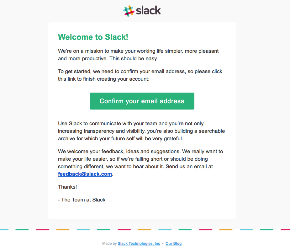
Slack’s onboarding emails keep it basic, too. Their welcome emails are sleek, simple, and get to the point right away.
By keeping to the basics, Slack users can get right to work reading through their channels, sending messages to their co-workers, and uploading important documents.
Once they see the value of your product, they’ll come back for more.
Until then, give them the bare minimum they need to succeed.
9. MailChimp hides their advanced functionality
Most businesses don’t start out with 100,000 customers. In fact, most businesses start out with just one.
Over time they grow and scale and require a lot more functionality than they used to.
But at the beginning, they don’t need all that functionality.
More likely than not, they need only the most basic functionality.
MailChimp gets that. The email platform has every bell and whistle you could possibly imagine.
That’s probably why the company made more than $400 million in 2016 and grew their user base from 12 million to six million in just one year.
They have A/B testing, integration with Salesforce, newsletter sign-up forms, and complex analytics.
But when you’re just starting out, you don’t need any of that.
In fact, when you’re just starting out, all you need is to be able to email your customers.
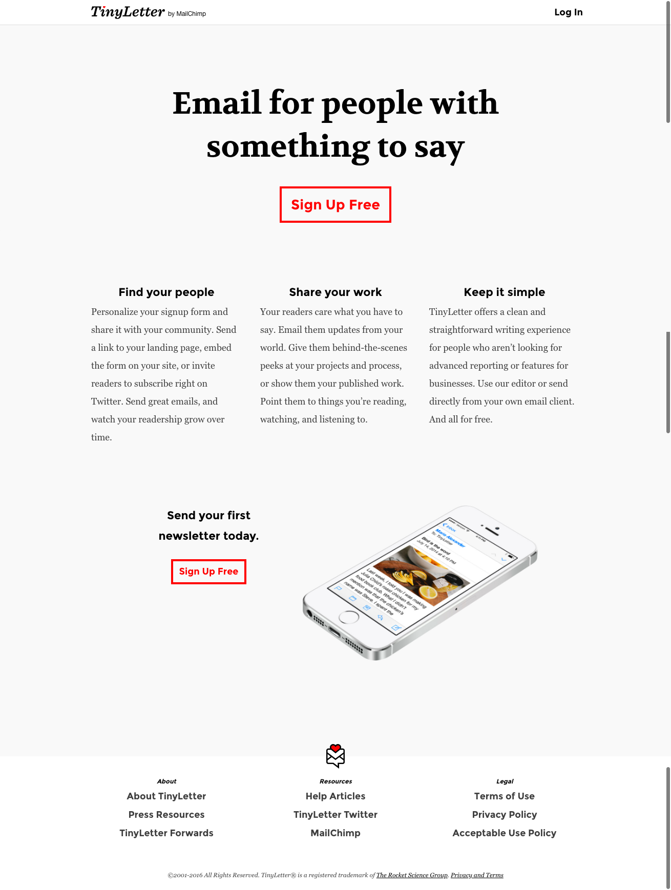
That’s where Tiny Letter comes in.
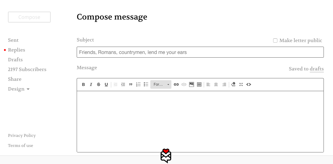
Tiny Letter is MailChimp’s lite program. All you do is sign-up, upload your existing customers, and send them an email.
That’s all there is to it.
There’s no analytics. There’s no A/B testing. There are no embedded forms. There are no design elements.
It’s just a simple way for your business to send an email to everyone you want to send an email to.
You can keep using Tiny Letter until you have 5,000 subscribers. But by then you’ll probably want to add a bell or whistle or two.
That’s when MailChimp pulls back the curtain and lets you see all of your deepest desires.
But not a moment before you’re ready to see them.
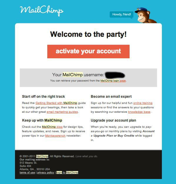
MailChimp emails are designed to serve the exact same purpose.
Online training, a knowledge base, marketing guides, and a blog are listed to help users become acquainted with the service before diving in deeper toward advanced features.
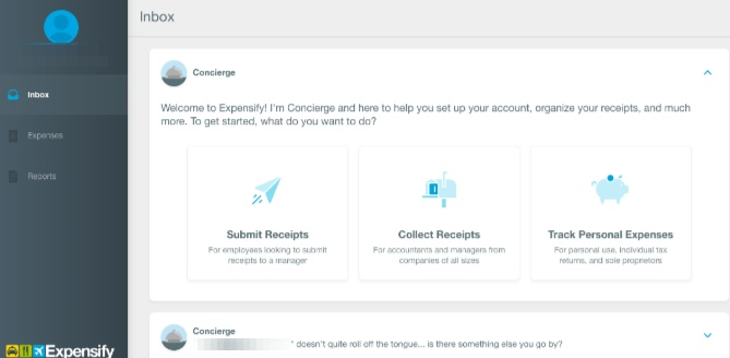
10. Expensify makes it easy
In some cases, it’s relatively easy for a customer to want your product and even to sign-up for it, but then they struggle to roll it out for their employees.
The product tutorial is the perfect opportunity for you to address those concerns.
Take Expensify, who doubled their customer base in six months, for example.
Expensify lets employees submit their expense reports and get reimbursed for them.
But getting employees to start using the program means making it as easy as pie.
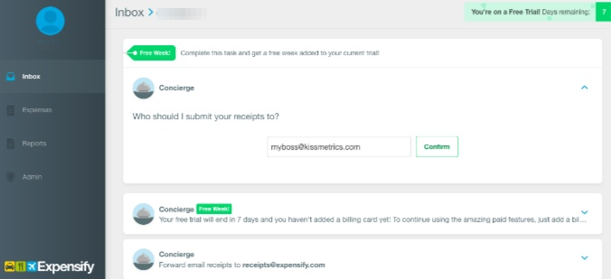
Expensify simply asks who it should submit receipts to.
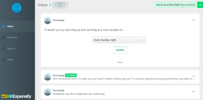
And when they should be submitted each week.
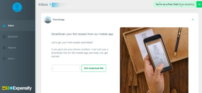
That’s it! The employee can immediately start uploading pictures of their receipts.
And Expensify will do all the rest.
The brand doesn’t even require users to create a password at first. Instead, users can create a password once they receive a welcome email. The entire sign up process is practically infallible.
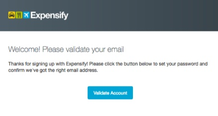
The easier it is for companies to roll your product out to their employees, the more likely they are to bridge the gap from purchaser to loyal customer.
Mind the gap. Make it easy.
Conclusion
You should be thinking about your customer and what they need from your product. Period.
Find ways to make your product tutorial simple and engaging. Give your customers what they came for. And fast.
Your product tutorial should be so easy and intuitive that anyone can get started. Even your grandmother.
Encourage your customers to take (at least one) action right away, like sending an email.
They’ll be able to see what your product can do. And whether or not they prefer your product to another one.
Keep tutorials simple like Buffer or break things down into actionable, smaller steps like Mint.
Spice tutorials up and make them fun like Canva or make users get started right away like Evernote.
Be personable like Maven or let users customize their experience like Asana.
Timely only has two required fields, which could help you keep onboard customers more effectively. Slack only gives users the basics, which keeps them from becoming overwhelmed.
MailChimp hides advanced features until users are much more experienced, while Expensify makes it easy to sign up for their service right away.
As a result, users of these services can get hooked on using these products and services monthly, weekly, or daily.
That’s what a successful product tutorial should do. It shouldn’t turn your subscribers into churners. It should turn your subscribers into users.
How have you used product tutorials to activate your sign-ups?
About the Author: Neil Patel is the cofounder of Neil Patel Digital.
from The Kissmetrics Marketing Blog https://ift.tt/2FaJZzV
via IFTTT

No comments:
Post a Comment