Thursday, 31 May 2018
Wednesday, 30 May 2018
Why Good Site Architecture Is The Only CRO You Need
When you hear the words “site architecture,” the first thing that comes to mind is probably SEO.
It doesn’t take much digging into SEO best practice to learn that Google loves a site with clearly defined architecture that’s easy to crawl and index.
But if you stopped your site architecture planning with just your SEO, then you’ve missed out on the greater picture.
Site architecture isn’t just an effort to game search engines into ranking your site higher.
It does help with SEO, but it’s so much more than that.
Ultimately, your site architecture should be a strategic effort that allows your organic or paid visitors to navigate easily and use your site for its intended purpose.
That means that site architecture is the older brother of conversion rate optimization.
So in this post, I want to show you exactly how site architecture simultaneously supersedes and enables traditional conversion rate optimization efforts.
And to start things off, I want to dig a little deeper into why so many conversion rate optimization efforts fail.
Why conversion rate optimization doesn’t always work
When dialing in your conversion rate optimization, it’s easy to want to focus on the more traditional efforts.
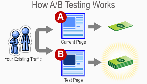
Typical conversion rate optimization efforts require brands to set up competing versions of the same page in order to see how they can improve them.
It’s like a battle royale for website pages.
After a week or two of waiting and measuring, the best performing page wins.
One of them stays up, while the others are discarded for all eternity.
From there, more experimentation occurs based on the winning page’s performance to see if anything else can be improved.
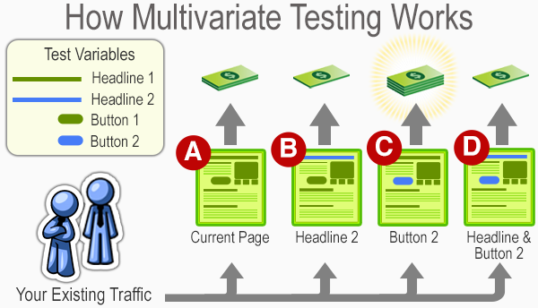
Sometimes, brands will even get brave and conduct some multivariate tests to see if changing multiple elements can yield improvement.
Much like a traditional A/B test, the results hinge on a last-man-standing approach.
Brands can be the loser, and the winner stays up as the subject of more experimentation.
All of this is an ongoing effort to see how you can improve conversions over time.
Many frequently blog about this practice, which even has its own career field in the marketing industry.
But these types of tests aren’t always the most dependable for small brands that need to optimize as efficiently as possible.
And even some large businesses fall prey to common A/B testing mistakes.
For example, elements like sample size can drastically skew the results of conversion rate testing.
Simply put, if you’re not getting enough traffic, then you’ll be making changes and concluding off of insufficient amounts of data.
That means you could be making the wrong moves and ultimately hurting your brand’s performance.
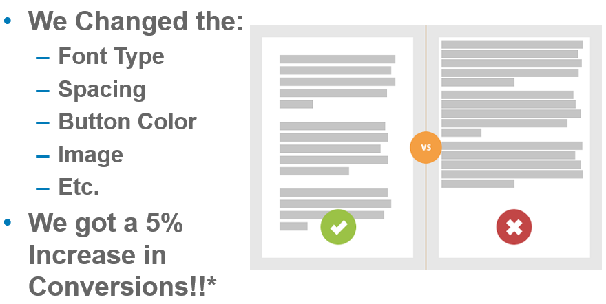
Or you could also be testing something silly, like colors on your website.
To put it in ConversionXL’s Ott Niggulis’ words:
“There is no universal best color. What works on one site, doesn’t necessarily work on another.”
And that’s part of the point as well.
Many conversion rate optimization trends rise on the backs of a brand or two saying they saw good results from a particular experiment.
Then everyone does it, and confusion results when improvement doesn’t follow.
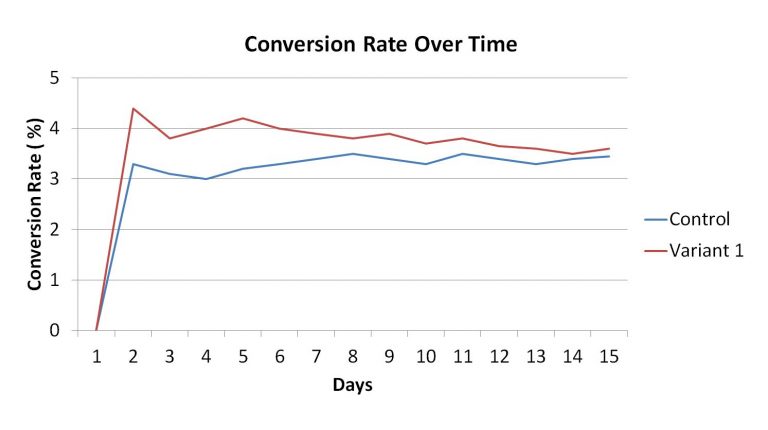
And then to make matters worse, many brands often don’t allow a proper amount of time to see if their results end up sticking.
If your variable regresses back to your control’s average, then there’s a good chance that dropping your control could be a bad idea.
Many brands will prematurely make a decision on the first few days, which ultimately hurts them in the long run.
People call this the small win mentality. It ultimately leads to poor optimization and potentially undermines your results.
So with all of the potential pitfalls of traditional conversion rate optimization, can site architecture create a more foolproof way to ensure that your website sees plenty of conversions?
To answer that, I want to break down some of the basics of site architecture and show you how it correlates to your conversion rate optimization.
How site architecture creates conversions
Your site’s architecture focuses on building a platform that is easier for your users to navigate.
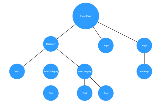
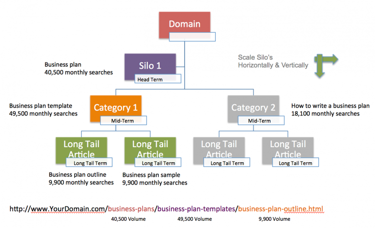
When you look into what site architecture actually is, you’ll typically see a graph that offers a genealogy-like depiction of how pages on your site interact.
While there’s a good chance no two sites will be exactly alike, this hierarchy style is a pretty standard example.
You start from a homepage and then navigate through a series of categories and subcategories until you’ve found what you’re looking for.
If this process is fluid, as in the graph above, then your users will have no issues.
But if the architecture is muddled, and it’s hard to find a page that should fall under a natural category, then it’s increasingly more likely that your users will leave.
In other words, the idea is to create a fluid user experience that ultimately leads to trackable and accurate conversion testing.

If you implement this correctly, you’ll have a site that’s easier to improve on in the long run.
But does site architecture have a genuinely positive effect on your conversions?
A brand called Voicer reported a 75% increase in conversions by correcting some “small” user experience flaws in their site.
If they can see that kind of improvement from small changes, imagine what would happen on a site that has significant user experience problems.
And yet another brand reported a 112% increase in revenue by improving the usability of their site.
So, good site architecture that leads to good user experience can clearly act as a solid basis for conversion rate optimization.
But breaking down the user experience of your website isn’t a simple process.
It requires a great deal of data gathering and analyzing to get to a point where you can indeed create a site architecture that works well for conversions.
Thankfully, there’s a method called the honeycomb model that shows you how exactly user experience can be broken down to help optimize your conversion rates.
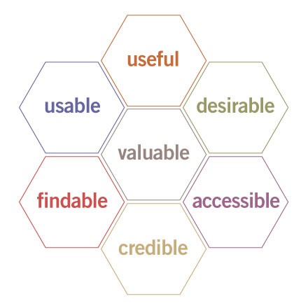
This methodology provides a simple framework that helps brands create websites with the following characteristics:
- Useful: Serve the purpose for they created it.
- Usability: Simple and easy to use.
- Accessible: Anyone can use it.
- Desirable: Provides positive emotion and is pleasant to use.
- Findable: Navigation is intuitive, and solutions are easy to find.
- Credible: Conveys in a believable or trustworthy manner.
- Valuable: Delivers on a promised value.
If you can fulfill all of the requirements in the honeycomb model, then you optimize your sales funnel paths naturally for conversions.
So for the rest of the article, I want to show you some ways that you draw a direct line between user experience, site architecture, and conversion rate optimization.
You’ll see without a doubt that site architecture is a viable path to increase your lead generation.
Reason #1: It gives your site utility
The first steps of the honeycomb model rely on creating a website that is useful and usable.
This addresses the utility and the function of your site in a few ideas that are easy to understand.
But just because they’re easy to understand doesn’t mean they’re easy to implement.
When building out your site’s architecture, you need to create an experience that helps your user find what they came for.
This natural flow is the first place to start when addressing the usability and usefulness of your website.
This ultimately determines how people interact with your website.
And how they interact with your website will, in turn, determine how many conversions you get in the long run.
Think of it in terms of an example involving a site that sells power tools.
On a well-designed website, this would be a logical flow of thought:
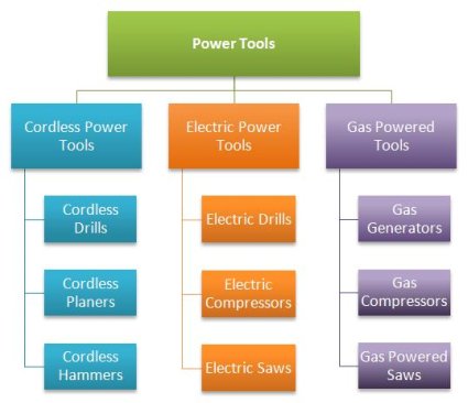
Users can navigate based on the type of tool that they want to find. The site then presents individual products according to whether they are cordless, electric, or gas powered.
Now imagine if you were to switch some of the products around.
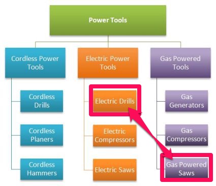
In this case, if you were trying to find a gas powered saw, you would naturally look under the gas powered tools.
If you misplace this in your site’s architecture, a user might navigate to the logical page but still be unable to find a product you actually have.
That means no matter how much you optimize the page, your organic traffic will struggle to navigate your site and may ultimately leave.
So when linking site architecture to conversion rates, the first place most brands start is with a mockup of what they want their users to achieve.
The purpose is to base the entire website design process on actual data and user behavior.
In the words of Paypal UX designer Larry Sawyer:
“They say a picture is worth a thousand words, but a mock-up is worth even more than that.”
So this design process typically follows a flow of testing, analysis, definition, ideating, prototyping, and then validating.
If you follow this particular model, you’ll be able to create a website that is usable by anyone in your audience and thus inherently useful to all parties.
So your initial goal is to optimize your site according to what visitors are doing.
You then take that information and analyze their behavior to see what stands out.
How they use your site defines what is essential, which further provides you the ideas you need to test if you want to improve your conversions.
From this information, you create a prototype of your website, and then validate your findings with additional testing.
If the prototype is invalid, you rinse and repeat until your site is in complete working order.
Keep in mind that this style of UX design does typically involve more design than just site architecture.
But for our purposes, we want to focus on the bigger picture.
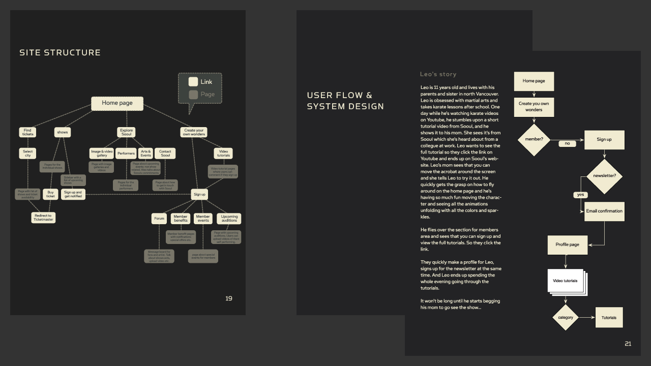
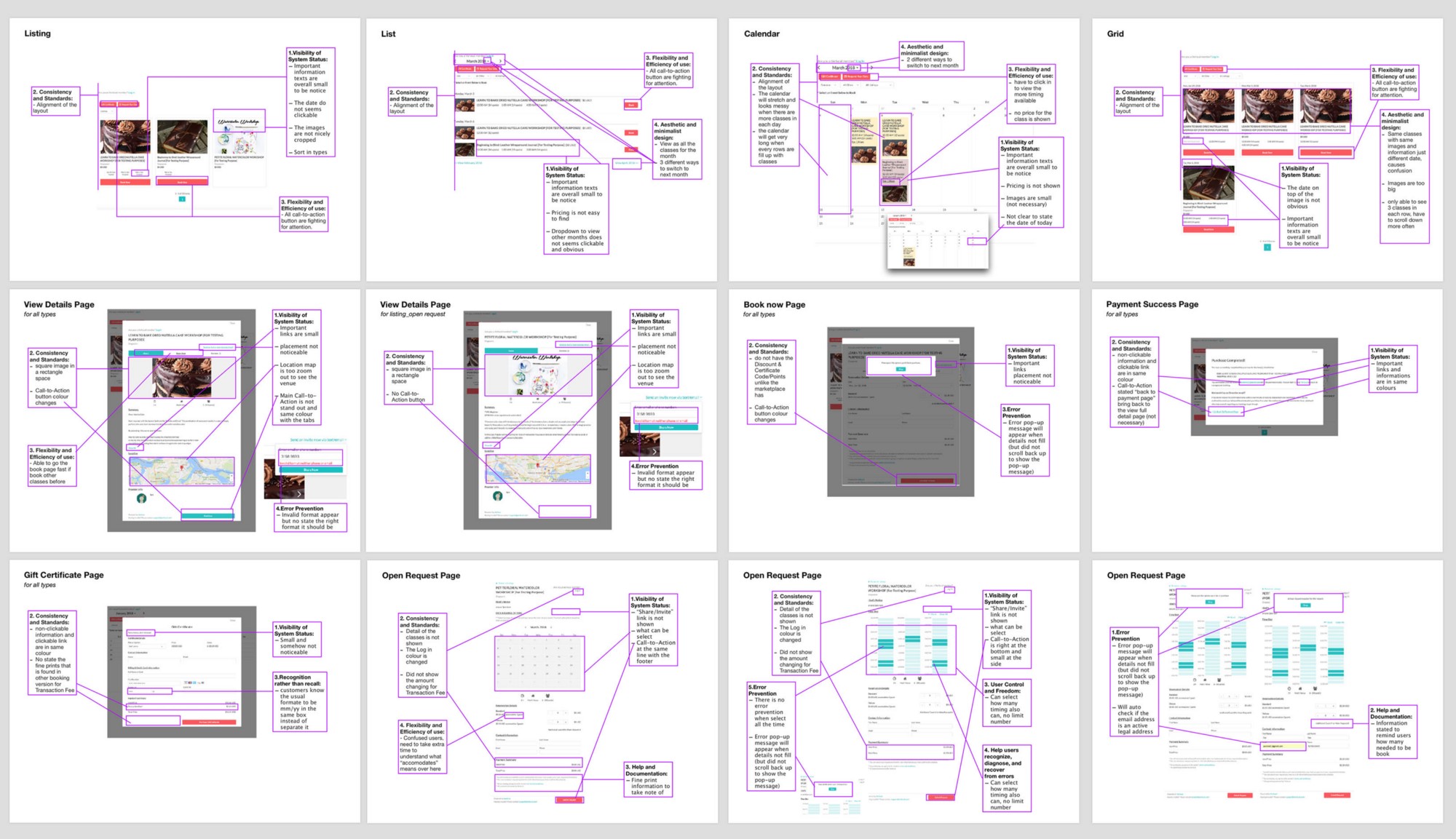
So when finally creating your site’s architecture mockup, many brands start with a comprehensive markup of how the elements of every page contribute to the user experience.
As this professional breakdown demonstrates, you can draw out and improve every aspect of your site.
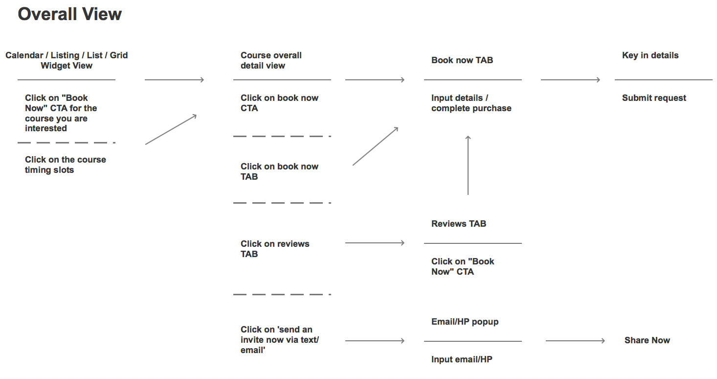
From this exercise, you can create a basic outline of what your users should achieve on every page of your site.
The purpose here is to take a vast amount of data from your original design and then strip it away until only a series of user actions remain.
This, in turn, dictates your site’s architecture as it is a direct representation of how you want your user to use your site.
From this simplified design, one then typically creates a more comprehensive wireframe mockup.
Once you’ve completed the wireframe, you only need to finalize your imagery, copy, and calls to action.
You can then test your new prototype site to see if your user experience is positively affected.
If this simplifies the actions your users take, then you truly aligned your site’s architecture with the intent of your audience, thus fulfilling the usefulness and usability criteria.
This process can be tedious, but it’s a great illustration of how data-backed and conversion oriented your site architecture really is.
If you can successfully do this with your site, you’ll be one step closer to creating a better overall conversion funnel that will help your brand for years to come.
Reason #2: It creates positive momentum
As we move deeper into the user experience and site architecture connection, the next layer according to the honeycomb model hinges on creating positive momentum.
That means according to the honeycomb model it needs to be desirable, accessible, and findable.
So once you’ve established a flow and created a site that’s usable on any device, the next step is to move beyond and create a pleasant experience.
It may surprise you to learn that one in three users will leave a site because they can’t find a product.
That means your site architecture can hurt conversions in a very direct way.
So your goal at this point should be to create a site that’s both easy to navigate and that builds natural forward momentum.
If you strive to emphasize the architecture of your site with compelling storytelling, the natural result will be that more users complete actions on your site.
That means finding a way to create a site whose architecture naturally lends itself to being informative, interactive, and even at times entertaining.
Consider the example of the site My Grandmother’s Lingo.
This award-winning website helps users learn new words from one of the oldest language in the world.
The creators designed the website for use and utility but even took that effort a step further by making it compelling and engaging.
The tantalizing idea of learning something both old and new hooks the user, and then sends them on a 10-minute journey where they learn something.
In the end, the primary goal is to help spread awareness of these ancient languages and provide a platform for future preservation.
How do they achieve this? Through vivid storytelling and a clear site architecture that’s geared toward positive momentum.
But momentum isn’t just about storytelling.
It also relies on where you position yourself, like on mobile.
More than ever, users are browsing with a mobile device.
That means that the architecture of your site needs to be conducive to both a desktop user and a mobile user.
If you only focus on one or the other, you are missing a significant portion of your potential audience, and thus you are losing conversions.
And if someone comes to your mobile site only to find it isn’t optimized, then all positive momentum is gone.
But momentum has to start even further back with your SEO.
And site architecture plays a critical role in bringing organic traffic to your site and providing forward momentum.
In one study, a brand was able to increase their site’s organic traffic from 800 visits per month to over 3,600 per month by focusing on the user experience their website gave.
That’s a growth of 350%.
They achieved this by focusing entirely on the information architecture of their site and its contents.
So it’s clear that site architecture can lead to more traffic.
If your traffic can access across any device, then your momentum continues.
Moreover, if your storytelling is engaging, you further the momentum again.
And all of this links back to your site’s architecture and how well both Google and your audience utilize it.
Reason #3: It ultimately clarifies value
The final reason that links your site’s architecture to your efforts concerning conversion rate optimization hinges on your site being credible and valuable.
Another way you could say that is, “How does your site’s architecture help you deliver on your promise?”
If you fail to deliver a promise by creating a muddled and confusing site, then you’re never going to be able to see any real improvement from an A/B test.
And according to the LIFT model of CRO, the clarity and relevance of your value proposition will ultimately take your brand to new heights.
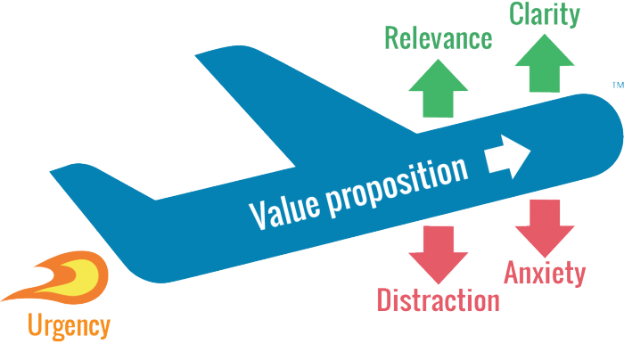
The key to remember here is that users don’t always come to your website via your homepage.
There’s a good chance they could enter at any given point, so long as they have the right URL.
For example, how do you potentially sell – via your site’s architecture – to a visitor who first visited your blog?
If you don’t have a way for them to get their bearings and navigate your site immediately, you could potentially lose a lead before the process even begins.
Your goal then, with your site’s architecture, is to provide value at every stage.
That means that when someone comes to your site, they should immediately know where they are.
Elements such as your permalink structure even play a role in helping your visitor understand where they are and what value your site offers.
If you parse your site out into easily understandable silos, like the example above, users will see your site as much more credible and ultimately more useful.
Take for example the Merge and Purge case study that sought to boost organic traffic and improve user experience.
In this case, the focus was on taking disparate pieces of content created over many years and compiling them into understandable content silos.
When the site was simplified, they saw a 32% increase in organic traffic.
And as we’ve already seen, organic traffic is the part of the site architecture conversion machine.
So in this case, by clarifying the value of their site by creating a cleaner content architecture, the brand was able to achieve a big win.
Brands should always seek to clarify their value proposition, and in this case, the answer is simple:
Your site architecture is the best place to start.
Conclusion
Conversion rate optimization is a nuanced and technical field.
It takes a lot of time and effort to learn the ins and outs of what works and what doesn’t, and that often trips up brands that seek to experiment and grow their online presence.
A/B tests fail very often, and the resulting frustration often turns businesses away from conversion rate optimization as a whole.
But if you were to focus on creating a robust site architecture, the results can be very different in the best possible way.
Site architecture is the backbone of conversions, and following the honeycomb model to help improve your user experience is the best course of action.
If you do, your site will have much more utility, and your site’s users will be able to navigate with ease.
From there, you can use your architecture to build positive momentum and keep people engaged with your brand.
And finally, you’ll have a clearer and more appealing value proposition that users can find from any entry point.
You’ll be much better suited to grow and convert new leads by merely creating a solid site architecture.
How has your site’s architecture helped or hurt your brand?
About the Author: Neil Patel is the cofounder of Neil Patel Digital.
from The Kissmetrics Marketing Blog https://ift.tt/2sp0xQk
via IFTTT
The 'Where are you from?' meme reminds us to look at a map every once in a while
/https%3A%2F%2Fblueprint-api-production.s3.amazonaws.com%2Fuploads%2Fcard%2Fimage%2F782693%2F50ed17c9-f87a-4fc3-9890-35eff3f5bb98.jpg)
Growing up in a small town, leaving said small town, and then having to explain where you're from to curious people you encounter for the rest of your life is exhausting.
Sure, people are mostly familiar with the 50 states, but when someone asks "Where are you from?" they usually want specifics like towns, noteworthy landmarks nearby, etc.
Trying to explain geography to someone completely unfamiliar with an area is tough, and finally, Twitter users have found a way to accurately illustrate the frustration associated with describing your place of origin.
Behold: The hometown meme.
More about Twitter, Memes, Culture, Social Media, and Hometownfrom Social Media https://ift.tt/2slakH4
via IFTTT
Tuesday, 29 May 2018
25 Sales Questions to Qualify Your Leads Faster
You can attribute a lot of great relationships to perfect timing.
When you connect with the right person at the right time, everything seems to just fit.
This is especially true for sales.
Connecting with your lead too early means they won’t be ready to buy.
But if you wait too long, they may have moved on to a competitor.
Unfortunately, finding the perfect time to connect with a customer is complicated.
It’s not like you can set a timer that will ding when they’re ready to connect.
Instead, you need to qualify your leads yourself.
It’s always important to connect with your leads to figure out where they’re at in the buying process.
Asking questions, getting feedback, and building a relationship can set you on the right path for being available when they’re ready to buy.
To help you qualify your sales prospects, here are 25 questions you should be asking.
Establishing the relationship
The relationship is the most important part of closing a sale.
When it comes time to make a purchase, your consumers aren’t going to buy from just anyone.
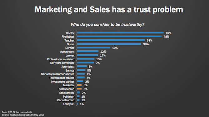
Instead, they’re going to turn to someone they know they can trust. Unfortunately, only 3% of people trust marketers and salespeople.
In order to be there when they’re ready to buy, you want to work on establishing the relationship early on.
To lay the foundation for the business relationship you’re creating, here are a few questions you should be asking.
1. How did you hear about us?
Sales leads should be coming to you from a variety of angles.
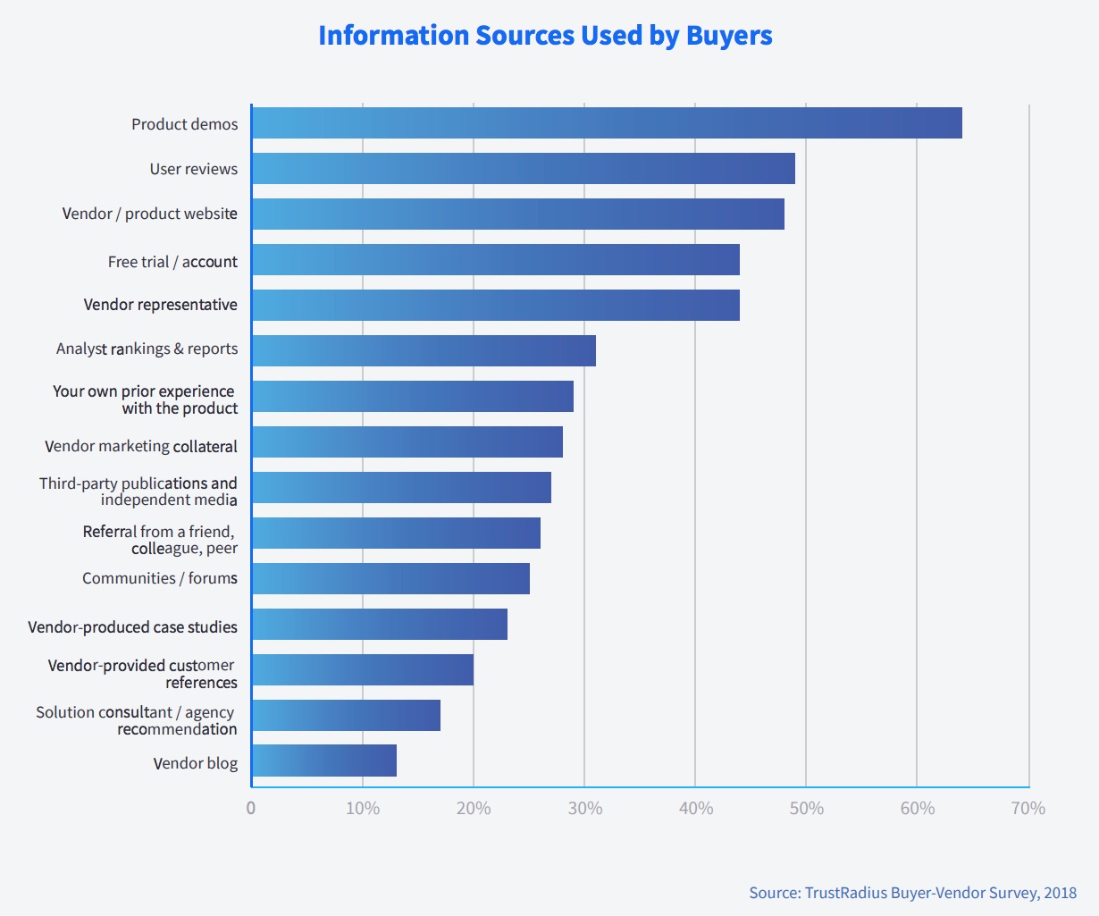
In fact, buyers typically consult almost five different information sources when deciding on products, vendors, or services.
Some may find you on social while others may have participated in a webinar that you hosted.
Referrals are another popular way new sales prospects tend to find potential vendors or agencies.
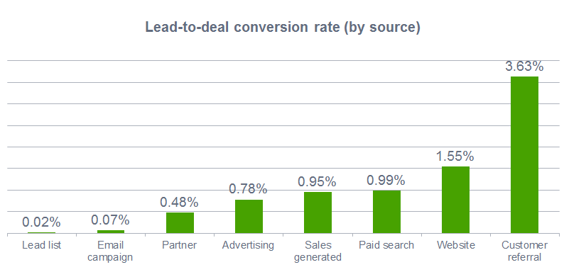
Customers or clients who come to you by referral actually have a 16% higher lifetime value.
Knowing how the lead found you can help you understand the best way to move forward.
If the lead is a referral, this can strongly influence their willingness to work with you.
You can leverage that relationship to win over the lead and convince them to purchase.
If they found you through a more traditional lead generation source, you can get a better understanding of what aspect of your brand interests them.
2. What are you looking for in a new vendor or agency?
Ask your leads what their “dream” vendor or agency would look like.
Have them point out three key factors that they’d expect out of a new vendor or agency.
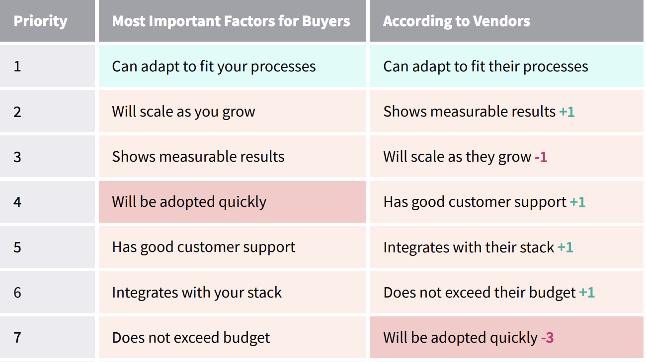
For buyers, the most important factors of a new pairing are adapting to fit processes, scaling with growth, and providing measurable results.
While you may not fit this description perfectly, it can help you better understand what they’re really looking for.
Then, think of ways that your company fits the description they’ve created.
However, don’t try to trick them into believing that you’re exactly what they’re looking for – especially if you’re missing some key components.
Instead, be upfront and honest about what you can provide and how you can help.
This kind of honesty can do wonders for the relationship you’re creating.
3. What attracted you to our brand?
Try to find the characteristics or qualities that made you stand out to your prospect.
Whether it’s your unique branding or your pricing strategy, understanding why the lead likes your brand can help you better understand where their priorities lie.
Knowing their favorite points about you can also give you an angle to focus on during your conversations.
For example, say that a lead mentions that your pricing attracted them to you the most.
This means they’re probably sticking to a tight budget.
As you nurture the lead into making a purchase, you can focus conversations around pricing and budgets.
This personalized approach can convert leads faster and help the prospect feel like you’re taking care of them.
4. How can we best help you make this decision?
Every sales prospect has something holding them back.
Whether it’s budget or not being entirely sure what they need, you want to find the hurdle that’s preventing them from pulling out their credit card.
Finding where that obstacle is can help you qualify your leads faster.
Ask your sales prospect what you can tell them about or offer them that will help them say “yes” to a deal.
Remember to listen to their unique challenges and fears.
Even if you’re trying to qualify multiple leads at once, you want each to feel special.
5. Who else is part of this decision-making process?
On average, 6.8 people are part of the B2B decision-making process.
Unless you’re working with very small business, you’ll probably need to convince more than just one person that you’re the right agency or vendor for them to work with.
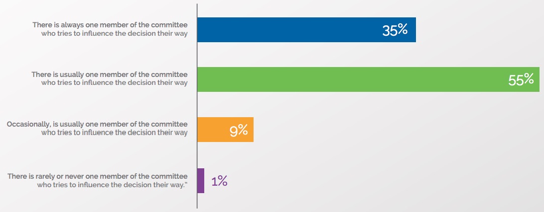
However, 90% of individuals stated that there is usually one member who pushes the decision their way.
To ensure you’re establishing a relationship with all the right people, you want to find out exactly who is involved in the process of making decisions.
You’ll also want to find out where this individual fits within that process.
Knowing if you’re dealing with the CEO or the manager can make a major difference in how you pitch your solutions.
Discovering the problem
Before a lead can make a decision to work with you, they need to understand why they need a change.
You can do this by helping them find the problem with what they’re currently doing.
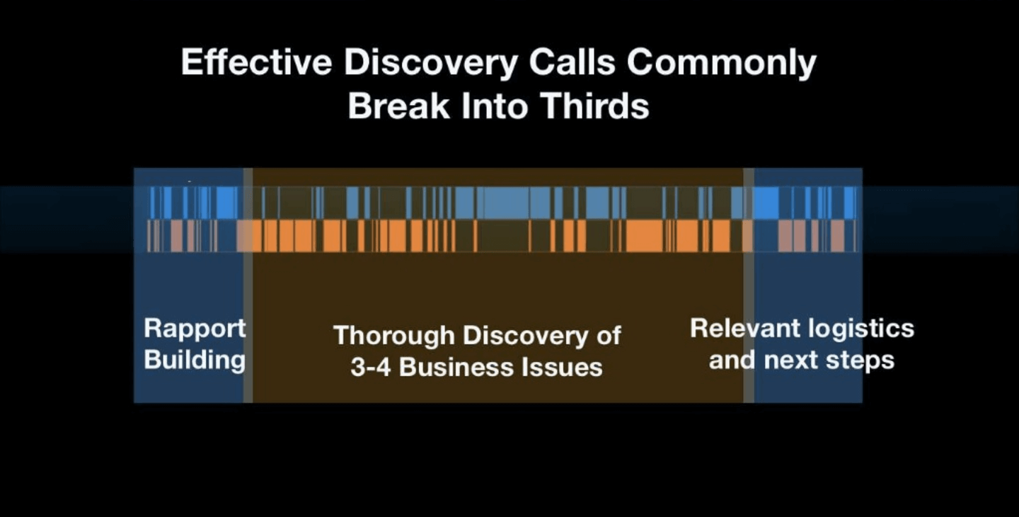
According to Gong.io, discovering business issues should make up the majority of your discovery calls.
Chances are, they probably know something isn’t right.
However, they may not know exactly what needs to change, so they don’t know why they need your help.
By bringing the problem to the surface, you’re making your leads more aware of where they’re falling short.
Focusing on where they’re going wrong or falling behind can encourage them to look for a solution faster.
You can help them find their problem with these questions.
6. What resources or solutions have you tried in the past? What happened?
Ask your prospects to talk about what they’ve already tried.
This can help see if you can offer different solutions.
It also helps the lead recap what they’ve already been through.
By going back and covering all the things they’ve tried and failed with, they can begin to understand what solution they might be looking for.
Additionally, covering the things that have brought success can give you some insight into their audience’s behavior.
Arjun Varma, Sales Manager at Quantcast, uses the tactic “ask, define, explore” to get more from his prospects.
He says:
“Ask discovery questions to uncover the largest business challenges a prospect is facing. Define the implications of these challenges. Explore a partnership or sale that addresses the defined challenges and helps the customer do more business.”
You can then use this information going forward to provide them with solutions that are more likely to work.
7. Why weren’t you happy with your last vendor or agency?
Sometimes, it isn’t the attempted solution that isn’t working. It’s who they’re working with.
Letting your lead discuss the problems they’ve experienced with their current agency or vendor can help you better understand what they’re expecting out of a new partnership.
Maybe their current agency isn’t working fast enough.
Maybe they aren’t giving them the personalized attention they had hoped for.
Or maybe they’re just looking for something new and different.
However, knowing what they don’t like can help you become what they do like.
8. What are you hoping to accomplish in a new partnership?
Bouncing off their unhappiness with their current vendor, try to see what they’re hoping for in a new partnership.
Try to go beyond simple business goals.
Instead, focus on what they’re looking for in the actual relationship with your business.
And remember: use collaborative language.
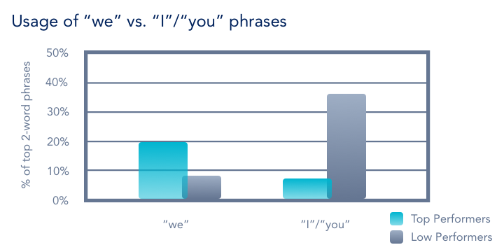
Sales representatives who used “we” instead of “I” or “you” were more than twice as likely to get a deal.
As you talk about what a new partnership would look like, start creating an image in the prospect’s mind of the two of you working together.
9. Why are you choosing to look for a new agency or vendor now?
Try to get to the root of what happened to push the lead to connect now.
Was there a particular event that made them realize they need to make a change?
Are they fed up that others aren’t meeting their expectations?
Are they looking to launch a new product or service and needs some additional hands on deck?
Customers tend to leave companies when they feel like the company is ignoring them, when they find a better deal, or when they have a bad experience.
When you know their purpose behind connecting, you can get a better idea of when and why they’re looking for a new deal.
10. What are your greatest strengths and weaknesses?
Take a minute to try and understand the lead’s perspective about their own business.
Ask your sales prospect to outline where they believe they shine and where they think they may be lagging behind.
Knowing how they view themselves can help you understand their priorities.
Finding a solution
Once you’ve discovered the problem and agitated it, you want to help your leads find a solution.
By working with them to discover what their next move should be, you’re establishing trust and confidence that you can help them through the next stage of their business.
Here are a few questions that can help you and your lead discover the right solution for them.
11. Where do you see your competitors surpassing you?
Ask your lead who they believe their competitors are.
Then ask how they believe their competitors are surpassing them.
By getting them to think about the areas their competitors are doing better in, they can better understand the solutions they need to implement to see similar success.
This can give both of you a better idea of what steps you need to take moving forward.
12. What is your budget?
The budget is arguably the most important part of a new partnership.
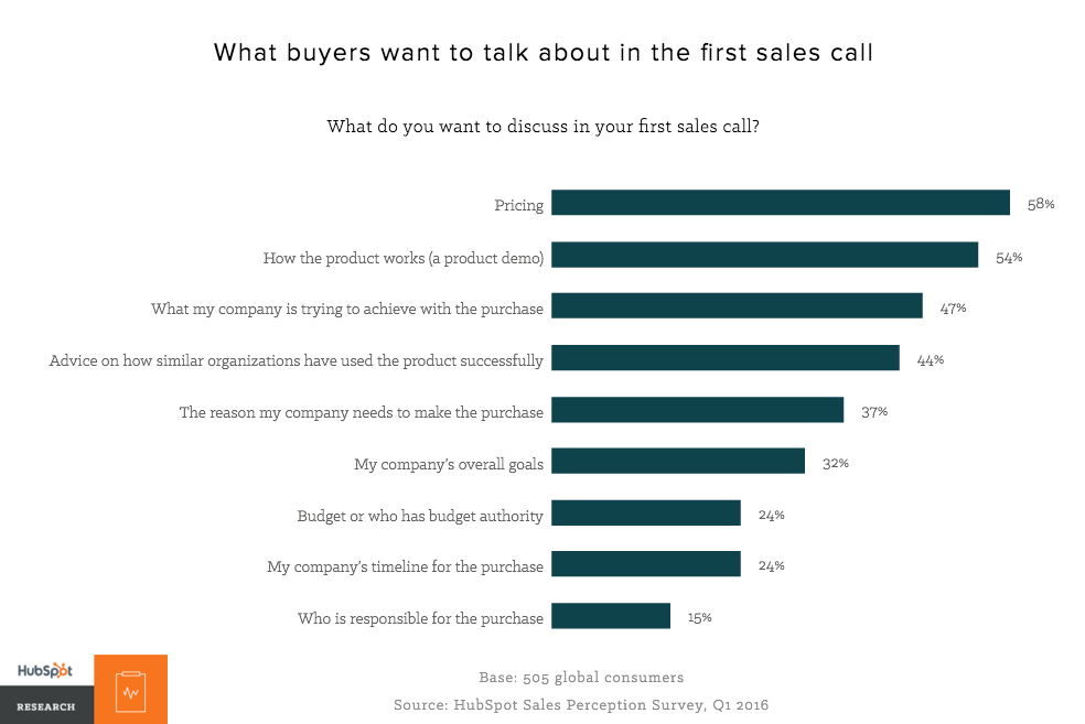
That’s why almost 60% of buyers want to discuss pricing on their first sales call.
For both you and your lead, you need to find a way to create a deal everyone is happy with.
Talking about budget expectations up front can help you understand where the lead falls in becoming ready to purchase.
You can also get an idea of where they can fit within your pricing strategy and if they’ll be able to afford your products or services.
13. What is more important: money or productivity?
Unfortunately, you typically can’t have more productivity on a smaller budget.
Asking your leads if they’d rather grow quickly or save cash can allow you to get a feel for where their current priorities lie.
If they’re looking to move quickly, they may be more likely to make a purchase sooner.
However, if they’re looking for a new budget-friendly option, you can provide them with the marketing materials they need to see you as the right financial fit.
14. What requirements or deal-breakers are there for working together?
Requirements and deal-breakers can sometimes be a difficult thing to talk about.
However, discussing these requirements up front can make it easier for you to tell if you’re the right fit for each other.
Regardless of the direction the conversation goes, it’s always important to be open and honest about your product.
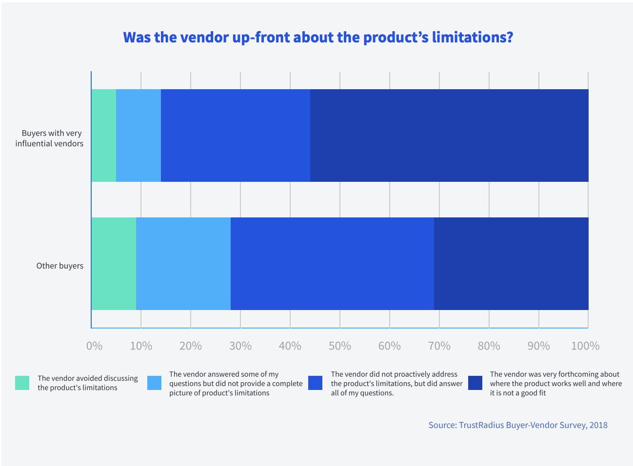
Buyers find vendors more influential when they are honest about their product or service – even if it means admitting it isn’t the best fit.
Trying to deceive the customer into believing you offer the perfect solution will only cause headaches and frustration down the road.
15. What is your biggest priority right now?
When a new lead comes to you, they probably have a few ideas about what they’d like to accomplish.
Unfortunately, it isn’t likely that you’ll be able to tackle all of these problems at once.
Talk about what the customer’s main priority is at that time.
This can give you a better idea of what solutions they’re really looking for.
Discovering a timeline
Timing errors or miscommunications can cause serious problems in new deals and partnerships.
Discussing a timeline up front can also help you identify when the prospect might be willing to buy and what commitment they’re looking for from you and your team.
By determining your prospect’s ideal timeline, you can then get a better idea of where they are in the buyer’s journey.
The more you know about when they’re looking to buy, the more specific content you can provide them with.
Here are a few questions you should ask to learn more about your prospect’s purchasing timeline.
16. When do you hope to get started?
There is a big difference between starting in a week and starting in three months.
However, 63% of people requesting information about your business will take at least three months to buy. Another 20% will take more than twelve months.
If you know that your lead isn’t looking to buy for another year, you can focus your nurturing efforts further down the line.
However, if they’re looking to get started immediately, you’ll need to be more aggressive about the way you promote.
Although it may not be exact, ask your prospect for a timeframe of when they’re looking to get started.
17. What is the timeline for your goals?
Talking about goals is great, but it’s more important to know when they’re hoping to accomplish those goals by.
Getting a timeline for when they’d like to achieve their priorities can help you better understand what kind of commitment they’re looking for.
If they need to accomplish their goals within just a few weeks, they may be looking to hire a committed team immediately.
On the other hand, if they have no idea when they’d like to accomplish their goals, they may need some more nurturing and education.
18. Do you have any outside factors influencing your timeline?
Your leads may have an idea of when they’d like to get started or complete their goals by.
However, it isn’t always in their control.
Sometimes, outside factors constrain our leads.
External due dates and other factors can make your job more complicated. At times, they can influence when a deal can actually go through.
They can also add some restriction about when a prospect is really ready to make a purchase.
Whether they have a contract they need to see through or they have a deadline they’re scrambling to meet, you’ll want to ask if there are any outside factors that will influence the timeline.
19. What could stop us from working together?
Unfortunately, lots of things can make a deal fall through.
In fact, the average lead-to-deal conversion rate for B2B sales is only 0.08%.
Maybe your lead found a better deal elsewhere or they decided that they didn’t need your product or services after all.
Regardless, discuss what potential events could prevent you from working together.
Head sales experts like Geoffrey James use this type of “reverse selling” trick.
In an article that Inc. published, Geoffrey sites “The Reverse Close” as one of his five key ways to close a deal.
Once you know what might inhibit a deal, you can find solutions to ensure that the sale goes through.
20. How soon do you want to see results?
Knowing what kind of turnaround your prospect is expecting can help you better understand when they may be willing to make a commitment.
If they want to see results in just a few weeks, you’ll want to get started right away.
However, if they have no idea when they’d like to start their progress, they’re probably not yet ready to make a purchase.
Establishing future success
It’s always more efficient to gain repeat customers than it is to constantly connect with new prospects.
This is why you should always plant the seed of a long-term relationship when you’re still in the nurturing process.
Letting your sales prospects know how you can help them through growth and changes can help you secure long-term relationships with them.
Here are a few questions you should ask to help establish a future relationship.
21. What hurdles might we run into down the road?
It’s impossible to know exactly what hurdles will show up when you’re working with a new client or customer.
However, determining what they could be can help you plan ahead.
Discuss which hurdles might arise and what solutions they may need.
22. How do you measure success?
Small business owners are becoming increasingly confident in their success.
However, success can mean different things to different people.
Some simply see success in dollar signs while others focus on the number of happy customers who keep coming back for more.
Knowing how your sales prospect defines success can help you determine what will keep your customer happy and what they’re ultimately looking for from you.
23. What are your long-term goals?
Chances are, you’ve already discussed some goals at this point.
However, you really want to dig deep to find out what long-term goals the individual or company is hoping to achieve.
Ask what they’re looking to accomplish further down the road – even if those dreams are too far out of reach at this time.
24. How do you see your needs changing as you grow?
Your sales leads are looking for a solution for now.
But if you can also provide a solution for the future, you can help them achieve growth with a smoother progression.
Helping them understand how their needs may change as they grow – and how you can be there to help them solve new problems or meet new goals – can help set you up for a long-term partnership.
25. Where do you see this relationship going moving forward?
Find out early if they’re only looking for a short-term deal.
Are they just looking for someone to help with their current goals, or do they want a long-term partner who can help them overcome future hurdles?
For PJ Pereira of Pereria & O’Dell, a willingness to collaborate is one of the most important factors when choosing a new agency to work with.
Showing your prospects that you’re thinking about how you can keep the relationship going as they grow might encourage them to work with you over a competitor.
Conclusion
Quit playing the guessing game when it comes to connecting with sales prospects.
If you want to stop missing out on high-quality leads, stop assuming that you know when they’re ready to make a purchase.
Instead, let them tell you when they’re ready – even if they don’t realize they’re doing it.
By asking these 25 questions, you can get a better idea of who your prospect is, what they’re looking for, and how you can help them.
What questions do you like to ask your sales prospects?
About the Author: Neil Patel is the cofounder of Neil Patel Digital.
from The Kissmetrics Marketing Blog https://ift.tt/2shq4vz
via IFTTT
