17 comments, 223 likes on Facebook, and 88 retweets.
You’re writing stuff, and people are reading it. They’re clicking your links and arriving at your blog. Your efforts are finally paying off with a steady stream of traffic.
We’re not going to focus on the importance of a business blog. You know it’s crucial to business success in the 21st century:
- 85.1% of American households have some sort of computer, to say nothing of the prevalence of smartphones.
- Marketers that prioritize blogging as part of their efforts are 13x more likely to see a positive return-on-investment.
- The number one challenge for marketing departments is generating traffic and leads. A frequently updated blog can kill two birds with one stone.
- Nearly 80% of people identify as blog readers.
- Companies that blog generate 67% more leads than those who don’t, 434% more indexed pages, and 97% more indexed links…all of which lead to better SEO and ranking.
- 70% of B2C marketers use blogging in their marketing efforts, second only to social media (89%) and email (86%). The numbers are even higher in the B2B sphere, where 79% use blogging, 92% use social media, and 93% use email.
- More is more: those that publish 16+ posts per month generate nearly 3.5x more traffic and 4.5x more leads than those that only publish between 0-4.
Blogs are a popular, effective, and affordable way to bring people to your digital domain. That’s the good news.
The “bad” news? Traffic generation is only half the battle. Pageviews, likes, tweets, and comments are nice, but none of them are the ultimate goal. You need to convert that traffic into leads. According to Forrester Research, around 97-98% of your visitors leave without taking an action or identifying themselves.
They may absolutely love your posts. They may come back again and again. They may consider you an authority and expert in your industry. But the vast majority pop in, read, and leave. You have to do something to take it to the next level. Can you afford to let 98% of your potential leads disappear without a trace?
Traffic generation combined with lead generation make your blog a worthwhile investment. Everything else – likes, retweets, comments – are nothing but vanity metrics. People like your posts and that gives you a nice little ego boost, but that and $3.50 might get you a coffee at Starbucks.
You need to actively generate both traffic and leads. Traffic without leads is meaningless. Leads without traffic will eventually dry up.
Here’s the best news: a frequently updated blog with high quality, valuable content is a lead generation machine…when done properly.
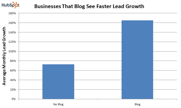
Small to mid-sized (SMB) businesses that blog experience 126% more lead growth than those that don’t bother.
So increase your traffic. There are plenty of great guides and tutorials on how to do that. Just don’t forget about the lead generation part of the equation. Remember:
Traffic generation + lead generation = digital marketing bliss
That said, you don’t want to explicitly bombard your readers with aggressive tactics. No one likes a pushy salesperson.
Nor do you want to be so subtle that no one even notices your trying to convert them from visitor to lead.
Find the middle ground with these tactics to nudge your traffic into lead territory because that’s where they want to go.
If you want them to do something, you’ve simply got to ask.
Call-to-Action
For some of you, this might be a wake-up call. Your blog posts need a call-to-action. Every one of them. If you’re ending your posts with nothing more than an invitation to leave a comment, you’re doing it wrong. You need to get your visitors to do something: sign up, download, click, read something else, subscribe, install, contact you, and so on.
Are you asking? Are you giving them those opportunities to convert, or just hoping they’ll decide to do so on their own?
A high quality blog post without a compelling CTA is a lead lost. They’re already on your site. They’re already interested and engaged with you and your brand. So give them more.
A strong CTA is action oriented, benefit-to-them driven, visual, persuasive, and ideally creates a sense of urgency.
But it also needs to be easy to find. There are several places you could locate your CTA on your site:
- At the top of the page
- At the end of the post
- Within the post itself
- In the sidebar
- As a floating or scrolling popup
- As a sliding popup
- As a full-screen overlay
You don’t want to crowd the page and choose them all. You need to select one or two that maximize exposure on your blog and resonate with your readers.
And you do that by testing. In real estate, the axiom is location, location, location. In digital marketing it’s test, test, test.
“Almost any question can be answered, cheaply, quickly and finally, by a test campaign. And that’s the way to answer them – not by arguments around a table. Go to the court of last resort – the buyers of your product.” ~Claude Hopkins
Pick a few, set up an A/B test, and see what actually works best. Test various locations, types, colors, designs, copy, offer, and more. Zero in on the single most (or top two, or top three) powerful to turn your traffic into your leads. Use VWO, Optimizely, AB Tasty, or a similar service to make it fast and easy.
While only you can ultimately decide what works best for your blog, these are a few popular and efficient tactics to test.
Hello Bar
When someone arrives on your blog, they’re at the top of the page, and there’s no guarantee they’re going to scroll down any further. Putting your CTA at the very top, then, makes a lot of sense.
The Hello Bar is a very simple but highly effective tool that places your call-to-action in a thin, attention-grabbing band across the very top of your page. Instantly recognizable, static, and stays there even if they do decide to scroll down.
Using just a hello bar, DIYThemes generated just under 1200 new subscribers in only 30 days.
While the Hello Bar is perhaps the industry standard, there are alternatives available that do the same thing:
- SalesPanda
- Sumo SmartBar
- WP Notification Bar
- Sleeknote
- OptinMonster
You can also find several free WordPress plugins, but remember that you get what you paid for.
A hello bar can be used to encourage social engagement or email subscriptions, promote new products or services, and more.
In-text CTAs
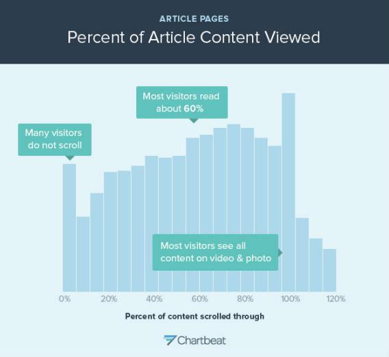
According to recent analysis by Chartbeat, most people don’t read your entire blog post. In fact, a full 10% never scroll at all, while the majority stop after scrolling through about 60% of it.
You can still get your call-to-action in front of those individuals with an in-text CTA.
Some of you may be thinking that the hello bar solves this problem. It’s at the top and seen by everyone. That’s true in theory. But let me introduce you to something called banner blindness.
Because we’re so used to them, because we’re inundated with them everywhere while online, many of us either choose to ignore or subconsciously block out static banners and ads. We just don’t “see” them. This is banner blindness at work, and your colorful hello bar may fall victim to it.
But an in-text call-to-action that’s either a direct or indirect part of your blog post is different. Include 1-2 in the first 60% of it, and you’re going to have a lot of eyes on it as they read.
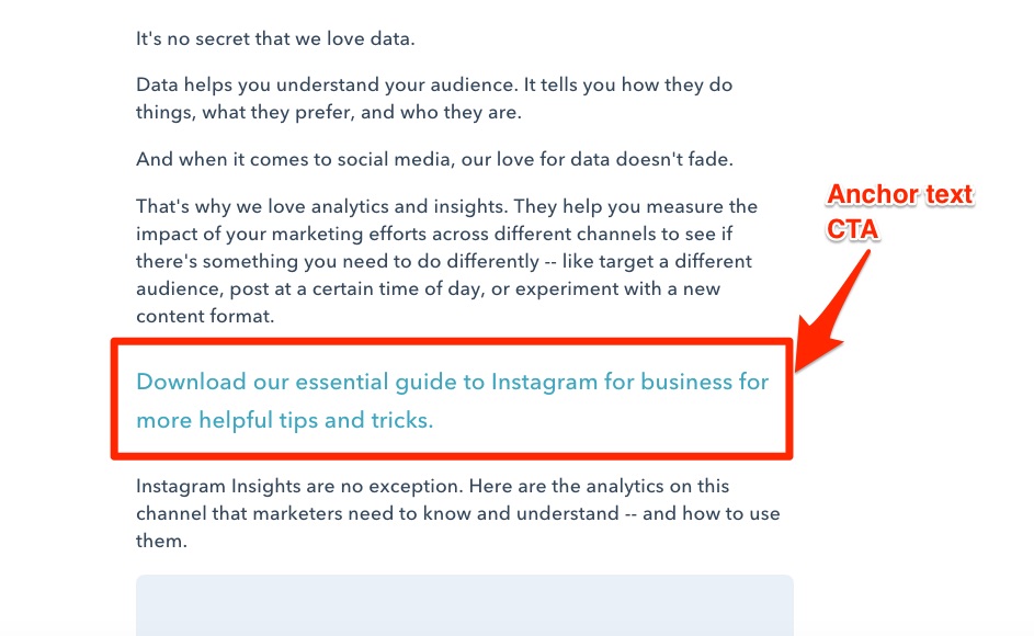
Hubspot generates between 47-93% of their leads via what they’ve labelled anchor text CTAs (compared to only 6% for end-of-post banners).
It’s a bigger font and different color to stand out, but still relevant to what they’re currently reading about in the blog post. Value added. Visitor to lead.
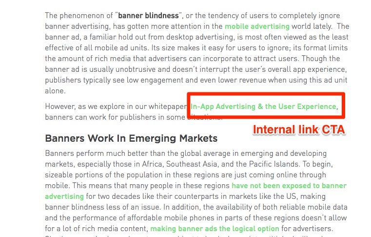
That same analysis revealed that anchor text CTAs combined with internal link CTAs represent a whopping 83-93% of their leads.
As you can see, internal link calls-to-action are part of the blog post itself. Click one, and it takes you to a landing page to subscribe or download something relevant to the topic at hand.
Location, Location, Location
Besides the top of the page and in the post itself, you can place a CTA virtually anywhere on your page. Test each one to see what works best for you.
Static Sidebar
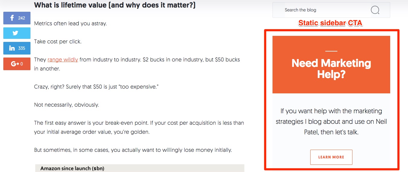
A static banner in the sidebar is widely used in the blogosphere because it typically works quite well. Almost every blog you visit will likely have at least one inviting you to either subscribe to the email newsletter or contact the author.
It’s unobtrusive. It’s not “in the face” of your readers. It’s not annoying. It’s just there, quietly doing its job of helping to convert traffic to leads. Here’s the sidebar CTA I use on my blog:
That said, it shouldn’t be your only tactic. The sidebar CTA is easy to ignore, subject to banner blindness, and gone as soon as they scroll down. Use it in partnership with something else.
AdEspresso found a 0.4% conversion rate (CVR) for their static sidebar CTAs.
Scrolling Sidebar
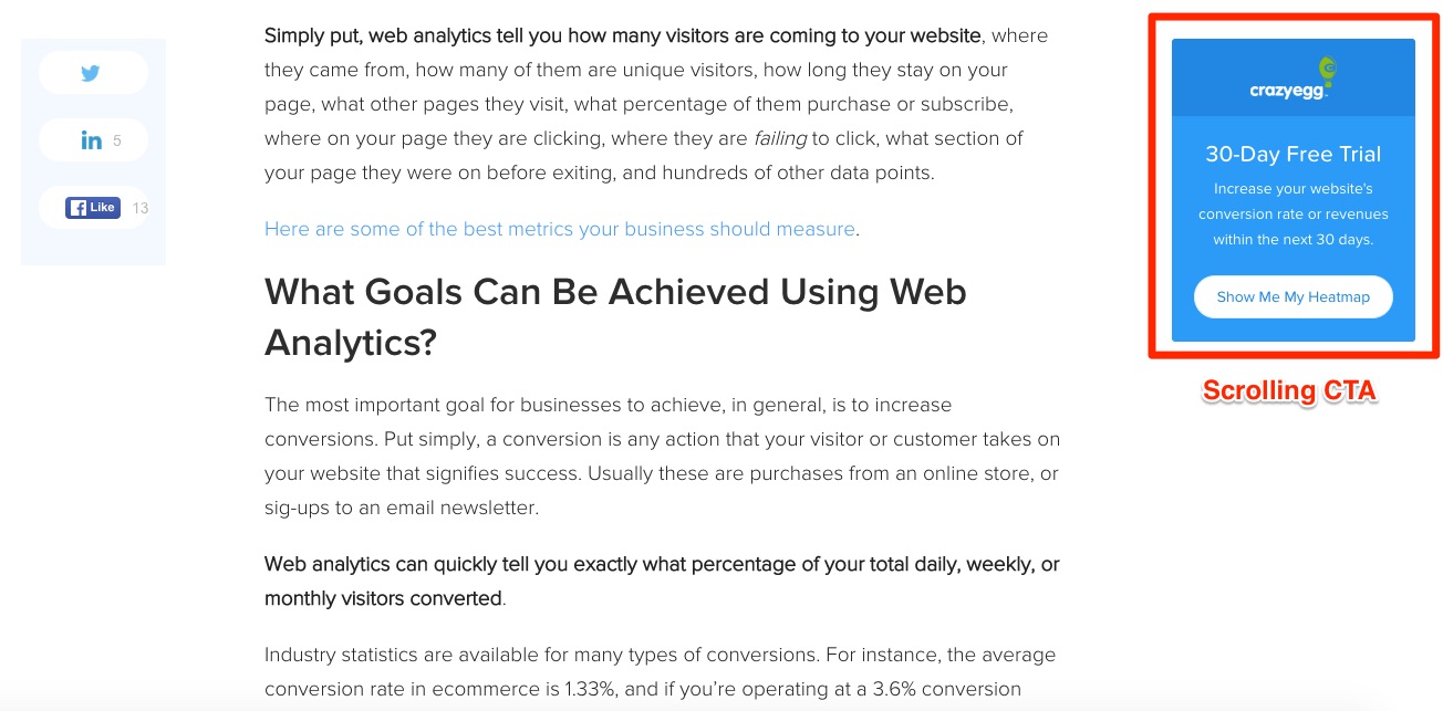
A scrolling CTA looks very similar, but it follows the reader down the post. Because of this mobility, it tends to stand out a bit more and gives the reader more time to decide to click. AdEspresso scrolling ads had a CVR nearly double – 0.76% – the static rate.
Slide-in or Popup
A slide-in popup or overlay is the next logical step in the evolution of the call-to-action. It relies on a trigger – say, X% of the page scrolled, or X number of seconds on page – before it slides in from the side, top, or bottom.
In doing so, it’s only revealed to those readers that have already demonstrated real interest in the post. If they’ve scrolled down 75% of the way – past the 60% where most visitors stop – or spent at least 90 seconds reading, then you’ve got their attention. Strike while the iron is hot.
OptinMonster, Sumo, and NinjaPopups are three respected options to give these a try. Popups delivered a 2.5% CVR for AdEspresso, while others have experienced an impressive 10x higher email subscriptions after introducing the strategy to their site.
You can customize and experiment with everything from where, when, and why to find the perfect combination.
Exit Intent Overlay
An exit overlay works in much the same way, but is only triggered when someone demonstrates their intent to leave by moving the cursor towards the tab, address bar, or back button on their browser.
Remember when I said that 97-98% of your traffic leaves without completing an action? An exit popup or overlay can pull back at least some of those lost leads.
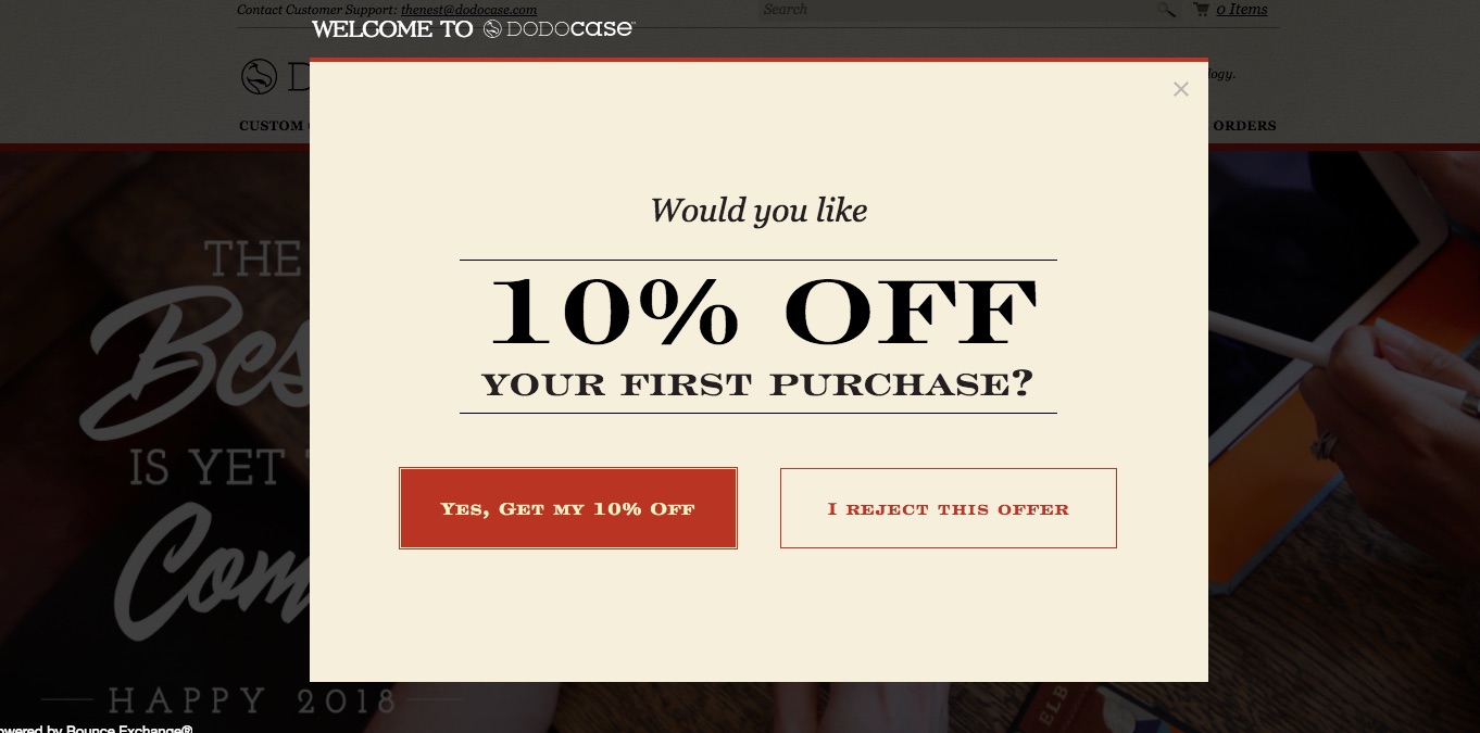
Demonstrate intent to leave on the DODOcase website, and this pops up:
This is a great example of a lightbox overlay. The box takes center stage, overlaying and darkening the rest of the website. It stands out, and gives each visitor a clear choice between this or that.
An exit popup can offer a special discount or coupon, collect feedback, introduce a useful lead magnet, suggest another product or blog post, recommend your newsletter, or whatever else you want to dangle in front of them to tempt them to stay and convert.
Welcome Mat
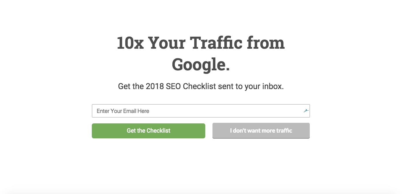
When a visitor first arrives at your site, take advantage of the opportunity to convert immediately with a welcome mat. This whole page overlay displays a compelling call-to-action before revealing the post or page they’ve clicked on.
Navigate to ClickMinded, and you don’t initially see their homepage, you see this:
Both Sumo and OptinMonster offer popular options. With them, you can encourage your site visitors to join your email list, check out your latest blog post, download some valuable resource, and more. Much like an exit overlay, they have to actively choose not to do whatever it is you’re asking them to do. Some will. Many won’t.
AppSumo discovered that a welcome mat was 3x more effective for them than any other page or tactic for collecting email addresses.
An optimized and compelling call-to-action strategically placed on your page is your best bet for turning traffic into leads, but it’s not the only way.
Retargeting
Despite your best efforts, there will still be a sizeable chunk of traffic that leaves without completing your CTA. Maybe they were pressed for time, or your offer wasn’t compelling enough, or they simply missed it.
That’s where retargeting comes in. It gives you another kick at the can.
To make use of it, you need to use a service like ReTargeter, Perfect Audience, PixelMe, or AdRoll.
Essentially, a tiny string of code called a pixel is placed on your website. This pixel drops a tracking cookie on the browser of every visitor to your blog. That done, it can follow them around the internet.
It’s a lot less creepy than it sounds.
Ever notice an ad for a product you were looking at on Site A in the sidebar of Site B, or on your Facebook feed? That’s retargeting doing its thing.
The pixel follows them, and displays relevant ads to them to draw them back to your blog or landing page. You get a second chance to convert them.
Wordstream, for example, experienced a 300% increase in engagement and 51% more leads after 18 months of retargeting.
If you’re willing to put some time, money, and effort into retargeting, you will absolutely see an increase in conversions.
There’s a learning curve to it, but most services provide tutorials and how-tos to get you going in no time.
The more chances you give yourself to turn your visitors into leads, the better.
Exclusive or Upgraded Content
Another useful tactic to try is offering exclusive or upgraded content in exchange for contact details.
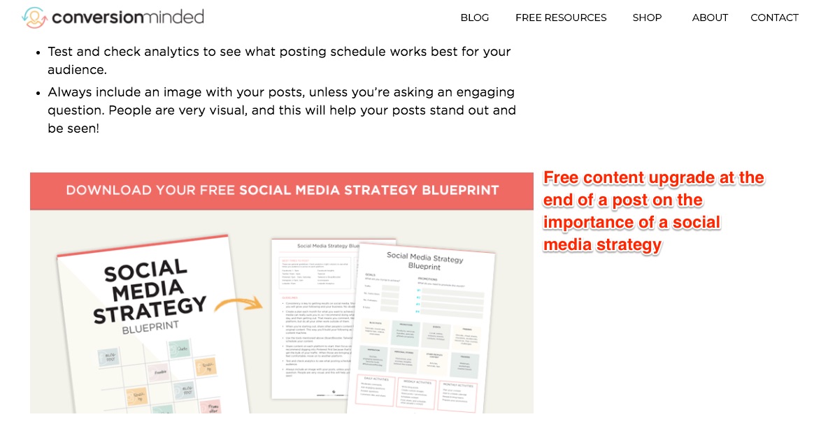
Either in or at the end of your post, offer some relevant but additional piece of content. It might be a template, or checklist, or blueprint that allows your readers to put what they just learned into action with as little friction as possible.
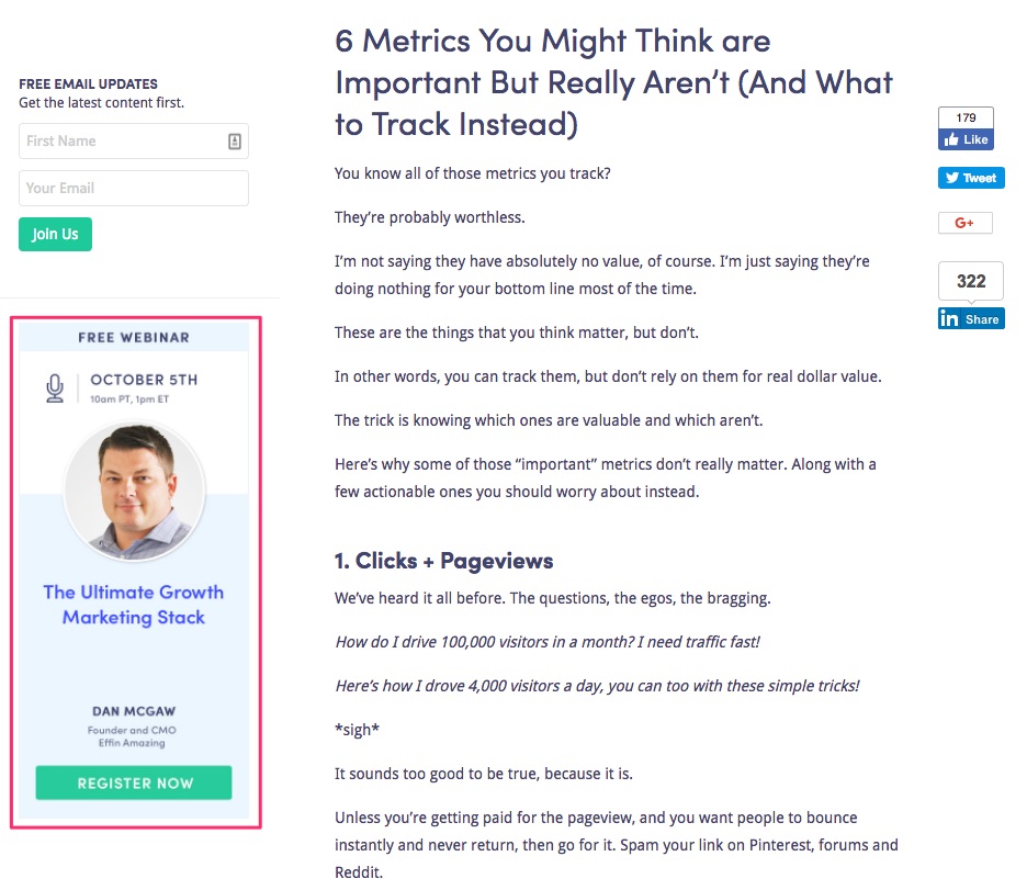
How about a registration box for an upcoming webinar on a relevant skill or strategy?
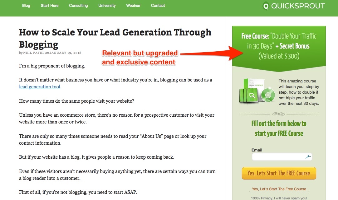
Or a free online course to help readers build complementary skills. A post about lead generation through blogging combined with a sidebar ad for a course on doubling or tripling traffic? That’ll work.
The sky’s the limit on what you can offer. Make it relevant, useful, and irresistible. Ask for nothing but an email address and maybe a name. Make it easy for them to say ‘yes’.
Learn To Be More Persuasive
Ultimately, you’re trying to convince someone to trust you. Most of us are a bit reluctant and cynical when it comes to handing over our details online. You’ve got to persuade and convince them.
To do that, there are few tools as powerful as the six principles of influence as described in Dr. Robert Cialdini’s seminal book Influence: The Psychology of Persuasion. If you’re not familiar with it, I highly recommend it.
Cialdini outlines six basic principles – sometimes called weapons – and you can use them all in your blog posts:
- Reciprocity: we feel obligated to “return the favor” when someone does something for us. If you’re consistently providing your readers with fantastic content and useful tips, they much more likely to give you their email address when you ask for it.
- Commitment and Consistency: if you can get your readers to commit to something small and innocuous – like clicking on a related post – we’re wired to remain consistent in our action. If they’ve committed or agreed to something small like that, they’re very likely to agree to a larger request like their name and contact details later on.
- Social Proof: this hinges on the idea of safety in numbers. If you can demonstrate that the majority already trusts you or uses your product with subscription numbers, social media following, clients or companies you’ve worked with, “as seen on” or “featured in” section, testimonials, and reviews, you’ve got a much easier time convincing new visitors to sign up or purchase.
- Liking: simple. We are more willing to trust or purchase from someone we find agreeable and likable. Be friendly, positive, approachable, helpful, entertaining, relatable, and engaging in all your posts.
- Authority: we inherently trust an authority figure like a teacher, police officer, or doctor. So make yourself an authority in your industry or niche with frequent guest posts on authority sites, speaking at conferences and other events, engaging on social media, answering questions on sites like Quora, displaying your formal credentials and relevant training or experience, and more.
- Scarcity: we want what we can’t have or believe is exclusive. Place a limited period of time or limited number on something, and watch conversions skyrocket. Amazon displays ‘low stock” on items for a reason. But – and this is a big but – don’t overuse this strategy or it quickly loses its power and people feel lied to and manipulated.
While you don’t want to utilize all six in every post you write, strategically using one or two will make you a more persuasive and trustworthy individual.
Quick Tips
Most of the strategies we’ve covered so far are long games. But that doesn’t mean you can’t use a few quick tips to land more leads.
- Promote your products in your posts. You don’t want to overdo it, and avoid aggressive sales tactics, but mentioning a relevant product or resource in the post itself can generate interest and leads. If you’re writing about Facebook Ads, and that’s one of the services you offer, there’s no harm in mentioning that…once.
- Include plenty of internal links to other blog posts, a “related posts” or “you may also like” section, and perhaps ‘previous’ and ‘next’ buttons at the end. Anything you can do to a) further demonstrate your expertise, and b) keep readers on your site will only increase your chance of converting traffic to leads.
- Use plenty of headers, subheaders, and bulleted lists to break up your posts, make them scannable, and keep your readers from bouncing.
- A simple but effective offer at the end is a downloadable summary of the post they just read. If the article is 3500 words, but you can provide them with a convenient, 350 word PDF summary in exchange for their contact details, you’d be surprised how many people will jump at the chance.
And last but not least, consistently provide the best, most valuable, highest quality material you can. There are millions of blogs out there, but the vast majority aren’t worth the digital space they consume. Be different. Be better. People will return again and again if you’re delivering the goods. They’ll recommend you to friends. They’ll sign up, subscribe, download, and purchase.
Try the ideas here, and let me know how it works out for you.
I also describe how bloggers can get readers to buy their products and services. Give it a watch and let me know what you think!
Conclusion
When it’s done right, content marketing can be one of the most effective marketing channels you’ll have. It can reliably bring a steady stream of traffic to your blog and marketing site.
But just like your marketing site converts visitors into customers, your blog needs to convert readers into subscribers. You need to get some information from them while you give out tons of free, actionable content. Often times this means you’ll have to give more free content, but this all part of the transaction. You give a little to get a little.
Anything you’d add to our list? What tactics have you tried to convert your traffic to leads?
About the Author: Neil Patel is the cofounder of Neil Patel Digital.
from The Kissmetrics Marketing Blog http://ift.tt/2FkhVux
via IFTTT



No comments:
Post a Comment