I’m a bit of a cable news junkie.
Now, I don’t watch it often, but am generally more interested how a news product can draw people in hold their attention for hours, and keep them coming back everyday.
But why is this so interesting? And why should marketers care?
Because news itself can be pretty boring.
For your average 9-5 American with two kids and a mortgage, there’s not a big reason to watch news.
And the thing is, news outlets know this. They know reporting on the latest earthquake in Oklahoma is mundane and doesn’t matter.
Unless you spice it up a little bit. Get people’s emotions involved. Make viewers scared or angry.
So here’s why all marketers can take a lesson from cable news.
Cable News is Entertainment Masquerading as News
Their expertise does not lie in reporting the news or helping you understand the world’s events. Instead, they’re experts at messaging and grabbing your attention and holding it for hours, everyday. Because the only way to get viewers is to entertain.
It’s designed for channel changers. Those people with their hand on the television remote, flipping through channels. Cable news is designed to capture that 1-2 seconds of the channel changer, and holding that attention.
In this post, I’m going to examine the different ways news programs (primarily CNN and Fox) use emotions and classic Hollywood-style entertainment techniques to grab viewer’s attention and make sure they come back night after night. Then, we’ll see how marketers can steal these for their own gain.
1. Use Numbers to Your Advantage
Numbers can tell a story. They let the viewer understand impacts and effects. Numbers can be attention grabbing.
And cable outlets know this. They love using numbers, especially when it relates to danger.
Don’t believe me? Just wait for a hurricane or any other major natural disaster.
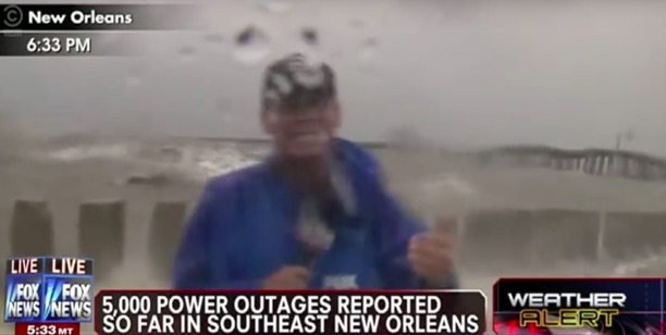
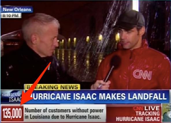
You’ll see cable and other news programs use numbers whenever a hurricane hits the U.S. And it’s generally meant for fear mongering. It’s typically “5 million people in the storm’s path” and “13,000 homes underwater” and “20 million people under evacuation orders”. It’s forceful messaging that grabs attention.
Here, in big text, Fox tells viewers how many are without power:
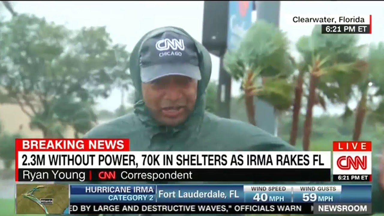
CNN uses a different number, but makes it clear so the channel changers see it right away (and how could they leave out Anderson Cooper and his correspondent standing in the pouring rain):
During Hurricane Matthew, Fox reports on evacuation numbers:

Here’s how CNN reports on Hurricane Maria:

Rescues underway in Puerto Rico as Millions Without Power captures the eye. It takes a few seconds to read, but draws you in. Who would turn the channel after reading that banner?
Another hurricane, and more attention grabbing numbers. And if that wasn’t enough, they also threw one of their correspondents into a hurricane!
This correspondent is away from the hurricane, but that doesn’t stop them from throwing the Millions Could Be Without Electricity For Weeks banner:
You get the idea. Numbers grab people’s attention. They may not hold the attention for a long time, but they do catch the eye.
Now, let’s look at how some marketers are using numbers to their advantage, and how you can as well.
Lessons For Marketers
Some marketers use numbers as social proof. Help Scout uses numbers to show how many customers they have:
Or to encourage you to signup for their email list:

LifeLock uses numbers to sow fear (more on that later) for visitors – and make their product the protection:
It’s also important to note that they’re using a recent data breach to sell their product. If marketing is all about timing, then LifeLock is getting their marketing right and profiting from it by pouncing on opportunities.
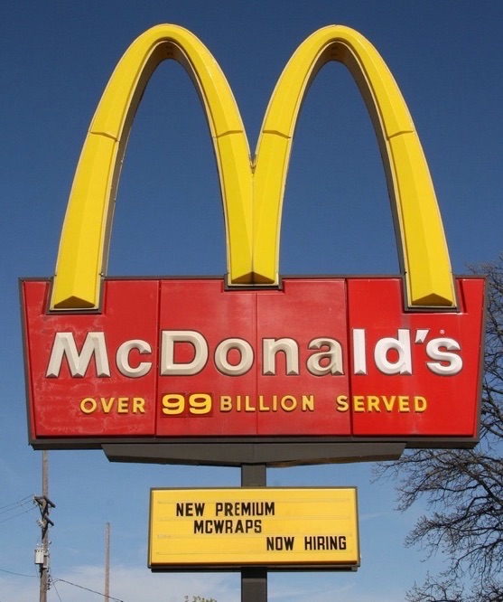
McDonalds used to post the “Billions and Billions served” under the golden arches. Here they give a more specific number while keeping the emphasis, billions served, the same.
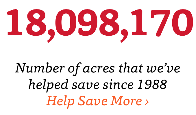
Rainforest Trust, an organization that preserves forests, tells visitors how many acres of forest they’ve saved:
Combine that with a call to action to save more land, and it makes for a great use of numbers to draw donations.
I’ll frequently use numbers in blog posts to capture reader’s attention. In one of my videos, I give the reader a specific number:

Think about it – what headline would get more people to read my article (or in this case, watch the video):
How I Built 23,540 Unique Links to NeilPatel.com
Or this headline:
How I Built Links to NeilPatel.com
The number adds to the impact and gives the headline more of a “punch”. I didn’t just build a few links – I built over 20,000 links to the Neil Patel blog. I guarantee that I got more views on this video because I gave readers a specific number.
On the Quick Sprout blog, I’ve used this advertisement for many years with a lot of success:

I didn’t just increase pageviews. I helped a company grow to 500 million pageviews.
In this video, I give viewers a few numbers to chew on in my intro:
What’s the message here? Rich people listen to podcasts. The impact? 60% of podcast listeners make over $150,000. And they listen to roughly 5 hours of podcasts per week.
I used the cable news model – what’s the story, and how do you capture people’s attention using numbers to explain the impact?
So, how can you use numbers to persuade? Here are a few ideas:
- Try adding numbers for social proof. How many customers do you have? If you have a lot relative to the market you’re in, put it on your homepage. Let people know how many people are using your products and services.
- Add numbers in testimonials. You didn’t just save a customer some money. How much did you save them?
- Add numbers to the results you achieved. This is particularly useful if you’re a freelance. You didn’t just help Widget’s Inc improve conversions; you helped them double their conversions in 3 months. It’s more specific, and packs a punch. An x increase in x amount of time.
Now let’s move onto another favorite tactic of cable news outlets, instilling fear. What better way to hold a viewer’s attention?
2. Fear Will Grab Attention
Watching news media outlets in the summer and fall of 2014, you’d think that walking outside would make you susceptible to Ebola. This is despite four cases of ebola and just one death.
This CNN headline takes advantage of two things people are scared of – deadly diseases and terrorist organizations.
If you’re flipping through channels, what does this headline do to you? It grabs your attention. Makes you stop and turn up the volume, lean in, pay attention, and maybe makes you a little scared. For some people, it may make them think the end of the world is near.
In this way, fear picks up where the numbers left off. The numbers will capture the eye of channel surfers, and the emotion of fear will keep them glued to you for hours.
CNN wasn’t alone with the fear-mongering. Here’s the version from Fox:
Did any of these things come true? Was Ebola used as a biological agent? Did terrorist organizations contaminate the water supply with the Ebola virus and hurt millions?
Of course not! But it’s easy to say it now. Back then, Ebola covered the news cycle. People were scared. So the headlines that cable news outlets used capitalized on that fear (which news itself built) and only grew that fear that most people already had.
Just watch as Jon Stewart brilliantly tears down the news media’s attempts to dramatize the Ebola outbreak:
So, how can you use fear marketing?
Lessons for Marketers
Perhaps the most common use of fear is the Fear Of Missing Out (FOMO). And with FOMO, you can use two classic tactics – scarcity and urgency.
This Facebook ad has a good message. Anyone that’s scrolling through Facebook, sees this ad, and likes the shirt will buy it. It’s limited edition, meaning that it won’t be around for a long time, and now there’s only a few left in stock? Where do I place my order?
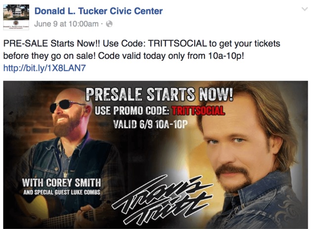
This Facebook ad has a simple FOMO message. The pre-sale is available now. Get your tickets before anyone else or else you’ll miss out.
The “best worst movie” The Room recently had a nationwide one-day special screening. It spread via word of mouth and some press coverage:
The Room,' tonight. 500 theaters nationwide. Will you be there? https://t.co/7qHor3mRGT
— USA TODAY (@USATODAY) January 10, 2018
Needless to say, when people couldn’t make it, FOMO triggered and they were pretty upset:
So they are having a one time screening of The Room tonight nationwide and I’m not gonna be there
pic.twitter.com/eKqibMDId9
— oh_hi_mark (@zero_mark_30) January 11, 2018
Marketers use FOMO for a reason. Because it works really well. As long as you have a product or service that people want and value, adding some scarcity to it will make people buy it up as quickly as possible.
Think about it – if your product is widely available, will anyone be in a hurry to buy it? Probably not. They may even rethink buying it. But adding a little scarcity to it will make people value it more and makes them more likely to buy.
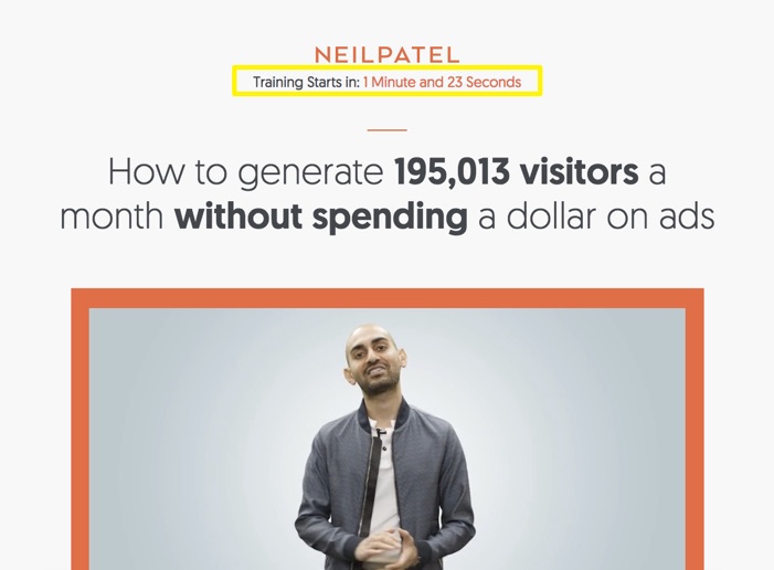
I’ve used FOMO before to promote some of my webinars:
My webinar is starting in two minutes, better not miss it!
The other way marketers use fear is to buy some protection against a threat. We saw the example above with Lifelock.

Millions of people potentially have their identity stolen? And we sell identity theft protection? Cha-ching!
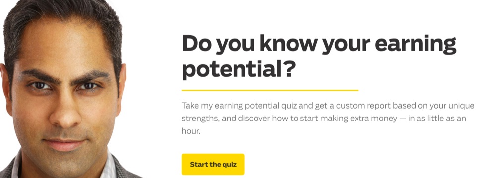
Ramit Sethi wants to make it clear – use his courses and you’ll learn how to make more money. If you don’t use it, you’re not making your earnings potential (thus you’re Missing Out on money that could be yours):
The quiz is a lead generation tool. Start the quiz, give them your email to get the results, and you’ll be thrown into a drip campaign in no time. And then start making more money in “as little as an hour”. Who could pass that up?
Viruses and malware spreading across computers isn’t as common as it once was, but customers are still afraid of their computer becoming “infected”. And Symantec marketers use that fear:
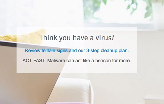
These marketers use the fear as a lead generation tool. Who’s clicking on this link and reviewing the cleanup plan? Time to retarget them and sell our antivirus software.
Use fear at the right times. Marketing is about timing; so don’t rely on fear all the time. Use it at the appropriate time and it will be more effective for you. Use fear like you’d use a service, only at the right time, for a limited amount of time, and for the appropriate use.
3. Use Bold Graphics
Television is the ultimate vision medium, and much of the web is as well. Boring graphics with bland colors won’t draw viewers.
Let’s face it – people don’t want to read a wall of text, and they don’t want to read long headlines. They want fancy colors and beautiful people reading them the news.
When Jeff Zucker took over CNN, he was charged with turning around a ratings decline. One of the first things they did was debut a new graphics package:

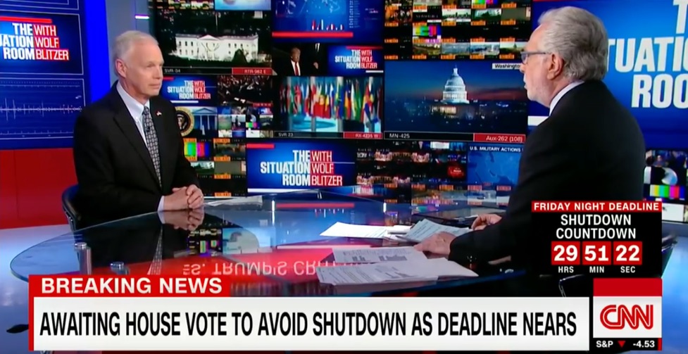
Have you watched The Situation Room with Wolf Blitzer lately? You’d think their news set was taken straight from a Hollywood movie:
Just take a look at that set!
Dozens of different images on at once (in the background), big typography on the screens, and combined with the Breaking News headline (because apparently everything is breaking news) and the countdown clock makes this the perfect cable news show.
We’re “awaiting”, which means viewers can’t click away, the countdown clock (which starts with at least *29 hours*) means that even if you leave to watch something else, you’ll have to come back and see where the clock is now and continually check to see if the Shutdown Countdown is called off. This is turning the political theater that is Washington, DC into theater television.
Jeff Zucker, I admire you. Well-done sir.
Lessons For Marketers
The lesson here is to find the balance between big graphics that stand out without overwhelming. Combine great graphics and design with strong messaging (like cable news) and you’ll earn the visitors attention.
The graphics I use on Neil Patel use bold colors combined with simple messaging. Do you want more traffic to your site? Put in your URL and see what I can do for you. The graphics stand out, the message is clear, now the choice is up to the visitor.
The Apple Homepod page uses big typography and beautiful image of the product:
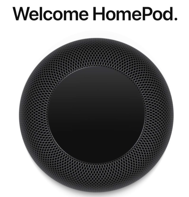
Go ahead and visit the HomePod page and scroll through. Just try to click away. You can’t do it. Why? Because it unfolds like a product description. The graphics keep you scrolling and the copy keeps you reading. The font is big, bold, and stands out against a white background. And the product images draw the eye in.
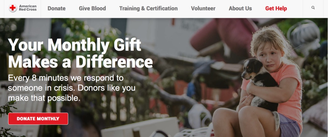
The Red Cross homepage has one job – get donations from visitors. Here, they don’t use beautiful graphics. Because why would you do that if you want people to donate to a project in need? They need to see sadness or human struggle. So, they go with this:
The little girl holding the little puppy after what appears to be a natural disaster. They’re saved, but sad and clearly in need. How can you help? Give them some money so they “respond to someone in crisis”.
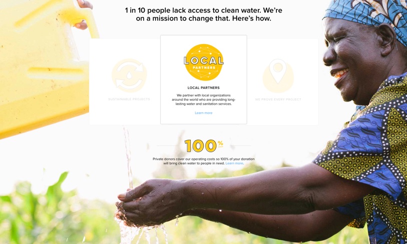
Charity: Water uses graphics to show visitors what they’ll accomplish with a donation – helping rural and poorer countries get access to clean, drinkable water:
This is an example of marketers using an end result to deliver conversions. Clean water coming out of a jug. A happy woman that finally receives uncontaminated water.
It’s not about the organization or the charity, it’s about the mission and what it accomplishes for people. Visitors want to know why they should donate, and this graphic makes it clear.
Conclusion
So why does any of this matter to marketers?
Because it teaches us about messaging, catching and keeping someone’s attention. And in today’s world, it’s a marvel at how cable news does this. They take a boring product (news) and turn it into entertainment that some people can’t look away.
Your product may be exciting to you, but to others it may come across as boring. You should be aware of this and appeal to people’s interests. The classic things that capture people’s attention and hold it. Use numbers to people can understand your impact, use fear to sell, and graphics to keep people’s attention.
What have you, as a marketer, learned from cable news or any great television producers?
About the Author: Neil Patel is the cofounder of Neil Patel Digital.
from The Kissmetrics Marketing Blog http://ift.tt/2FavrAx
via IFTTT





No comments:
Post a Comment