Banner advertising is everywhere. So prolific on so many pages of the internet you probably visit regularly, you may hardly notice them.
Which is kind of the point.
Banner ads are a type of paid ad designed to sit seamlessly on the top, sides, or bottom of a website. In many cases, they fit so well they look right at home. Of course, their actual purpose is to drive you to click.
Let’s cover what banner advertising is, how to create them, and then explore examples of successful banner ads.
What Is Banner Advertising?
Banner advertising consists of placing a designed ad on another website. As the name implies, the ad is a banner shape, a long rectangle, either horizontal or vertical. Banner ads are usually at the top or bottom of a website or vertically along the side of a website, next to the main content.
Banner ads have been around since the dawn of the internet, allowing website owners to sell ad space, much like a billboard or bulletin board owner would.
While some website owners sell ads directly, most contract with advertising services, like Google AdSense, that create the ads, decide how much to charge, and then display them on your website.
What Makes an Advertising Banner Successful?
Before digging into creating a successful banner ad, we need to talk about what banner ads do. There are two primary goals for banner advertising: impressions and clicks.
Impressions refer to how many people actually see your banner. While these people may not actually click over to your website, impressions help increase brand awareness.
With click-throughs, your goal is to get people to click through to your website or to a landing page. You may generate leads, capture email sign-ups, make sales, or other specific engagement goals. In this case, you will be tracking how many clicks you get on your ads.
You might also be thinking about retargeting. Retargeting helps you target someone who already visited your website or engaged with you in some way. You can think about these people as a sort of warm lead.
They interacted with your brand at some point, and this is your chance to draw them back in. For this purpose, you’ll be interested in both impressions and clicks, as you make people more aware of your brand and entice them back to your website.
What Elements Help Increase Impressions or Clicks?
The best banner advertising is the one that draws attention to itself.
Keep in mind the person visiting the website came for a specific reason. Maybe they are scrolling through their favorite news site or looking up a new recipe.
Whatever their purpose, your goal is to capture their attention and draw them away.
That’s a tall order. Here are a few elements that can help you get there faster.
Visual Elements That Fit in, but Stand Out
When it comes to the colors and visuals you choose for your banner ad, think about the modern styles of the websites your ad may be on. While you can’t match everyone, you can use design styles that will fit in well with modern websites and will feel at home.
Lean toward the eye-catching and bold. You want to be attractive but not overt.
Bold Text, but Not Too Much
This is your time to make a statement, not write a novel. Don’t try to tell viewers everything there is to know about your brand.
Instead, choose one item or concept you are selling and focus on that message. Get creative, but keep it simple.
Relevant Images
Images are a great way to draw people in, but they need to be very related to the message you’re sharing. If you’re selling a product, the clearest picture of that product is your best bet. If you’re conveying a message or emotion, people or animals or even landscapes can be evocative, but just as with the text, keep it simple and clear.
Strong Call to Action
What do you want them to do next? Use the call to action to tell them. The shorter, the better. Make it obvious how they can learn more or take the next step. Words like “Shop,” “Buy,” or “Find out how” let people know exactly where they’re going if they click on your ad.
How to Create Banner Ads
To create a banner ad, you first need to choose a display network, such as Google Ads. You’ll work with them to create your ad, with the relevant link, and choose parameters, such as how much you want to pay per click, etc.
They will distribute to relevant websites, and you will pay them. They will also share data on how well your ad is performing. Learn more about Google Display Ads here.
To create the image for your ads, you’ll need to find out the size dimensions from the display network you are working with. Then you can either design on your own or use a template, such as those provided by Canva.
Upload your image into your campaign within your display network, and be on your way.
Real-Life Examples of Successful Banner Advertising
Want to see what others are doing before you start designing your own? Here are 15 real-world examples of banner advertising.
Let’s talk about what makes them work and how you can emulate some of these elements in your own advertising banners.
Ashley Homestore Successful Banner Ad

They have a clear message here. You can trust their products to be stylish and affordable and make your living space feel like home, they argue. With an evocative image and a clear call to action, you know exactly what to do next if you want that experience.
Also, the neutral color palette makes it ideal for a range of website placements.
Nutrisystem Successful Banner Ad

Nutrisystem is betting on the idea that you’ll find that price point alluring. They’ve made it really bold so that even when your eyes are looking at something else on the page, you can’t miss the “$249” message.
The other really bold items are the yellow jacket on the smiling woman and the orange “Shop Sale” button, which implies you’ve got a limited time to act.
Visible Successful Banner Ad

There is a bit too much text on this ad, but the bold text grabs you with a big promise. The bright blue background and white text makes it stand out on the page. The “Learn more” button is clear and enticing.
Chicwish Successful Banner Ad

This looks like two ads in one, giving viewers two chances to click and learn more. On the left, Chicwish showcases some of their popular items and some selling features, such as free shipping and easy returns.
On the right, there’s a precise text message about how you really only need a few items to have an ample wardrobe. Either way, you’re encouraged to click and start shopping.
Outskirts Successful Banner Ad

The neutral color palette makes this ad at home on a range of websites. They used the two font colors to highlight what they are really about—making books. On the other side of the ad, Outskirts highlights what makes them stand out from their competitors. The call to action is clear, but creative.
Square Successful Banner Ad
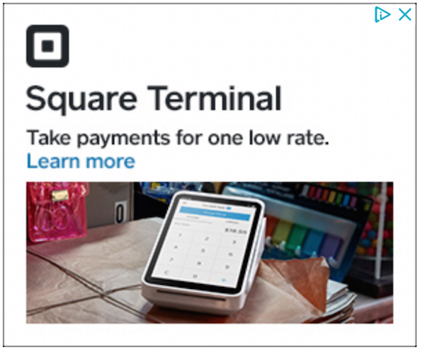
True to their own branding, this banner ad from Square is simple and almost monochromatic. The text is clear, with a blue call to action that really stands out.
The picture showcases their product in a real-life environment. While the product is the primary object, there are other items in the photo that draw your eyes in.
discovery+ Successful Banner Ad

With this discovery+ banner ad, the offer is clear. The message is simple and creative, encouraging people to give a subscription instead of buying one for themselves. The ad stands out with a bright, on-theme color palette.
IT Cosmetics Successful Banner Ad

In this IT Cosmetics banner ad, the product takes the spotlight. This is a prime example of staying focused on one product. The text and the photo highlight the selling points, while the call to action invites the viewer to learn more about it.
Nike Successful Banner Ad

Here’s another example of a banner ad that focuses on a single product to entice viewers. Without a lot of background visuals, the shoe takes all attention. As you’re scrolling through, you can quickly see the details. The text makes an enticing claim, to learn more about these new shoes. The call to action is simple and clear.
AARP Successful Banner Ad

This AARP banner advertising is a GIF, flashing through several program benefits. The bright red color reflects their brand and stands out on many websites. The evocative photo remains the same, and the call to action at the end is paired with a compelling discount.
Pottery Barn Kids Successful Banner Ad
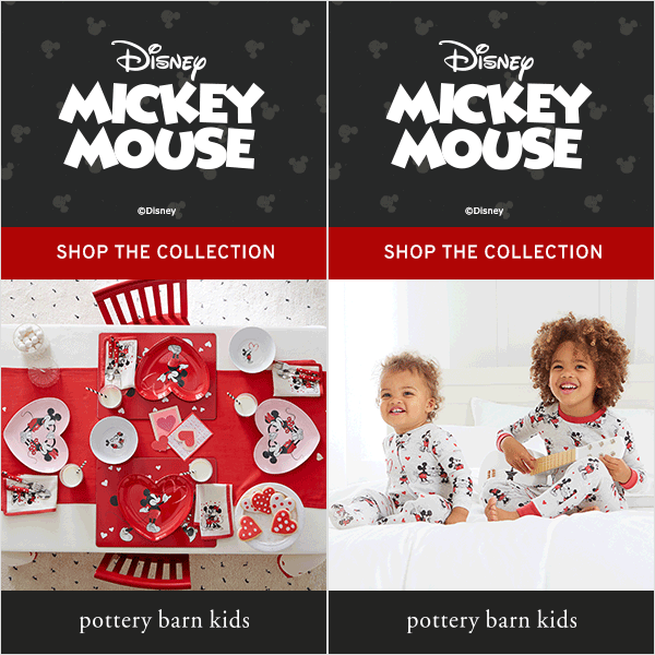
Here’s another example of GIF banner advertising. This Pottery Barn Kids ad keeps the branding and message the same while switching between two photos. The photos showcase several products in this category.
By focusing on the partnership between two brands, it keeps both brands clear, with an obvious call to action right in the middle.
American Eagle Successful Banner Ad

This American Eagle banner ad is all about keeping it simple. With very little text, only the brand name and a short call to action, all the focus is on the models and the clothes. It also keeps the color palette united by using similar tones for the clothing and landscape.
The Ridge Successful Banner Ad

This banner advertising does more than just show off the product. It also attracts attention with a side-by-side of the competition. The copy explains what makes this wallet different and then provides a simple call to action. The colors are neutral, making it at-home almost anywhere.
Planet Fitness Successful Banner Ad
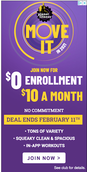
The bright purple and yellow colors make this ad from Planet Fitness hard to miss. The text is bold with big promises of sales prices and benefits of membership. The call to action is clear on the bottom, and even the branded image on the top has an active tone.
VRBO Successful Banner Ad

This banner advertising started with several pictures then landed on this image, which persisted until the viewer scrolled away. The light text on a dark background made the whole image stand out on the website, and the text pops. The creative call to action is enticing.
Conclusion
Growing your brand is no easy task. As you consider different marketing strategies, don’t forget tried and true options like banner advertising.
Get creative and focus on what your target market is looking for, their pain points, and make sure to keep your message clear.
These strategies will help you overcome banner blindness, which can occur when internet users see too much of the same visual noise again and again. Keep it fresh and keep them clicking.
What kinds of successful banner advertising have you seen out there?
The post 15 Examples of Successful Banner Advertising appeared first on Neil Patel.
from Blog – Neil Patel https://ift.tt/3qTaeDx
via IFTTT
No comments:
Post a Comment