
Landing pages help drive traffic, increase conversions, and improve SEO. However, not all landing pages are effective. If your landing pages aren’t producing results, the issue might not be your copy or your product—it might be because you aren’t using testimonials efficiently.
Below, we’ll look at ten different landing page testimonial examples and discuss why they work and how they build trust. First, let’s cover why they matter so much for brands.
Why Should You Include Testimonials on Your Landing Page?
The primary purpose of a landing page is to convert visitors and move them through your sales funnel. Ideally, you’ll have fantastic copy to convince customers you can solve their problems.
However, consumers don’t trust brands—they trust other people. According to the Edelman Trust Barometer Special Report, only one-third of consumers trust brands to do the best they can for their customers and the world at large.
Who do they trust? Other consumers. In fact, 92 percent of consumers report they trust word-of-mouth marketing more than any other type of marketing.
Testimonials on landing pages can also help:
- increase relevance by mentioning specific pain points the customer is facing
- drive conversions, as consumers who read testimonials, are 58 percent more likely to convert
- showcase important features in an easy-to-read format
- establish use cases that might not be highlighted in marketing copy
10 Testimonial Examples Used on Landing Pages
Including testimonials on a landing page is a powerful way to increase trust, drive clicks, and overcome objections. How those testimonials are formatted, however, can drastically impact how well they reach those goals.
The testimonial examples below showcase a few of the most effective ways to successfully use testimonials based on the audience and landing page type.
1. Blue Apron Uses Changing Testimonials
Blue Apron, an at-home meal kit company, leverages the power of testimonials on its pricing page in a unique way. The testimonials are plain text with no images. However, they still stand out.
Here’s the first testimonial on the page:
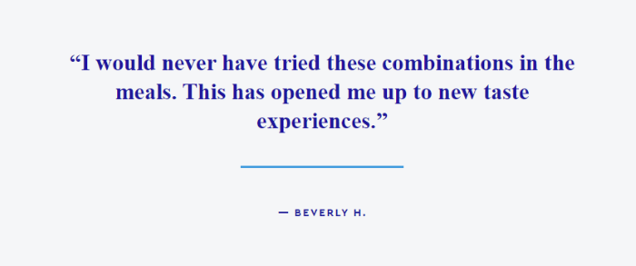
It highlights the novelty of the meal kits, which encourages users who might think they’ll get bored. A few seconds later, the testimonial changes to this one:
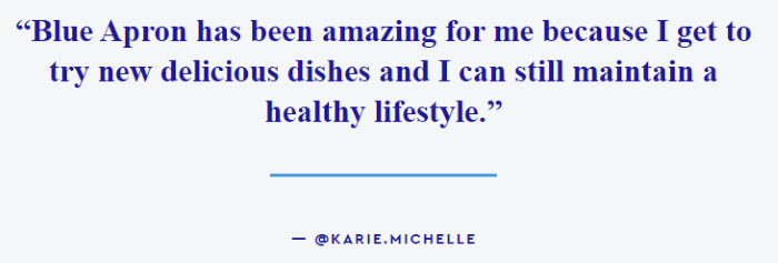
This testimonial focuses on how healthy the meals are, which is ideal for customers worried about their health. By changing the testimonials every few seconds, Blue Apron can show a variety of reviews to potentially address different consumers’ pain points. The change is also visually appealing, which grabs viewers’ attention.
2. Business-Software.com Offers Authorative Testimonials
Business-Software.com is dedicated to providing buyers and vendors with incredibly detailed reviews of popular business technology. On their landing page about Salesforce, a popular sales and marketing tool, they use a testimonial to highlight one of their reports.
In addition to being visually appealing due to bright colors and clean icons, the testimonial is powerful for another way because it’s from a recognizable, authoritative person in the field: James White of Active Spectrum.
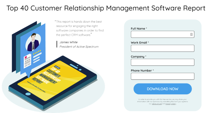
Using a testimonial from an authority figure helps establish trust. People often assume if someone in a position of authority likes a product, service, or piece of work, there’s a good chance we will too.
Putting the review next to a download form is also an interesting strategy. Most brands use testimonials to drive sales, not leads. However, this can be effective at enticing leads by encouraging them to fill out forms.
3. MarketerHire Increases Trust
MarketerHire is a company dedicated to connecting companies and marketers. The testimonials MarketHire features on their site specifically show how they help address pain points.
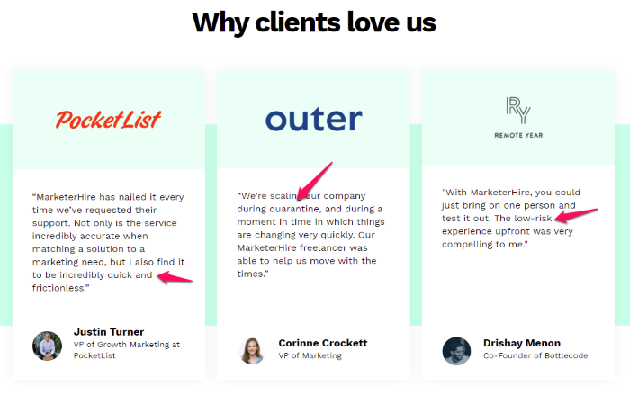
These testimonials address concerns about how difficult the service may be to use, worries about hiring during difficult times, and anxiety about trying a service like MarketerHire in general. Knowing other users have similar pain points and found MarketerHire to be an effective solution can establish trust.
The images of each testimonial provider and their name and position also help readers trust that these reviews are real and accurate. The images and logos are also eye-catching and invite scrollers to have a closer look.
4. InseevInteractive Offers More Testimonials Without Taking up More Space
If a few testimonials are good, a lot of testimonials should be great, right? That’s not entirely true.
If you want to include testimonials on your landing page, just be sure to not include too many. Going over-board with the testimonial examples can overwhelm your leads and they could move with your competitor.
InseevInteractive, a marketing company, found a way around this challenge by installing buttons that allowed visitors to see more testimonials or read long-form case studies.
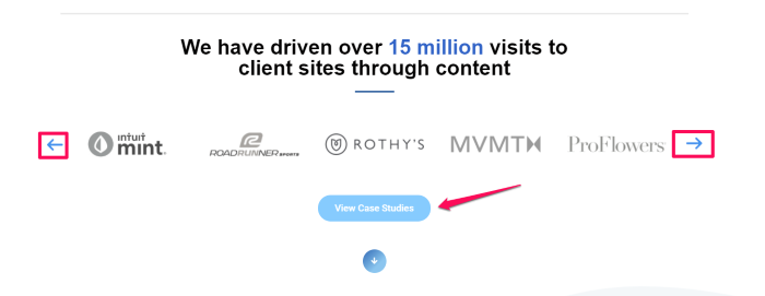
This testimonial example leverages the power of social proof while keeping customers who are ready to convert on task. If a customer needs a bit more information, they can easily click to read more.
As powerful as testimonials are, it’s crucial not to pull people out of your sales funnel with distracting elements. This testimonial example walks that fine line perfectly.
5. Teamwork Includes Eye-Catching Trust Signals
Teamwork is a project management tool designed to grow with businesses, making it ideal for small businesses and startups. However, there are dozens of similar tools on the market. Where do they stand out?
One factor that differentiates them is their use of testimonials
Teamwork features two testimonial sections on their landing page. The first includes an image of the person and a short review:
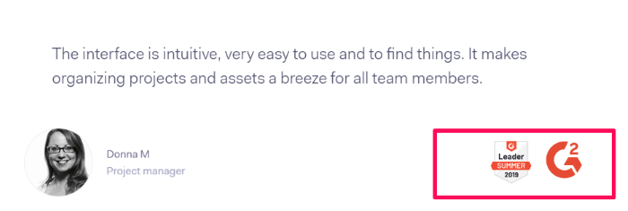
This testimonial example stands out because of the trust symbols Teamwork uses under Donna’s review. These showcase the tool as a reliable, award-winning tool. They are also bright and grab the eye as users scroll down.
Then, further down the page, they include more testimonials from Twitter.
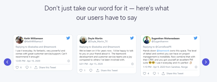
Sharing Tweets, which can be verified if readers want to do some extra legwork, establishes trust in the brand. Teamwork also uses the buttons on either side of the Tweets, which allow users to scroll through more testimonials if they so choose.
Offering more testimonials without overwhelming a whole page with them is powerful because it shows a wide range of people like your product. It gives prospects a chance to find a review that addresses their concerns.
6. Topic Uses an Eye-Catching Design
Topic is an AI-powered content tool designed to help brands create better quality content fast. They leverage the power of testimonials by including a ton of testimonials on their landing page:
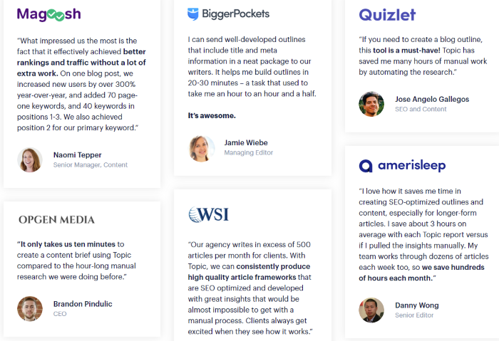
These testimonials stand out due to the careful attention to design. Each review includes the image, full name, and position of the reviewer, which can establish trust and give the section a clean, professional look.
Each review is split up into cards to keep them organized and easy to read. The logos and small profile images are visually appealing and draw the eye to each review.
This testimonial example is powerful for several reasons: the design is on point, the reviews are eye-catching, and they leverage several other strategies, like using authoritative reviewers and including images.
7. Booker Adds Five Stars to Grab Attention
The vast majority of internet users don’t read; they skim. Booker, a business management platform for beauty companies, found a way to capture scanners’ attention while also leveraging the power of testimonials.
They use several testimonial examples to highlight what people love about their software on their business management landing page.
In addition to the companies’ names and short testimonials, they include icons and star ratings.
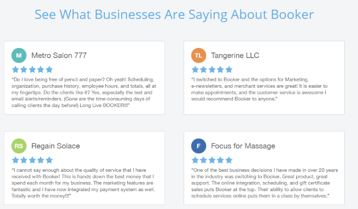
The five-stars allow users just scrolling by to easily see what reviewers think of Booker without having to stop and read the entire review.
This testimonial format strikes the perfect balance between trust by offering longer written testimonials and giving users the information they need at a glance by including the five-star rating.
8. Display User’s Testimonials on Different Landing Pages
Keap is a CRM designed for small businesses that want to leverage automation in their sales processes. They offer several landing pages for each feature, including CRM, automation, reporting, and analytics.
Each landing page includes several testimonials where current customers share what they love best about Keap. However, they don’t use the same testimonials on each page.
For example, on their automation landing page, each testimonial mentions how Keap’s automation features help save the users’ time.
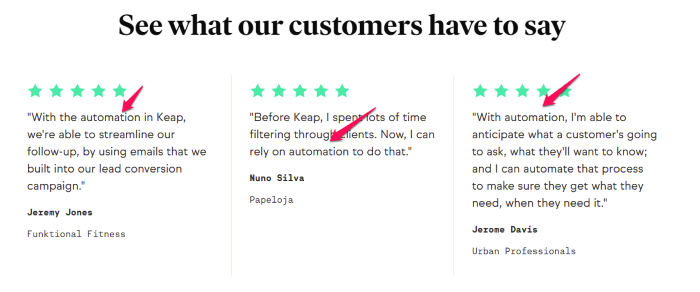
Like Booker, they include five-star icons, which grabs attention and allows people scanning the page to see how much the tool is loved.
By offering different reviews on each page, Keap provides relevant testimonials to each customer persona.
9. Salesflare Uses Pictures to Increase Trust
Salesflare is a powerful CRM designed specifically to help B2B businesses grow. The brand uses a simple landing page to drive conversions by offering a picture of the platform, an icon-rich features list, and several testimonials.
Unlike other testimonials, which are often several lines long, Salesflare keeps it simple by using one or two lines for each testimonial. They also include profile pictures, full names, and the the name of the company that completed the review.
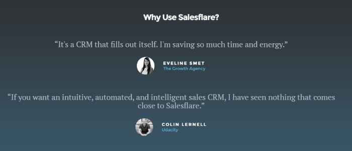
In some cases, using longer testimonials might be more effective. However, on this page, Salesflare relies on the images and brand names to increase trust and grab readers’ attention.
10. Lattice Combines Testimonial Types for a Powerful Punch
Lattice is an HR management platform used by some of the biggest brands in the world. Their testimonial section packs a big punch by using three different testimonial types, all in one easy-to-view section.
First, they list the names of big brands they work with, including Reddit, Slack, and Asana. Knowing those well-established brands use this tool helps inspire trust—they obviously aren’t new to the industry.
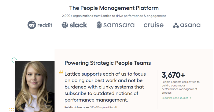
The next section offers an individual review from a reputable source: the VP of People of Reddit. Knowing she trusts Lattice may help readers feel confident it’s a trustworthy solution. They also include an image, which shows her face and helps viewers connect with the review with the human who gave it.
Finally, on the right side, they offer a link to read case studies and list how many people use their company.
Lattice’s testimonial section works incredibly well because it includes a lot of information and several forms of testimonials but keeps the design sleek and easy to read.
Conclusion
Many brands don’t effectively use testimonials on landing pages, if they use them at all. The testimonial examples above serve as inspiration for using testimonials on your own landing pages.
Keep in mind that testimonials don’t work in a vacuum; they should only be one aspect of your digital marketing strategy. For example, you may benefit from beefing up your social media strategy, carrying out marketing campaigns, publishing blog posts that help users find your business organically, and analyze/fix any SEO issues.
If this sounds overwhelming and you need help developing or improving your marketing strategies, reach out. Our agency is happy to help in whatever capacity you need.
Do you use testimonials on your landing pages? What impact have they had on your conversions?
from Blog – Neil Patel https://ift.tt/3rSj9VF
via IFTTT
No comments:
Post a Comment